How to improve your digital typography

Moving from print to digital, there's one obvious and important difference to consider when it comes to typography. Unlike with print, in digital design, your type is not going to remain static.
"Printed type can be tightly controlled, with the outcome exactly as the designer intended," says Jack Statham, mid-weight designer at Ragged Edge. "But typography on-screen may be rendered with varying levels of detail for different users, depending on their device."
That doesn't mean typography loses its importance, though; quite the reverse. "In recent years, web and app design has rid itself of superfluous decoration and now gives more space to content, and therefore to text," explains Massimiliano Frangi, senior design director at CBA Italy. "So the choice of a great font is now a key element for the success of a web project."
Article continues belowIn recent years, web and app design has rid itself of superfluous decoration
Jack Statham
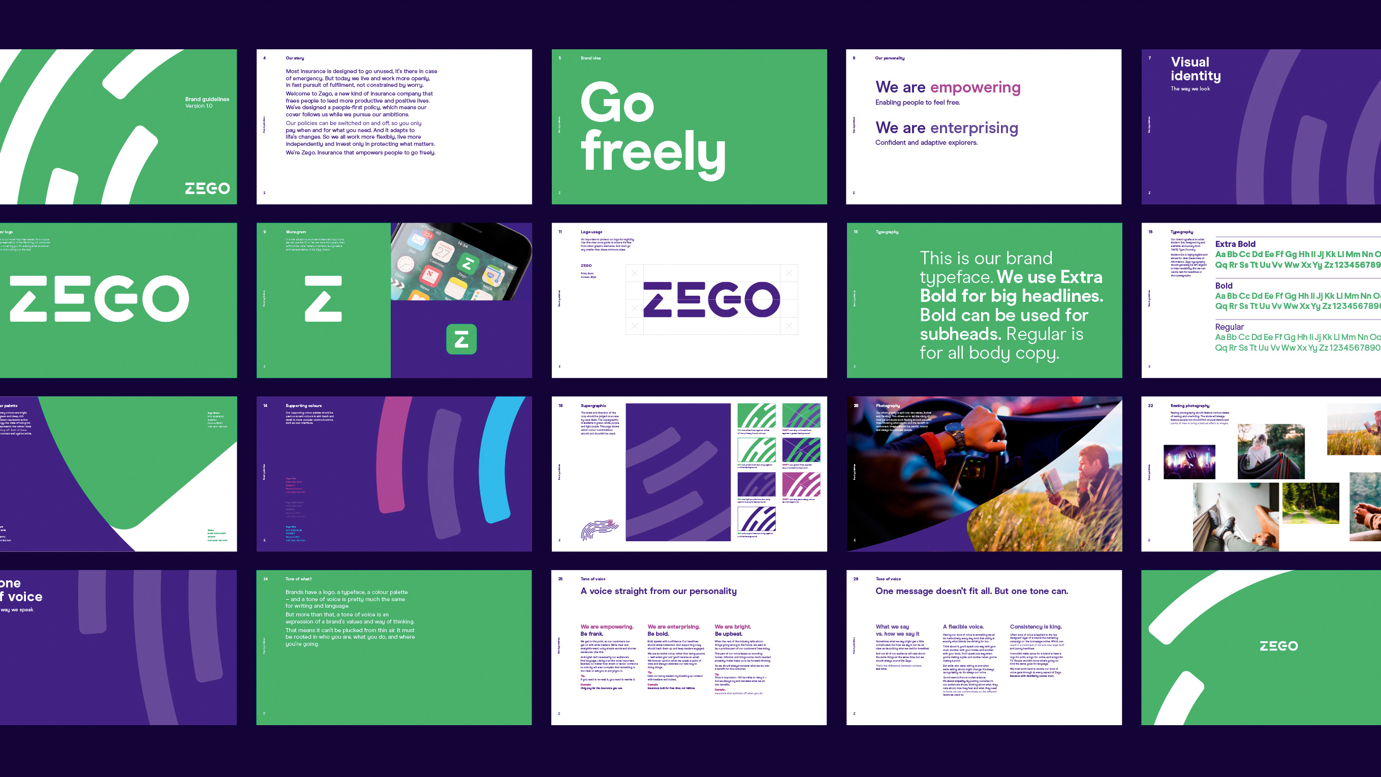
Nowadays, specialist web fonts are optimised to display as cleanly and consistently as possible across multiple devices and screen resolutions. "Often, typefaces designed for print have ink traps and a high contrast in stroke-width," says Statham. "Typefaces designed for the web usually feature more consistent stroke weights, higher x-heights, and more open bowls and counters."
All this means that if your design is going to work, look good, and be legible on multiple devices, screen sizes and orientations, then choosing the right font carefully and displaying it correctly is essential.
Legibility is key
"Just because a typeface is beautiful doesn’t mean it will readable in all sizes," says Martha Lisboa, digital designer at CBA Paris. "So avoid crazy typefaces, condensed styles and letterforms with thin strokes. And be aware that type effects such as shadows or bevels may look great at larger sizes but won’t work on small screens.
"In short, go with something simple and of a standard weight to ensure readability on all devices, especially for long paragraphs of text."
Sign up to Creative Bloq's daily newsletter, which brings you the latest news and inspiration from the worlds of art, design and technology.
When it comes to typesetting, hierarchy is always important, but it becomes especially so when people are using your interactive design to achieve a goal, says Statham.
"You have a limited area in which to set type and reduced navigation and wayfinding elements," he points out. "So a clear type hierarchy helps a user to quickly find their way around the screen, and acts as a bit of a shorthand for the user to digest the information on screen."

Alexandra Lofthouse, senior UX designer at Fifteen, agrees, and reminds us that people don't generally use apps to read massive paragraphs of text. "So text should to be easy to read and digest," she stresses. "This comes down to the tone of voice used throughout the copy, and the typographic style fusing together in an interesting and an engaging way."
And of course, legibility is hugely important in digital. "Especially in long passages of text, the goal is to make typography 'invisible', in that the user is able to pass over a paragraph quickly, without having to focus too hard on each letterform," says Statham.
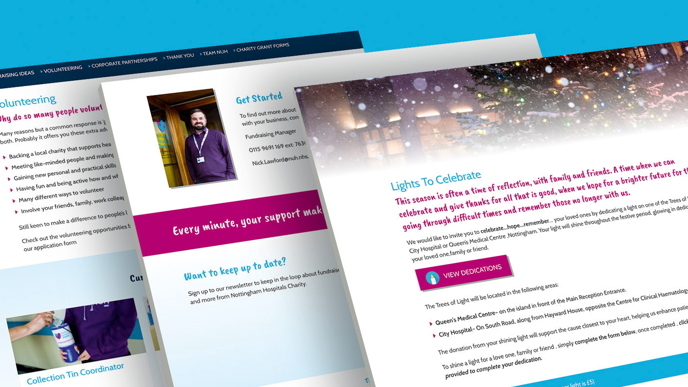
He advises you "pay attention to paragraph measure; keep them to between 45-75 characters. Provide generous spacing between lines: aim for a minimum line height of 1.5 for body copy. Aim for a slight increase in tracking, to give type room to breathe. And choose a reasonable point size: actual character size varies between fonts, but 16px is a good minimum."
Accessible typography
Colour is also an important consideration when it comes to legibility, he notes. "Backlit screens can increase the contrast between pure black and white, which can be tiring on the eyes, so using a softer black for text or pale grey background can make text more readable. Also there are a few apps, such as Contrast, which we often use to help ensure any colour combinations in a body of text are compliant with current accessibility standards."
Lee Carroll, interaction designer at Seymourpowell, offers similar advice. "Watch out for lack of contrast between text and background colours," he says. "Use the Snook.ca colour contrast checker to ensure the ratio is high enough for a double-A or triple-A standard of accessibility." He also suggests remembering that it might not be the colour alone that needs to change to solve some of these issues, sometimes a thicker weight or bigger text is what’s needed to increase the contrast.

And all that's just for starters: in 2018, the field is evolving at breakneck pace. "The technology that we use to view type is constantly changing, and so the requirements of type on screen is changing too," says Statham. "Prototypo, for example, has some incredible features in its typefaces which allow you to use one font file for several instances. You might have finer serifs on your headlines than in your captions at smaller sizes, say, or decrease the width of characters on narrower viewports. Browser support is increasing all the time, so we're hoping to utilise this soon."
And staying ahead of this curve also means being on good terms with your more technically minded colleagues, says Dan Bradshaw, design director at TH_NK.
"One of the main differences with digital typography compared with print is that once you’ve designed it, it needs to be built," he points out. "So get friendly with a developer if you're not too familiar with the code side of things, to ensure your designs can be brought to life justas you've laid them out."
This article was originally published in Computer Arts, the world's best-selling design magazine. Buy issue 277 here or subscribe to Computer Arts here.
Related articles:

Tom May is an award-winning journalist specialising in art, design, photography and technology. He is the author of the books The 50 Greatest Designers (Arcturus) and Great TED Talks: Creativity (Pavilion). Tom was previously editor of Professional Photography magazine, associate editor at Creative Bloq, and deputy editor at net magazine.
