How those awesome retrofuturistic logos were created for Apple TV's Hello Tomorrow
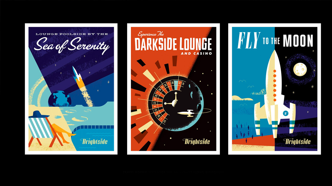
Hello Tomorrow! may not be the biggest hit on AppleTV, but look on the brightside, it features some of the most exquisite logo design to hit the small screen in a long time. The designer behind the imagined 1950s sci-fi show's logos, posters and signage is Matt Stevens, and he tells me exactly how it all came together.
As a graphic designer from an agency background, someone used to a lot of process, time and attention to crafting designs that are 'just right' working on a TV show "was very seat of our pants," laughs Stevens. "It was really about generating lots of ideas quickly. And not being too precious with it early on. And I think that for me as a logo designer, I had to let go a lot of you know, that the love of that process and just kind of go with the flow.
The Apple TV Plus show is set in an alternate 1950s America, one where technology has advanced to include robotic servants and AI delivery drivers but still attached to the clean lines and sweeping simplicity of mid-century design. In Hello Tomorrow! people can live on the moon but look good getting there.
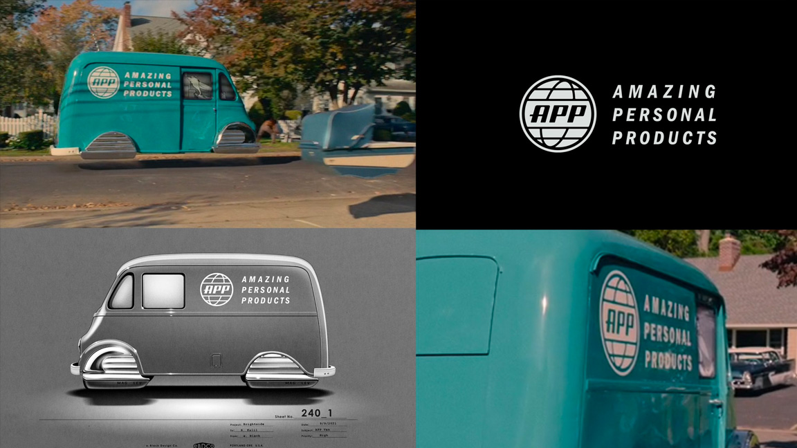
"We were really trying to go with something that felt like mid century but wasn't too on the nose," explains Stevens. He tells me the logo design for Hello Tomorrow! needed to tread a fine line between being directly mid-century inspired to fit the overall aesthetic of the show but they needn't "feel like they can land specifically in that time".
It's a balancing act many imagined designs need to meet; the juggle of being inspired directly by a time period or design style but also offering something a little new and unique. Hello Tomorrow! isn't specifically a period piece but a fantasy of heightened consumerism where the old world is clashing with the new.
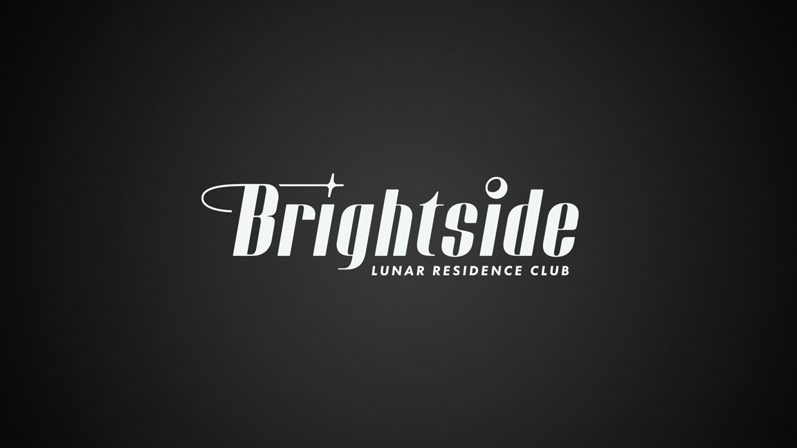
"With the Brightside logo," says Stevens, "it needed to feel a little bit anachronistic, it had some modern tendencies, but also it could feel like it would live in a mid-century world."
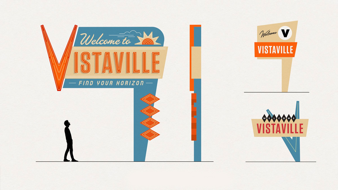
The Brightside Lunar Colony is the travel and realtor company at the heart of the show, its salesmen are out selling the dream of a new life on the moon to the population of Vistaville, a stone and wood built small town seemingly always under threat from the advances of new technology. Against this backdrop, the Brightside logo needed to feel fresh but still a part of the world.
Sign up to Creative Bloq's daily newsletter, which brings you the latest news and inspiration from the worlds of art, design and technology.
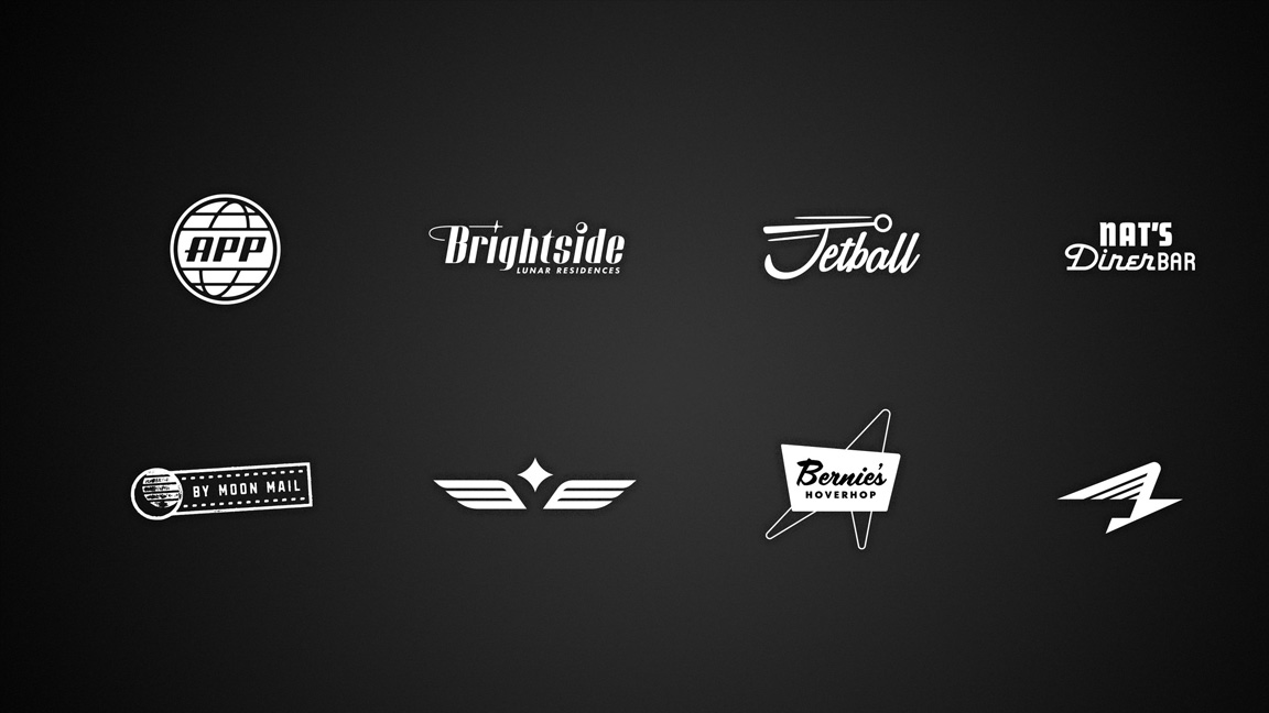
"I'm proud of the Brightside logo in particular," shares Stevens. He explains how it not only matches the brief of an imagined mid-century design but he approached creating this logo as a traditional designer, "where I was thinking about all the ways a logo needs to work and then breaking out to be used as an element."
If you watch Hello Tomorrow! you'll notice the logo is turned into lapel pin badges for the sales staff, cufflinks and other subtle uses. "I was thinking about primary and secondary logo designs," reveals the designer, saying: "I'm pretty proud of that."
When creating a logo for an imagined universe that also has a period footing it can be easy to slip into common mistakes. This can come from a lack of research, as Stevens says, "people can attach themselves to what they think of that era and so a lot of clichéd things get done; we didn't want to look like a '50s themed restaurant. […] We didn't want a lot of asterisks and goofy architectural shapes".
Research was vital to establish what was actually created during the 1950s, using old Sears catalogues and advertising from the era to establish a base to work from. It was important for Stevens to work from accurate references and not work from an "impression that you have in your mind of what was done in that period, because you could easily fall into the trap of doing things that are kind of a cliche of that era".

The depth of world building done, just from a graphic design standpoint, is actually quite incredible. Even before Hello Tomorrow! was picked up by AppleTV Plus a short film was made following the exploits of two jet pack salesmen, and for this Stevens created a bulging pitchbook of logos, graphics, in-world signage and posters.
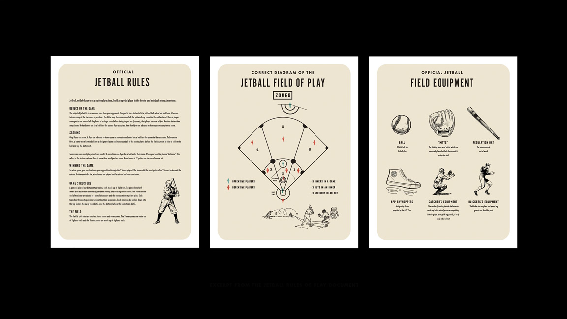
When it came to the final show Stevens even created design-accurate notes for many areas of the show's production and content, including a complete rules manual for the show's imagined sport of Jet Ball, "it's kind of a twist on mostly American baseball with some element of American football," says Stevens.
"That was fun just to work on something that will probably never be seen in the show," says Stevens who teases somehow this sets up some of the Easter eggs fans may spot. "There are several Jet Ball players in the show that are friends of Ryan Kalil [a former NFL player and owner of Mortal Media]," shares Stevens who also points out the number 67 was snuck onto many of the show's designs, this was Kalil's NFL number. "I tried to hide a 67 somewhere in there," he laughs.
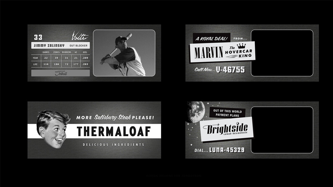
Stevens' day job as a graphic designer and former agency director (he now works for his own clients) rather than a concept artist affords him a professional insight when it comes to branding, in particular how to build a brand identity, even an imagined one.
This real world design approach is seen in the travel posters created for the show that can be seen on the walls of the sales office. Stevens tells me: "Part of what I love about branding is getting to do a lot of different interpretations of a thing. And so just thinking about it from the standpoint of, here's the logo, here's the travel posters, this kind of company would have come up with these kinds of otherworldly sort of settings was fun."
Unlike the real world where directors, clients and agency staff can study ideas and iterate, Stevens says developing branding for the show was hard work because everything was done at a fast pace. But it ensured there wasn't a lot of time for people to hesitate.
"With logo design projects you can have too much time sometimes, which means that the client has lots of time to ask for more options," he explains. This truncated process made the job a little easier as everyone involved was open to fresh ideas. When working in the real world, considers Stevens, people are closer and more passionate about the branding. "In most of my logo projects I'm working with entrepreneurs and start-ups, so it can be tough because people are really, really close emotionally to the thing I'm creating."
It's no accident Stevens landed the gig designing the logos for Hello Tomorrow!, aside from his friendship with Kalil the artist has a love of mid-century illustration. "I think my work tends to try to be reductive […] I find when I'm doing my own work, I tend to gravitate towards being more graphic and my background is more in print design. I just love the simplicity of it. I love the graphic nature of it. I definitely have a particular love for the elegance and the simplicity of mid-century design. I think it is really hard to beat."
Take a look at more of Matt Stevens work on Hello Tomorrow! on his website, including his work on the Umbrella Academy logo for the Netflix show.
Read more:

Ian Dean is Editor, Digital Arts & 3D at Creative Bloq, and the former editor of many leading magazines. These titles included ImagineFX, 3D World and video game titles Play and Official PlayStation Magazine. Ian launched Xbox magazine X360 and edited PlayStation World. For Creative Bloq, Ian combines his experiences to bring the latest news on digital art, VFX and video games and tech, and in his spare time he doodles in Procreate, ArtRage, and Rebelle while finding time to play Xbox and PS5.

