Behind the scenes on a stunning example of magazine design
How D&AD and Human After All are using illustration and data visualisation to tackle huge issues.
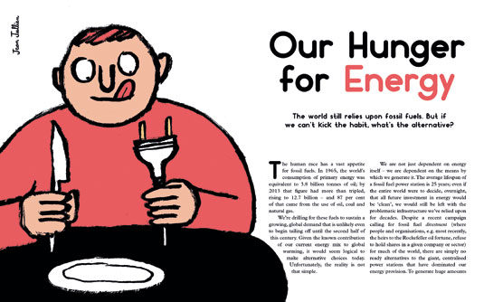
Weapons of Reason is a four-year publishing venture by London-based design agency Human After All and D&AD, and a stunning example of magazine design.
Created to understand and articulate the global issues shaping the world, the first issue of Weapons of Reason presents an exploration of the Arctic. Each 100-page issue will be split into three sections, taking a deep dive into the past, present and future of its chosen topic.
Human After All CEO Danny Miller and creative director Paul Willoughby discuss how the team used their experience on film magazine Little White Lies, and client projects for Google and the World Economic Forum, to bring the magazine design to life...
The magazine design brief
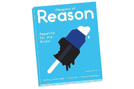
Danny Miller: Weapons of Reason is a project to understand the global challenges facing our world. We're taking on the most complex issues and using our design and communication skills to break them down, making them resonate with people who would normally not read about such issues.
The idea for Weapons of Reason started when I saw a talk by Al Gore at SXSW, describing six really important things that defined the future of mankind. He was talking about stupidly complicated things that I would never normally understand or read about, but in such a way that it really connected. I was super-pumped by the talk, bought the book and it got me thinking about the issues.
For this first issue we wanted to build a rounded view of the Arctic – geopolitical, economic, environmental – and make it as good as we could. We wanted to deal with the Arctic's past, present and future, but, in terms of the magazine design, treat it like a kids' book for adults. As design communicators, we can inspire people to action by inspiring them to think about the big problems.
Starting the magazine design
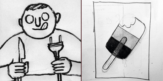
Paul Willoughby: We were looking at how you can simplify all this heavy content in some way: how can you convey our message with the least visual noise on the page? I did some research into design for the visually impaired and that was very important; thinking about those phones with the massive buttons and huge numbers, for example. Coming at it from that angle assures that readers won't have to decode complex information – everything is so immediate.
Sign up to Creative Bloq's daily newsletter, which brings you the latest news and inspiration from the worlds of art, design and technology.
The magazine is around A5 size, slightly bigger and slightly squarer. That has a geometric underpinning, so it's a square, with two other half squares on top of that square. We drew the grid inside to be 12 columns on every page, which allows all kinds of composition in the layout. And in the actual document grid, the small gridline interlocks with the guides on there as well.
If you look at our data visualisations, you'll see that a lot of them are reduced to a stage where they communicate as directly as possible. We use a bright colour palette, which we have created especially for Weapons of Reason.
I think, psychologically, people can see if a colour is half yellow and 100% magenta, even if they don't know it! So we haven't just picked a colour out of the blue (excuse the pun). Each colour we have devised has an underlying structure to it.
We are going to release eight magazines, and they are all going to relate to each other within the stories that they tell. From the very beginning, Danny was seeing all these covers together as a set, so it's really important that, for example, all the base colours of the covers relate to the previous one. That might be quite a prescriptive element, but in the end it makes sure it produces a beautiful series.
Initial concepts
Here are three ideas that didn't make the grade as the magazine design began to take shape…

We wanted the illustrations to have a vintage texture feel, but in the end we decided against it because we realised it was a noisy embellishment that just wasn't needed in the magazine.

Maps contextualise stories well and we could have used many. But the team felt we needed just one at the front of the magazine – using other visual means to contextualise the stories throughout.
We originally considered a newspaper-size, but when we got to designing pages we realised that each story or piece of information needed to be able to occupy a page on its own.
Why Weapons of Reason is free
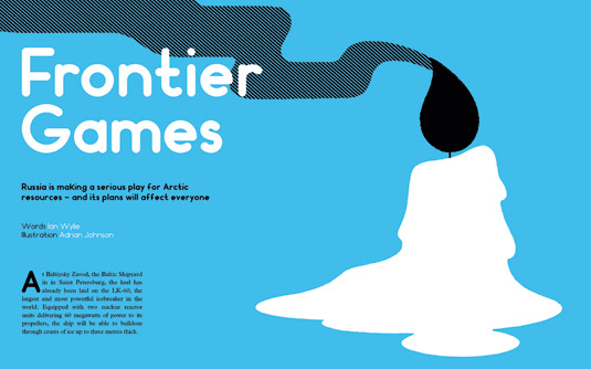
Danny Miller: You can buy a copy of Weapons of Reason through our website, but when you find it out and about in the world it will be free. This gives us the opportunity to reach a lot more people, and we can hit a really diverse group. That's one reason why we wanted the cover to be so approachable, so people who pick it up won't be scared off.
The point of Weapons of Reason is that all of the world's challenges are interconnected, so all eight issues will connect to each other both in terms of design and content.
We're not big on thinking about exactly who our audience is. If anything, really, it's people like us – people who want to know a little bit more about what's happening in the world but are a little bit overwhelmed by certain newspapers, sites, or magazines. I don't read The Economist, but I think Weapons of Reason has the punch of The Economist but with the visual style of Little White Lies or Huck.
We are a really busy agency and everybody is flat-out with client work and at the same time trying to get this magazine out. But there's a phrase I really like from James Hilton at AKQA: "If you're not shitting yourself, you aren't doing something new."
We had to do something like this to stand out. This is the level of challenge we had to set ourselves for the magazine design to be the best – and we wanted to set it for ourselves.
Words: Anne Wollenberg
This article first appeared in Computer Arts issue 234, a branding special that exclusively reveals the strategy secrets from the world's biggest agencies.
Liked this? Read these...
- First real alternative to Photoshop launched... and it's free!
- The 13 best magazine covers of 2014
- Create a perfect mood board with these pro tips and tools

The Creative Bloq team is made up of a group of art and design enthusiasts, and has changed and evolved since Creative Bloq began back in 2012. The current website team consists of eight full-time members of staff: Editor Georgia Coggan, Deputy Editor Rosie Hilder, Ecommerce Editor Beren Neale, Senior News Editor Daniel Piper, Editor, Digital Art and 3D Ian Dean, Tech Reviews Editor Erlingur Einarsson, Ecommerce Writer Beth Nicholls and Staff Writer Natalie Fear, as well as a roster of freelancers from around the world. The ImagineFX magazine team also pitch in, ensuring that content from leading digital art publication ImagineFX is represented on Creative Bloq.
