5 steps to commercial brochure design that works
A blend of information and inspiration, a great brochure can be a deal-clincher for your client’s customers, so getting your design right here is essential.
Product brochure printing is always a collaborative project between client, designer, photographer, copywriter and printer, and will likely include both printed and digital collateral. It is crucial that everyone involved is on board and has the same vision, so take time at the outset to brainstorm ideas, research the competition and make sure that you're all on-brand. Don't forget to talk to your brochure printing professional before you start too, so that you know what practical options are available to you.
In this article, we focus on the various elements of a typical product brochure, and show you ways in which you can pull these disparate parts together into a cohesive and beautiful whole.
01. Aspirational photography
Customers expect gorgeous, aspirational photography when they flick through a brochure. They want to be wowed, inspired and intrigued, and if your brochure doesn't do this, they will be disappointed and less likely to buy.
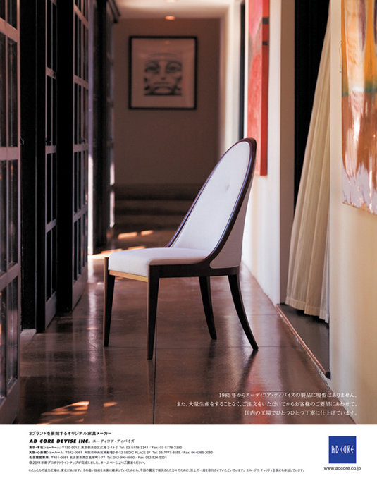
The photographer's job is to enhance the beauty of the product and showcase its features by making sure the lighting, background and overall composition are spot-on and make the product look as appealing as possible. Individual products are often shot against plain white backgrounds so that there are no distractions, whilst full-page photography often include the products in action, letting the viewer mentally fit the product into their own life.
Modern brochure printing techniques allow for full-bleed, glossy images, so make the most of this and use double spreads now and again to add a sense of luxury and expansiveness, as well as smaller images to highlight features and show detail.
02. Making it delectable
Any advertising pro will tell you that images of food - like images of happy people - sell products. Food is associated with comfort and happiness, and food photography plays a vital role in brochure and catalogue design, regardless of whether the industry is connected to food or not.
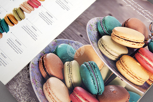
But whether you can include images of real food in your brochure or not, you can ceratinly take a few tips from typical foodie images. Here are a few ways to do it:
Daily design news, reviews, how-tos and more, as picked by the editors.
- Use extreme close-up shots of your products
- Use bright, 'tasty' colours
- Use shallow, romantic camera angles
- Use props to give life to your products
- Use natural light
- Use background textures and colours that complement your products
03. Breaking it down
Depending on the type of brochure you are designing, you might find it beneficial to show one 'hero product' in greater detail, drawing out its strengths and alerting readers to its individual features. Visually, this can create a welcome break from full-page photography and blocks of text, and allow you to use white space and typography to full advantage.
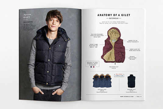
Be careful not to include too many features, but focus on the most interesting or unique, and talk to your brochure printing specialist about other innovative ways to approach these sections - using fold-out, tear-off or transparent details here could bring a plain design to life.
04. Written content
Your copywriter will have considered tone of voice, style, sentence structure, use of on-brand vocabulary and so on when writing their copy, and your job as designer is to display this content to full advantage. You will have a range of content to use, from headlines and product titles to taglines, product descriptions and longer, editorial-style sections, which will need to be dealt with in different ways.
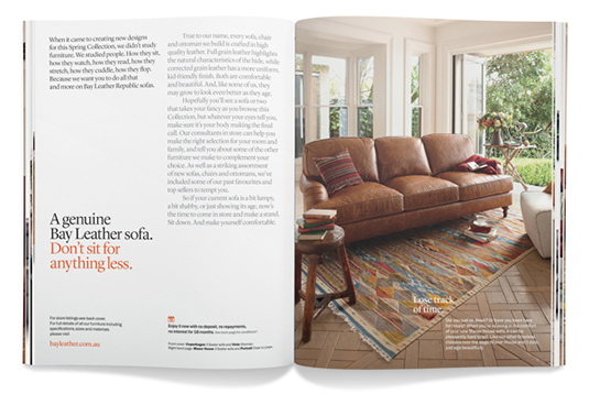
- Headlines, taglines and chapter titles will typically be larger, bolder and use a different typescript to the body text. Attention to typographic detail here can make or break your design, so choose wisely.
- Lengthier, editorial-style sections of text work in a similar way to magazine writing, bringing variety to your brochure, setting the scene for each product range and providing fuller explanations and descriptions.
- Individual product descriptions need to be shown near the product itself, and are typically set in a smaller font and positioned in their own block with plenty of white space surrounding them.
- Labels and tags need careful positioning and spacing, and might require separate typographic treatment in terms of size and colour.
05. Specifications
One of the tricky things about product brochure projects can be striking the right balance between inspiration and information. Once you've wowed your readers with stunning images and drawn them in further with tempting words, you will need to give them more detailed information to help seal to deal.
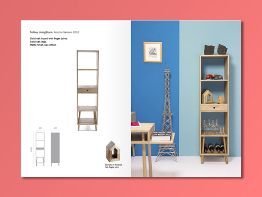
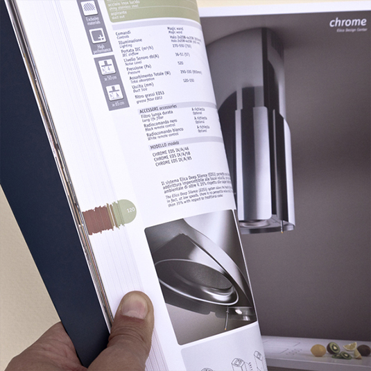
One way of doing this include showing product details on the same page as the photographs, ensuring that your readers get all the information they need in one place (although sometimes omitting the price). Another often-used method is to have a separate specification section at the back of the brochure, to which readers are directed via page reference numbers.
To conclude
Hopefully the above has given you some ideas and highlighted a few areas to consider when designing your product brochure. By taking your time, getting the full team on board and ensuring you keep the big picture in mind at all times, you will be able to produce a brochure that is inspirational, informative, effective and beautiful.
Words: Simon Tilbrook
Simon Tilbrook is the owner of Swallowtail Print, a premium brochure printing and design firm focused on delivering maximum value to their clients. Further bio on Simon can be found here, and for more design and printing tips connect on Google+.
Liked this? Read these!
- Free graffiti font selection
- Illustrator tutorials: amazing ideas to try today!
- Free Photoshop actions to create stunning effects
- The ultimate guide to designing the best logos
Have you seen a great example of brochure printing and design? Let us know in the comments below!

Thank you for reading 5 articles this month* Join now for unlimited access
Enjoy your first month for just £1 / $1 / €1
*Read 5 free articles per month without a subscription

Join now for unlimited access
Try first month for just £1 / $1 / €1

The Creative Bloq team is made up of a group of art and design enthusiasts, and has changed and evolved since Creative Bloq began back in 2012. The current website team consists of eight full-time members of staff: Editor Georgia Coggan, Deputy Editor Rosie Hilder, Ecommerce Editor Beren Neale, Senior News Editor Daniel Piper, Editor, Digital Art and 3D Ian Dean, Tech Reviews Editor Erlingur Einarsson, Ecommerce Writer Beth Nicholls and Staff Writer Natalie Fear, as well as a roster of freelancers from around the world. The ImagineFX magazine team also pitch in, ensuring that content from leading digital art publication ImagineFX is represented on Creative Bloq.
