Create a character with a strong pose in Photoshop
Develop a character with an intriguing concept, and unusual shapes and silhouette.
Sign up to Creative Bloq's daily newsletter, which brings you the latest news and inspiration from the worlds of art, design and technology.
You are now subscribed
Your newsletter sign-up was successful
Want to add more newsletters?
Creating exaggerated male characters is all about exaggeration, pushing the shapes, fun, motion and camera angle to the limit. A character design with cool shapes, interesting colour choices and fun silhouettes creates a strong first impression, which is going to make your image stand out from the crowd, drawing the audience in.
- Christmas offer: Save up to 47% on a subscription to ImagineFX magazine
If you focus too much on the little details, particularly the theme and story of your creation, then there's a chance of neglecting the importance of its overall appearance.
In this workshop I'll talk about the methods I frequently use. In addition to the techniques I'll discuss, I'll also share my thought process while designing characters. I hope you'll be able to learn something from this. Watch the video below, then follow the written steps below that.
Article continues belowDownload the custom brushes for this tutorial.
01. Sketch and flip
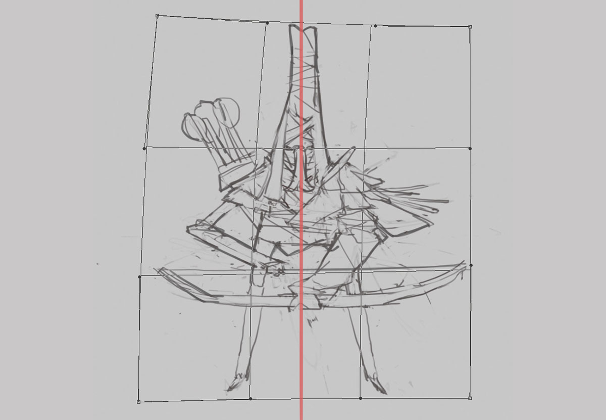
I decide to draw an archer. During sketching, I tend to prioritise the character's silhouette and pose. I prefer exploring it with line art instead of blocking out the shapes with solid colour brushes, so I can explore the details of the character at the same time. Remember to flip your canvas often to make sure the composition isn't off key. I use Photoshop's Wrap tool (Edit>Transform>Wrap) to make larger-scale shape adjustments.
02. Develop your idea
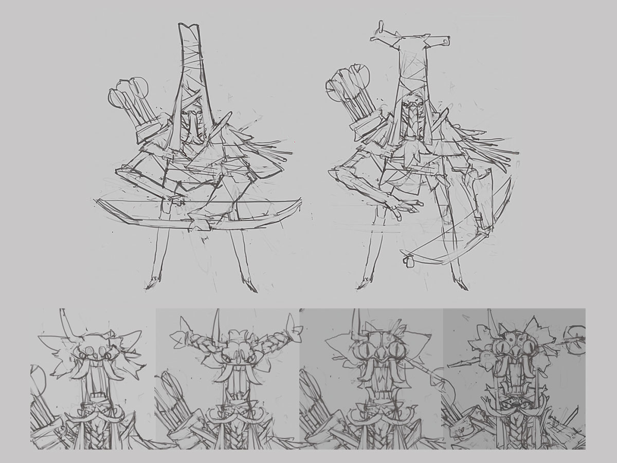
I think about how the sketch looks on a plain background, and try to create an interesting composition to sell the character. It often takes me quite a long time to find a pose/composition that I'm completely happy with. After finalising the character pose, it's mostly about applying more details and deciding what element to use in the execution. It's a lot of fun exploring the design of the headpiece during this stage.
03. Make a selection
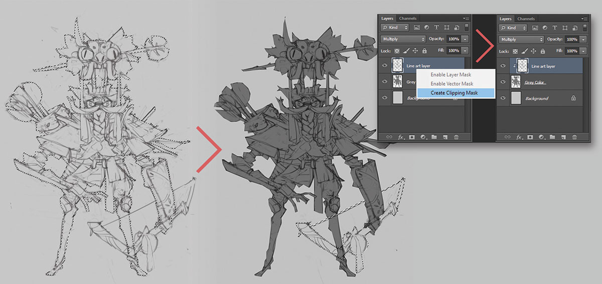
Feel free to use whichever selection tool you're comfortable with: Lasso, Quick Selection, Magic Wand and so on. In this case, I use Photoshop's Polygonal Lasso tool because there are a lot of straight lines and hard edges in my character sketch.
Sign up to Creative Bloq's daily newsletter, which brings you the latest news and inspiration from the worlds of art, design and technology.
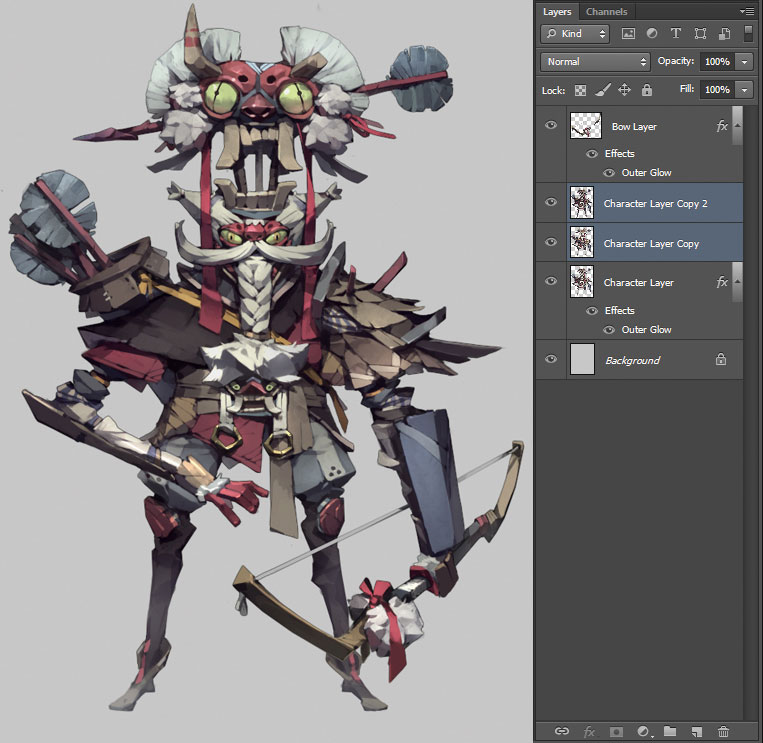
After the selection, I create another layer under my line art layer and fill the selected area with grey. Then I select Create Clipping Mask from the Layer drop-down menu. This makes the grey colour layer act as a mask. I keep the bow on a separate layer.
04. Define the base colour
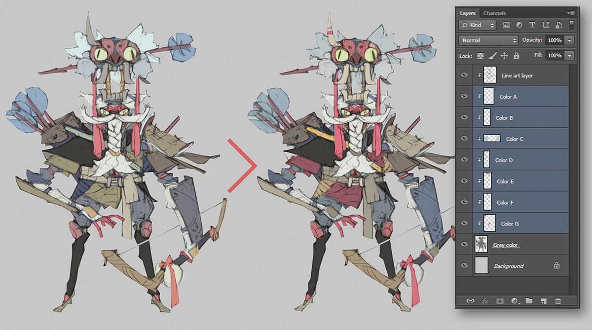
I then create layers for base colours (each layer consists of one or two similar colours) under the line art layer. After that, I make adjustments to each layer using the Hue/Saturation tool until I'm happy with the result. I find this method convenient and enjoyable, especially when you want to do colour variations for your character.
05. Add shadows and finalise colours
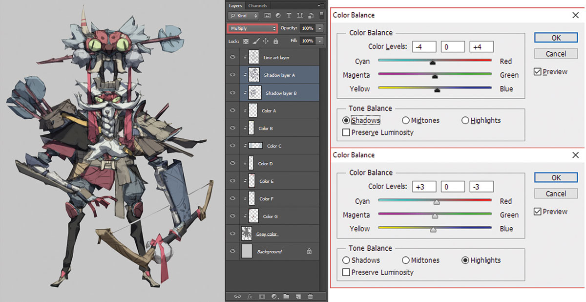
I create another layer on top of the base colour layers and set the blending mode to Multiply. I use a colour with 50 per cent Lightness and low saturation for this shadow layer. Using a brush with varied Opacity, I can create different shades of shadow. (You can always create another Multiply layer on top if you need more depth on the shadow.)
After some adjustments on base colour layers, I merge all the layers together. Then I make another colour adjustment using Color Balance (Image>Adjustment>Color Balance). This is primarily to unify the overall colour.
06. Render the face first
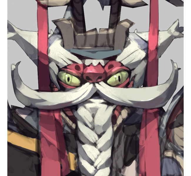
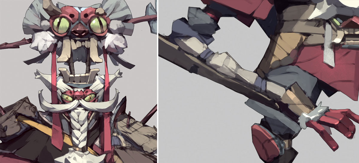
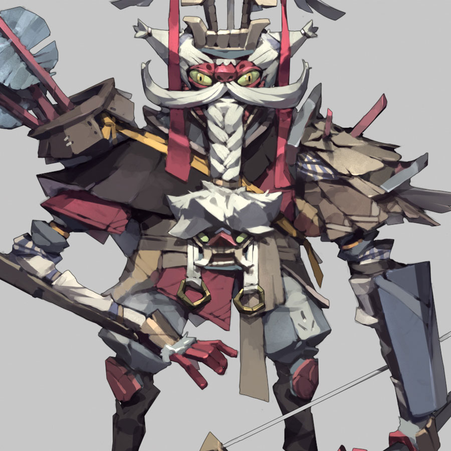
From here it's all about rendering the whole image. I love to start from the face because it's the most important part of a character. I think the face has the biggest influence over the art style and it determines the direction you are going for (funny, serious, cool, cute…). To lighten up a certain area, I use the Dodge tool with my Noise brush, which gives the area some noise texture.
07. Render masks and arms
Because this is a Japanese-themed character, I emphasise the design of the ghost masks on his head and waist. I give the eyes on the mask top of his head a glossy surface to make the mask look lively. The mask on his waist is actually his belt buckle.
To me, hands are important. Much like the face, they're the areas of a figure that the viewer will focus on, especially in a composition like this where most of the body parts are obscured.
08. Render further
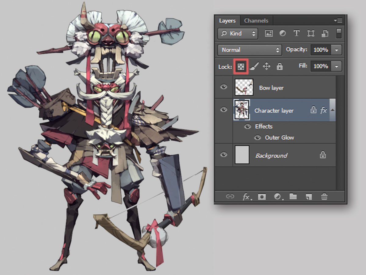
I render the rest of the character. At this stage I only focus on polishing the surfaces and cleaning the outlines. Having the whole character on a single layer enables me to make shape adjustment using the Warp and Liquify tools. Crucially, I can lock transparent pixels on it, which is a huge help, especially when I'm painting the sharp edges of my character. I use the Smudge tool to blend colours on bigger surfaces.
09. Duplicate the arrows
Digital art comes into its own when it comes to repeated items (in this case, the arrow fletches). I simply paint the one that's on top of his head and duplicate it for the rest. But make sure you make some changes after duplicating them, so they're not identical.
Furthermore, add some volume to the thin surfaces such as the feathers, fabric and strings so that they don't look too flat.
10. Be selective with small details
Now that I have all the lines and rough surfaces cleaned up, it's time to apply smaller details and patterning to the character. Elements such as scratches on hard surfaces and wrinkles on fabric are useful, but try not to overdo them.
It's fine to leave some big surfaces blank: these empty spaces will set the small details off, by making them more noticeable.
11. Cast a shadow or two
Let's not forget about the shadows cast by the objects we just added. Correctly placed cast shadows are important because they help make your image look more convincing. Next, I divide the objects into different visual planes to create greater depth of field for the image. For example, the character's right arm is in the foreground so its colour should be more solid compared to his right leg.
12. Adjust the brightness
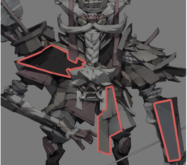
At this stage I'm pretty satisfied with the character. But taking a step back from the image I realise that the focus of the image is no longer on the points that I originally had in mind. To fix this, first I duplicate the character layer and lower its brightness and saturation. After that, with a Soft-edge brush, I erase the areas that I want to pop. The same applies to the bow layer.
13. Add a simple background
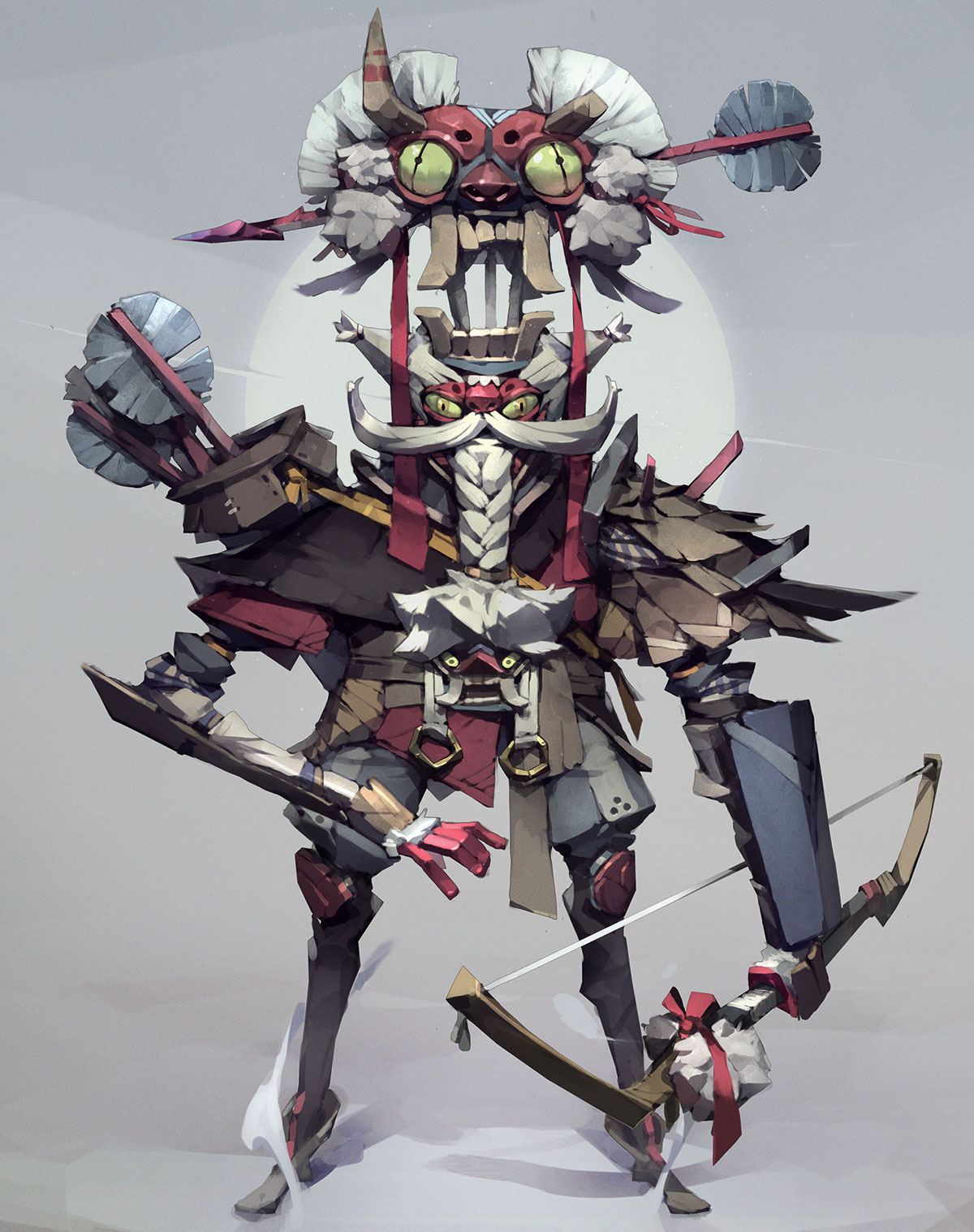
To draw attention to the face area, I create a simple background with a bright circle behind his head. I also add cast shadows on the ground to solidify the image.
14. Finish up
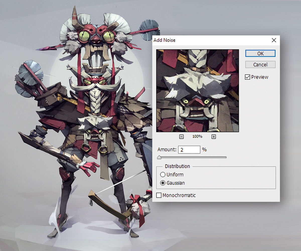
To wrap things up, I apply a bit of contrast and atmospheric lighting on the character to make the scene more interesting. I also rasterise the Layer style, use the Smudge tool to blur some areas at the back and apply a noise filter.
This article was originally published in issue 153 of ImagineFX, the world's best-selling magazine for digital artists – packed with workshops and interviews with fantasy and sci-fi artists, plus must-have kit reviews. Buy issue 153 here or subscribe to ImagineFX here.
Special Christmas offer: Save up to 47% on a subscription to ImagineFX magazine for you or a friend for Christmas. It's a limited offer, so move quickly...
Related articles:
