In this Procreate tutorial I make use of the digital painting app's best feature, it's mobility, to take my art out into the fields. There are so many great ways to learn and practise art these days; when it comes to studying light, colour and value, I’ve found no substitute for painting en plein air – which just means ‘the act of painting outdoors.’ Each time I go out to paint, I learn something new, and you can do it digitally.
Plein air painting might not sound much different than doing a photo study. Yet even the best cameras don’t capture much of the colour and value that our eyes can perceive. It’s also a great excuse to ditch the desk and get outdoors: spending time in nature can reduce stress and anxiety.
I work in Procreate on an iPad Pro, and it's a great duo for on-the-go art creation (but you can also use any of the best iPads for drawing, as Procreate works with them all). Of course, traditional mediums are fantastic, and you can foster an even deeper discipline and appreciation for colour temperatures by working with oils or watercolours, but for ease and portability, an iPad and Procreate is fun and accessible.
Follow the digital plein air Procreate tutorial
01. Before you begin: a checklist

The following should be on your outdoor adventure packing list, starting with your iPad or other art materials, water, snacks, jacket and a hat if the weather could change, camera (or phone). Consider a high-protection case for your iPad or tablet – worrying about damaging your device will just distract you from painting.
I also like to bring a tripod (Google ‘caddie buddy’ for an iPad tripod mount). And also make sure to use the bathroom before you start. Seriously!
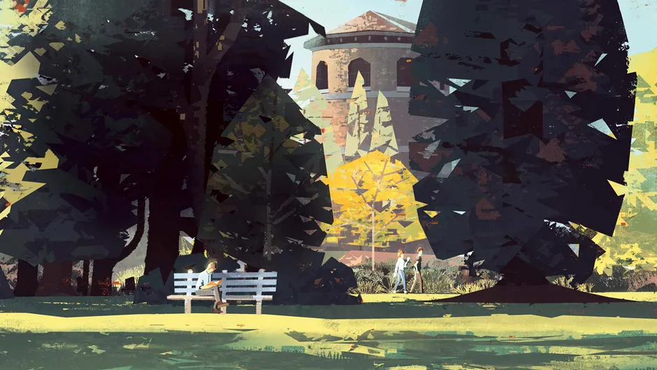
02. How to choose your spot

You don’t need to find some epic vista – I had a blast just painting in my parents’ backyard. A boring view for photography can still be great for painting. I usually start one to two hours after sunrise, so that the light isn’t changing too fast, but it’s still more dramatic than midday. Sunny and overcast are different but equally valid. Just avoid windy days if there are too many clouds in the sky!
Once on-site, look for a spot that will have full shade for a couple of hours. It also needs to give you a view with contrast, have visual interest and good fore-, mid- and background separation. The location should excite you in some way, and isn’t in people’s way too much. Passersby will sometimes want to peek and ask questions, which can be distracting if you’re deep in painting mode.
03. Observe and then block-in

Think and study before you paint. Frame the scene with your hands. Don’t try to include too much – focus on what you’re most visually excited about. Here, I’m enjoying the window view of the lit tower peeking through the shadowed midground wall of trees, while the bench guy in sunlight provides a strong secondary focus. Before I start, I take a picture so I can refer back to this lighting later.
I squint to simplify the scene into shapes and start blocking them in. Working digitally, I can afford to easily move elements around as I go. This isn’t pretty, but I’m just working to get colours and shapes down quickly.
04. Take steps to simplify a scene

You’re not here to record what you see, you’re here to interpret it. You decide what to change, what to emphasise, what to leave out. Compare my block-in to the original photo. You’ll see where I’ve adjusted parts of the composition, ignored areas of foliage to create a clearer view of the tower, and simplified shapes relationships wherever possible. I’m designing from observation, not blindly recording.
Now I refine shapes and add textural information. I’m trying to abstract all this foliage into something both communicative and graphically pleasing. Remember that everything in nature is either a cylinder, a sphere or a cube. If you study how lighting works on those primitive shapes, you can extrapolate that to anything.
05. Don’t chase the light

In just half an hour, the lighting has changed significantly. The sun is hitting the midground trees, removing the value contrast that highlighted the tower. When this happens, it’s critical to stick to your original plan. If you chase the new lighting, your painting will end up inconsistent. Instead, I’m painting based on a combination of observation, memory and general lighting knowledge.
06. Start negotiations with green

Green is the trickiest colour to paint. It can easily swing towards garish, or appear lifeless. I’ve failed to capture the temperatures of the grass here so far.
I simplify shapes, add a richer middle tone between areas of shadow and light, and tint a bit of complementary red into the grass layer to reduce its intensity. Oil painters call this approach “smuggling reds”.
07. Finish rendering (go home!)

I’m finishing this piece at home now, using my memories and photo reference. (Working on the iPad, I’ll splitscreen my photo right next to Procreate.) Capture the essence of the scene on-site – lighting, value, colour, mood – and leave when you need a break, and finish the painting later. I can sink into rendering details when I’m not worried about changing lighting conditions or passersby.
08. Add people or critters

In other work you might want to add figures first, but in plein air I think it works to mostly stage the scene first before dropping people or animals in, if they don’t take up too much compositional space. Now I can place them in reaction to the scene. I personally always like to add people or area-appropriate fauna, even if I didn’t directly observe it. Doing so adds liveliness.
09. Paint in soft lighting

I try to paint 'flat' until I’m happy with the painting’s construction and rendering. Now, using a soft Round brush, I paint areas of tinted light and shadow on an Overlay layer to quickly suggest diffuse and bounce lighting. I also add Color Dodge layers to intensify areas of direct light, and finally a Screen (or Additive) layer to selectively bloom out some of the brightest spots.
I also like to add some more naturalistic touches at the end to keep a piece from feeling too stiff. I selectively smudge a few edges and texture areas so that everything isn’t too uniformly crisp or detailed. I fade out some areas with Procreate’s built-in Damp Brush.
10. Adjust colours and you're done!

Get more Procreate tutorials in ImagineFX
This content originally appeared in ImagineFX magazine, the world's leading digital art and fantasy art magazine. ImagineFX is on sale in the UK, Europe, United States, Canada, Australia and more. Limited numbers of ImagineFX print editions are available for delivery from our online store (the shipping costs are included in all prices)
Alternatively, you can access us instantly through our digital options:
• Apple app (for iPad or iPhone)
• Pocket mags (multi-platform app, great for Android users)
• Zinio (multi-platform app for desktop or smartphone)

