
When I first switched from a traditional to a digital illustration workflow, my painting techniques worked pretty well on their new canvas – but my work seemed to lose some of the spontaneity that had been easier to achieve with traditional media.
To create this in my artwork, I've developed a traditional process that takes advantage of some of the flexibility of digital tools while still incorporating the unpredictability of natural media.
My favourite topics to paint are the surreal and supernatural. I often incorporate fairy tale symbolism into my work: creating an atmosphere that's haunting is essential to my style.
With this workshop, I'll reveal how building up details slowly and allowing underlying layers to show through can add an otherworldy quality. I'll also show how using mixed media can lead to interesting and unique results.
Before we start, it's worth pointing out that it's important to learn how to make mistakes. To understand a process, you have to know how to correct it, and how to let some mistakes be. Confidence is something that shows through in your personal style, and there's a sense of security in taking risks on the canvas once you know that if you mess up, you can correct the mistake – and sometimes even improve on the final result.
I work in a limited palette, almost grisaille, so that I can focus on form and value. The subtleties that I can express with a limited colour range are well suited to describing surreal and dreamlike scenes. When I establish a strong value structure and an interesting composition, adding colour becomes a much easier task.
Knowing that placing a warm grey next to a cool grey will make the former read as brown and the latter as blue is essential to understanding colour. Most of my recent art is in a cool limited palette, and I occasionally add a key colour when it's important to the narrative.
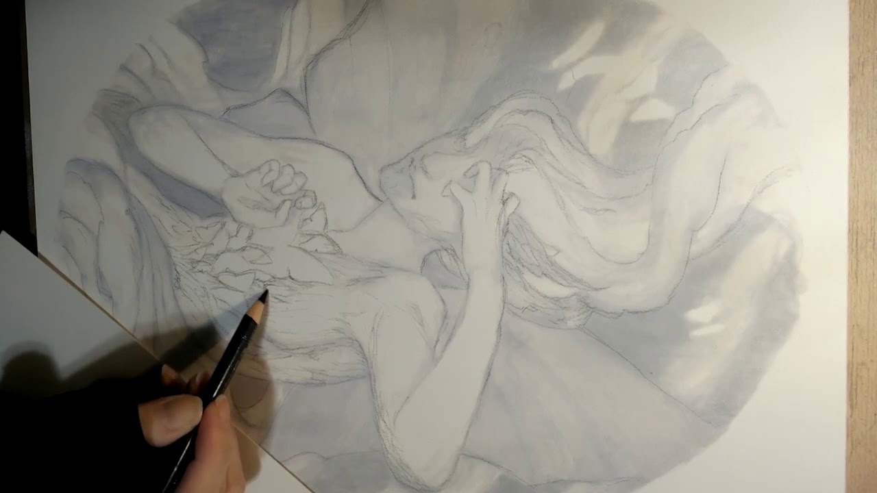
01. Sketch thumbnails to generate ideas

I grab my best pencils and start with a sketch on cream-coloured paper. Originally I began this piece as a horizontal composition, so I had to make some changes to get it to work as a portrait. I usually spend less than half an hour on each thumbnail. This stage is for generating ideas and figuring out the general composition.
02. Create a refined sketch

Making a refined sketch enables me to quickly make corrections, add new layers for ideas, and refine without worrying about overworking media. I also double-check all my shapes and dimensions.
03. Graphite underpainting

Once I've moved onto a computer, I tape a sheet of polypropylene vellum to my screen, which acts as a light box. Now I can easily transfer the sketch by tracing and then refine the details. Working on polypropylene can be tricky to get used to, but it does allow for reworking. I can also build up some interesting textures at this stage, but I don't want to spend too much time on the underpainting.
04. Underpainting with walnut ink

This step is on the opposite side of the vellum from the graphite drawing. By painting freely with the walnut ink, I get a better sense of the flow of the painting, and create some interesting texture to work on top of. I'm also able to establish my value structure.
05. Produce a small-scale study version

I have an easier time and am more confident in my decisions when I create a small version of the larger painting I'm going to create. It doesn't need to be detailed, just large enough to test out the value structure and make sure the composition holds up when reduced.
06. Apply a layer of gouache

After printing my underpainting lightly on high-quality watercolour paper, I apply a thin layer of white gouache to the surface. It creates a barrier between the pigment and the paper so that I can move the media around and wipe away mistakes without doing too much damage to the paper. I use permanent white, but if it needs to be more translucent, zinc white can be applied.
07. Defining light shapes

Once I've applied the gouache layer, I need to ensure my shapes are well defined before I make more decisions. I don't focus on the details inside the shapes because these might be lost in a later step. I only tackle the areas where there's an abrupt change in value.
08. Bring in some dark shapes

Now I can fill in the dark areas with India ink. I leave a little room around the light shapes and then blend the ink to give it a soft edge. If I've applied enough gouache on the underlayer then the blending is easy. I do this with a spent felt tip marker or one of my Molotow refillables.
09. Building up texture

Although I'll be building up texture throughout the process, now is a good time to lay down the broad strokes. I use a balled-up, damp paper towel and smudge the ink to create a sculptural sense of form. Sometimes the paper towel will start to dissolve, or the paper will begin to pill. Allow the paper to dry and then smooth away the raised texture with a dry, clean rag.
10. Refining edges

The painting looks pretty messy, so it's time to pull in some of those details. Edges are important. I try to avoid outlining, although it's a natural tendency for me. I try to turn my edges to create more depth, and give my work a sculptural quality. I use coloured pencils that smudge beautifully on the gouache surface. For a softer gradation I use a dry smudger, while for a more painterly stroke I use a felt tip marker filled with water.
11. Correcting the ghostly hands

The right hand feels inelegant to me, and is disrupting the flow of the painting. With a clean, damp felt tip marker I scrub out the hand. Once the paper is dry, I use a rag to smooth down any raised fibres, after which I put down a thin layer of gouache. Now I can redraw the hand from scratch.
12. Emphasising the head

The head, along with the hands, are easy focal points, so I spend time getting it right. Tackling modelling shadows and cast shadows below the nose and chin and getting the shapes correct will lend character to a face.
13. Drawing butterflies

The butterflies are a key value, and also act as a focal point. I use gouache to highlight the wings, and a grey coloured pencil to draw subtle shadows. I want them to be otherworldly, so they require a light touch.
14. Adjusting dark values

I reapply my India ink in the dark areas. I lose some interesting texture, but the painting will be too busy if I don't even out these areas. I use a thin layer so there's still depth and I'm careful not to ruin the edges that I've carefully established. I use the wet paper towel to adjust the modelling shadows in lighter areas.
15. Tweaking light values

Now I can go back and fill in the lighter details. I also go over the dark areas with white pastel, which I smudge to create a gradation. For texture I use a Grainer brush that's been cut to resemble a comb. This part of the process is meditative for me: I enjoy drawing in small details and creating texture. Once the painting is finished I spray it with a casein-based workable fixative.
This article was originally published in issue 161 of ImagineFX, the world's best-selling magazine for digital artists. Buy issue 161 here or subscribe to ImagineFX here.
Related articles:
