Get more from graphite with these tips
Create a strong image with graphite powder and pencil.
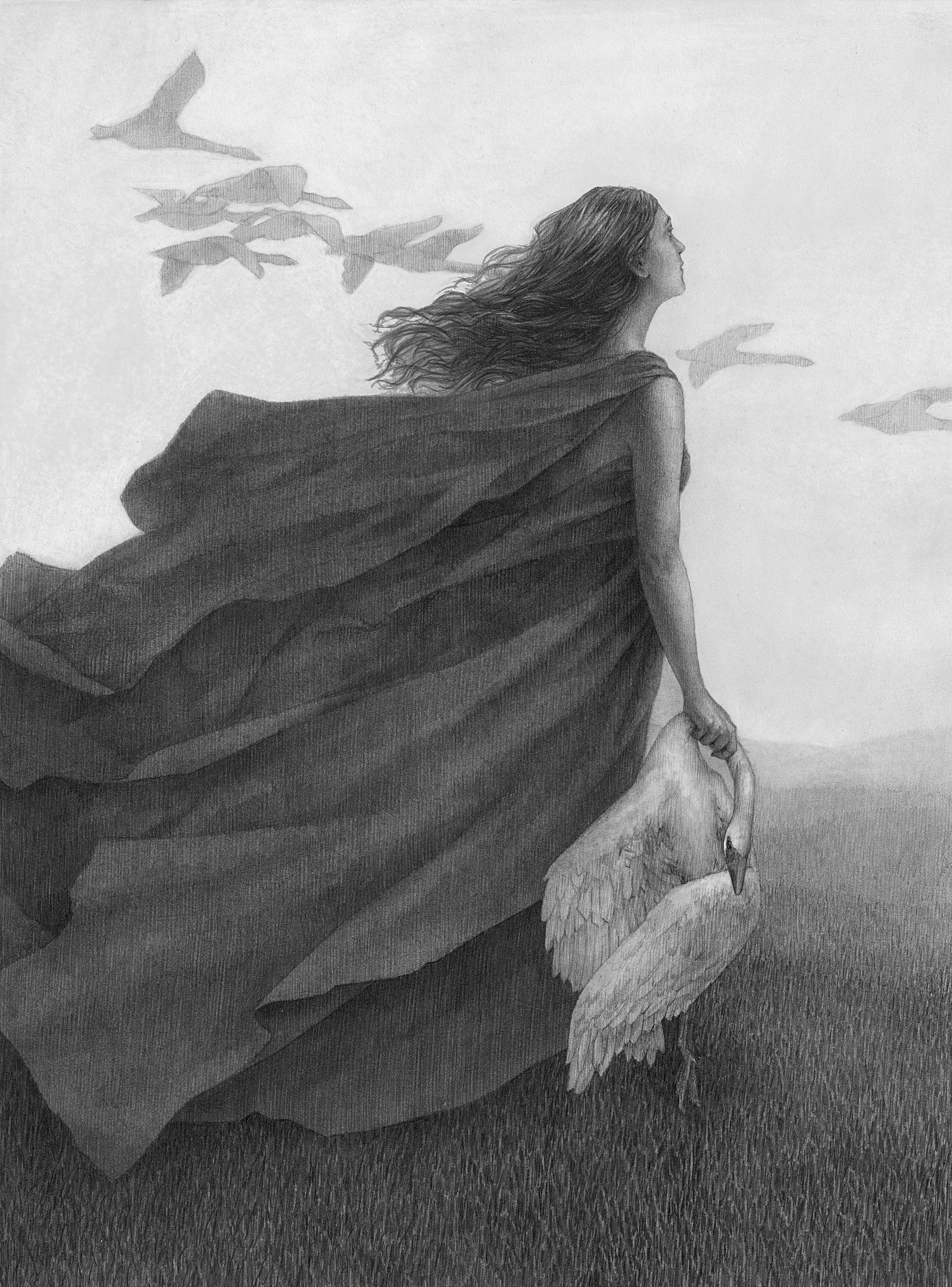
For the past three years, I've been using graphite as a medium for illustration, first only with mechanical pencils, then over the past two years adding powdered graphite into the mix. The art I make is all about subtlety of sentiment and narrative, and I wanted to find a medium in which I could really explore that nuance.
Even prior to exclusively working in graphite, I was always a fan of using light and shadow to tell a story or communicate an emotion. Regardless of what medium I used, I learned that the key was to work in layers: no darks were going to look deep enough or properly integrated unless they were built up patiently.
Graphite opened new doors in this regard; I loved how suited it was to a gradual process. It's a forgiving medium, as it comes in many forms, can be applied a lot of different ways, and can erase seemingly forever (or, as I found out during this workshop, until the New York humidity foils your plans!). Additionally, living in a small apartment necessitates a small studio, and working in graphite means I can reduce my entire setup to a desktop drafting "table" with a lamp and my computer.
Article continues belowFor me, drawing in graphite involves a lot of working back and forth with soft "washes" in its powdered form and structured hatching in pencil (discover the best pencils here). Yet it's all focused on bringing forth a subtle, engaging image.
In this workshop, I'll demonstrate how I use pencil and powdered graphite in tandem to create a sensitive drawing with rich, dark values. There's very little traditional rendering in my process: I use single-direction pencil hatching to create my forms and powdered graphite to build my values. Read more about different art techniques with our how to draw tutorials.
01. Thumbnail the idea
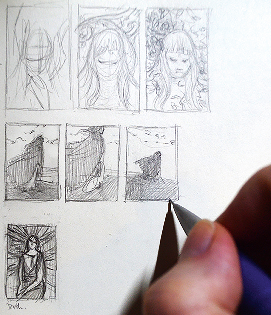
When I first have an idea for a drawing, I turn it around in my head for some time before putting it down on paper. I only do three thumbnails before deciding that the first one is the winner after all, but it's still important to see what the variations look like outside of my head.
02. Composite references
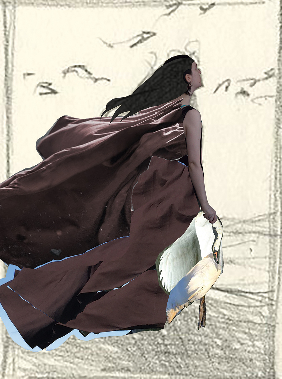
Now that I have a thumb, I take reference photos and composite them on top of it in Photoshop. I decide to buy Suzanne Helmigh's Gumroad references for the cloak, and I find some photos online that I can patch together for an approximation of the swan pose I want.
Sign up to Creative Bloq's daily newsletter, which brings you the latest news and inspiration from the worlds of art, design and technology.
03. Transfer the reference
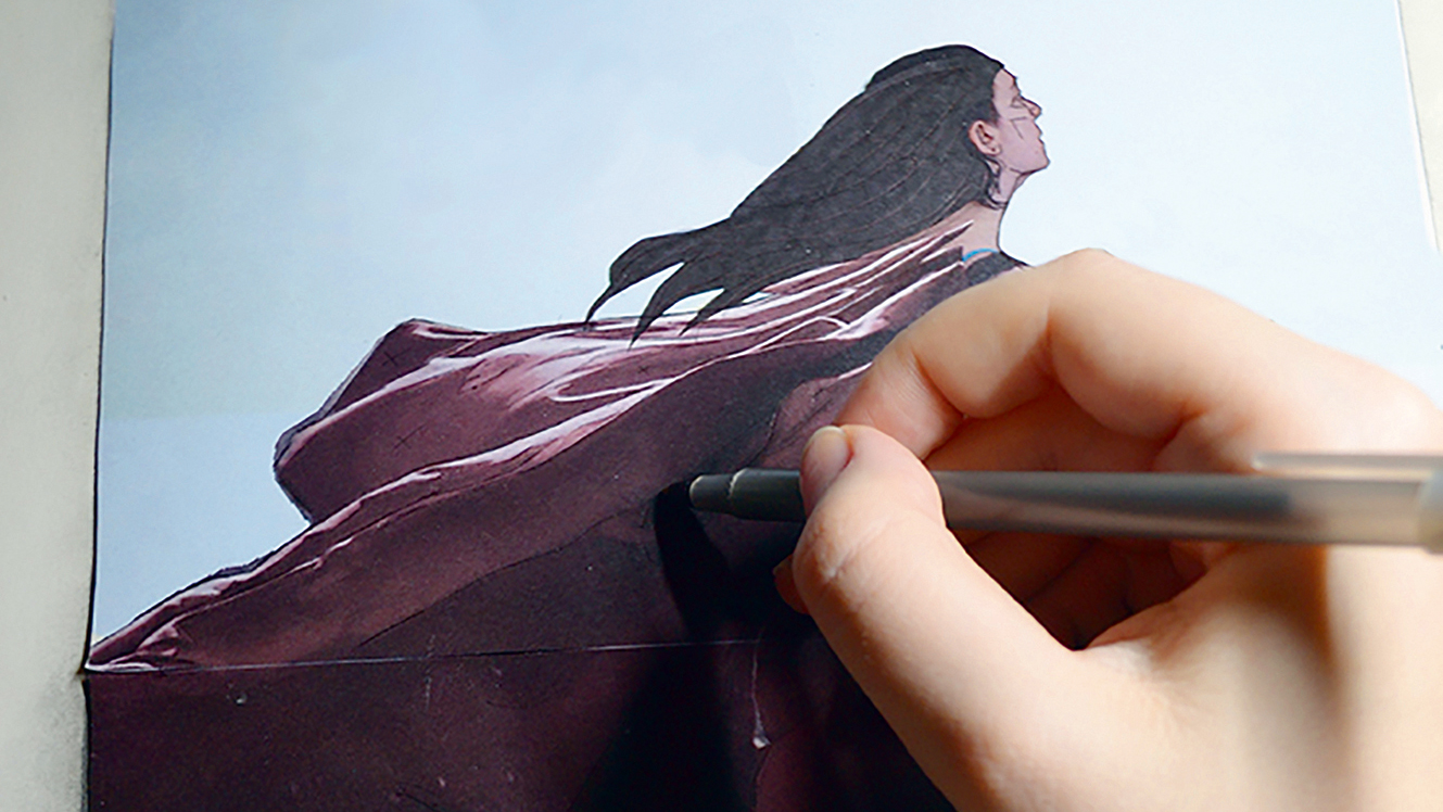
I print out the ref-comp and cover the back in graphite, then I tape it to my Bristol and trace the image. I transfer the figure and drapery fairly exactly, but am very general with the bird, because I'm still exploring where I want to take the pose.
04. Tighten the drawing
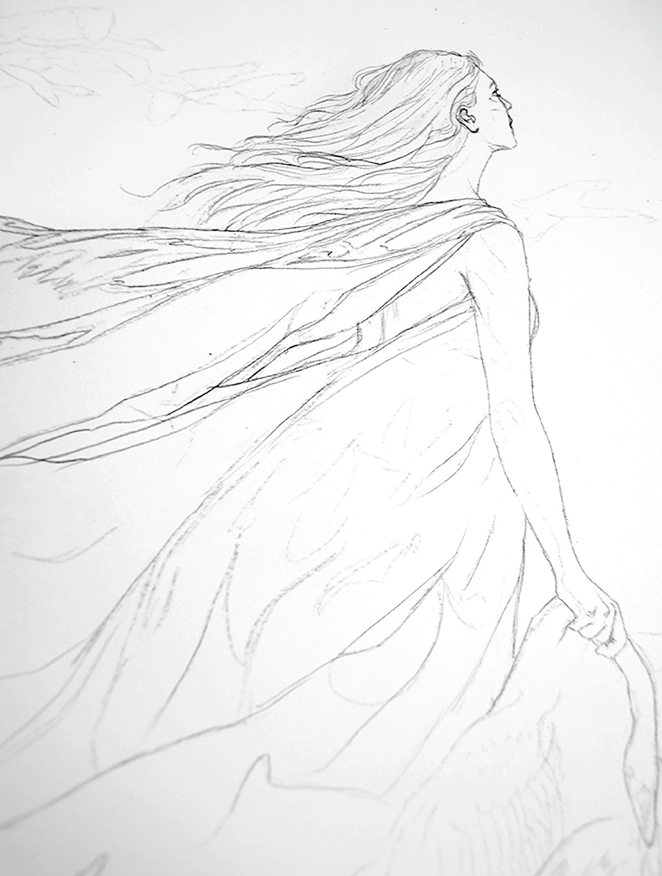
Before I can start with powdered graphite, I need to make sure my transferred lines won't disappear! I go over all of my lines with the 2B mechanical pencil, refining the initial drawing and develop a more elegant line in places where the transfer was awkward.
05. Lay down the first powdered graphite pass
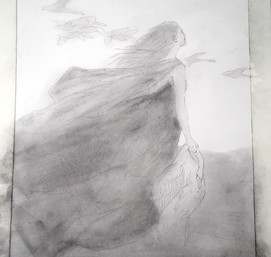
I scrub in powdered graphite with an old, no-brand, soft, synthetic flat brush, and while I'm keeping generally to the correct areas, I'm also being pretty messy. This is where I discover shapes and movement that I might not have thought to build for myself. This also gives me a base from which to build my darkest darks.
06. Establish pencil textures
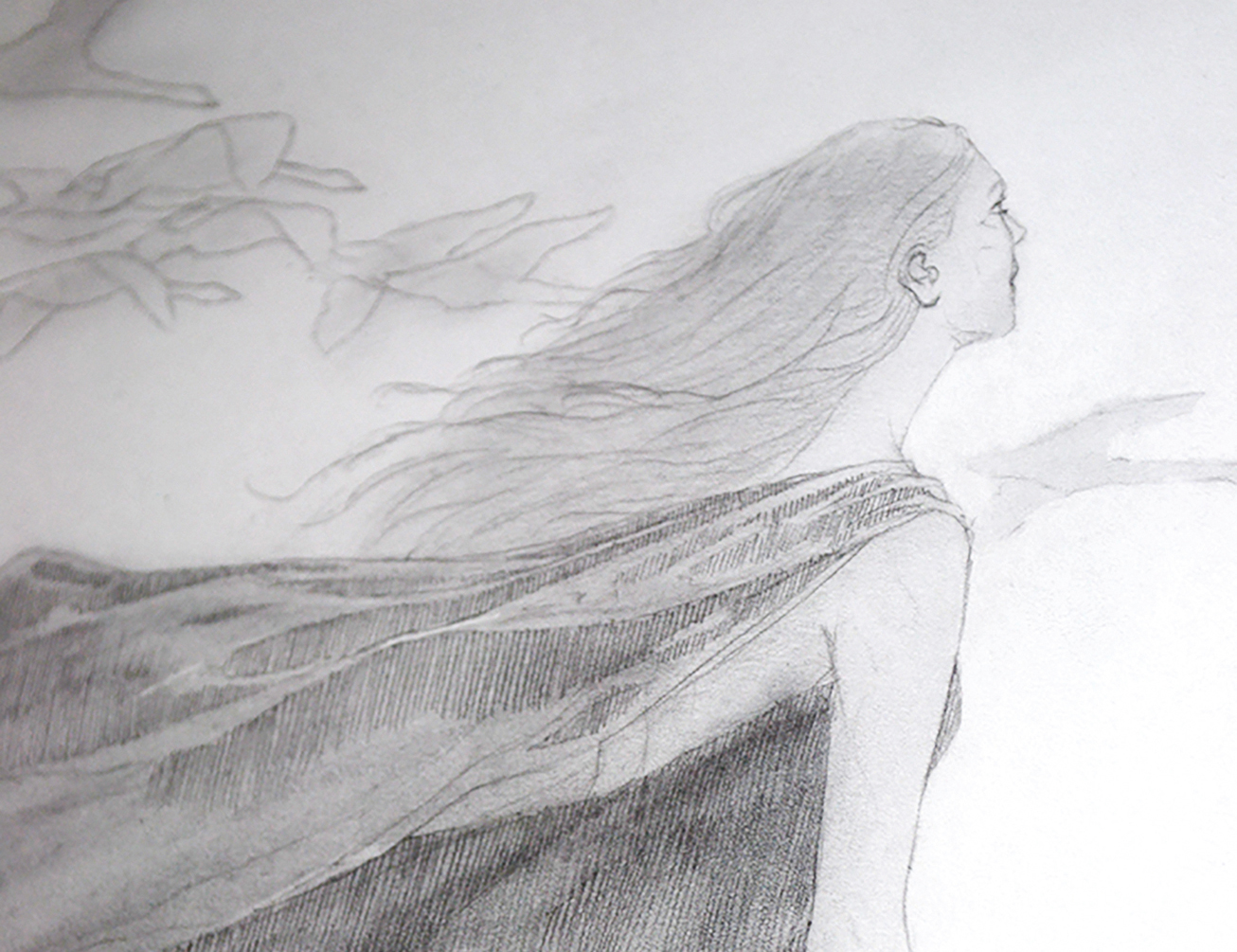
After the powdered graphite, I begin the next layer in the dark areas with 2B vertical hatch marks. I'm using medium pressure so the line is pretty dark without scoring the paper. This is a natural stroke for my hand, and will be almost everywhere in the drawing by the end – an easy way to unite the whole image.
07. Soften the strokes
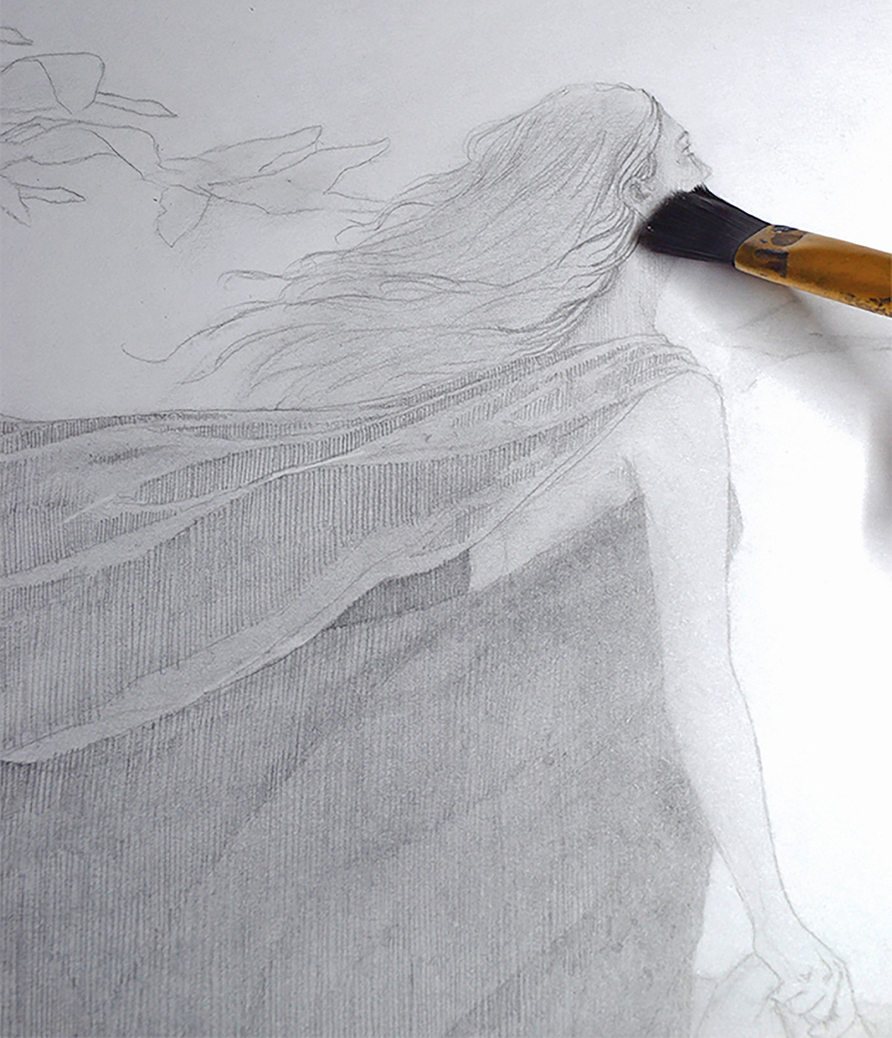
It’s important to keep the pencil strokes from overwhelming the soft feeling I’m going for, so after each section of hatching I go over it with the same brush I used for the initial powdered graphite pass. The new lines soften and become integrated more into the image. I’ll do this throughout the rest of the drawing process.
08. Add the darkest values
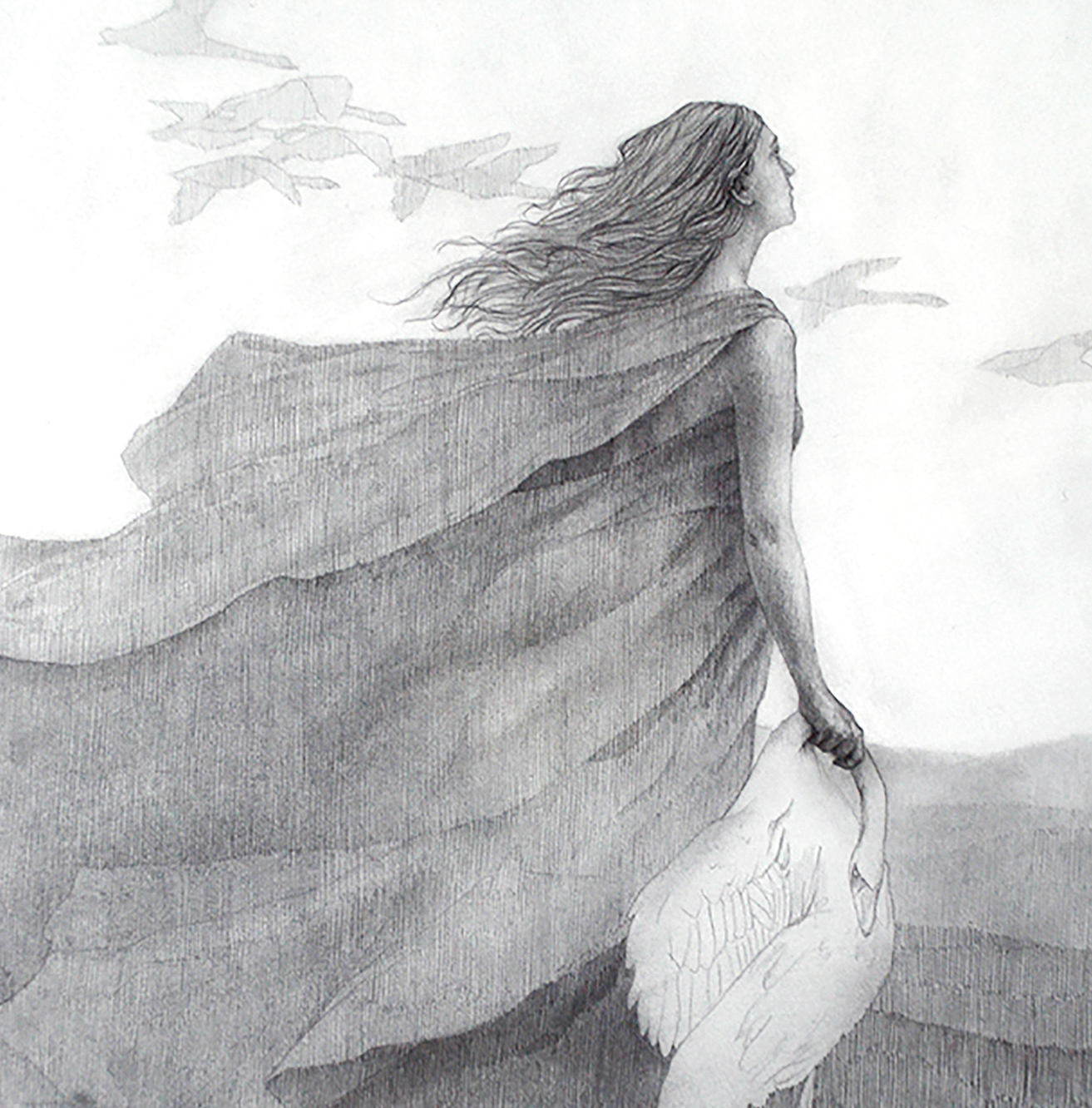
Having laid in the base for all compositional elements and begun my rendering, I begin to pick out where my darkest values are with the 4B pencil. This is where the image starts to come together, although I'm using this less to render than to establish the value range for my own reference at this point.
09. Dive into details
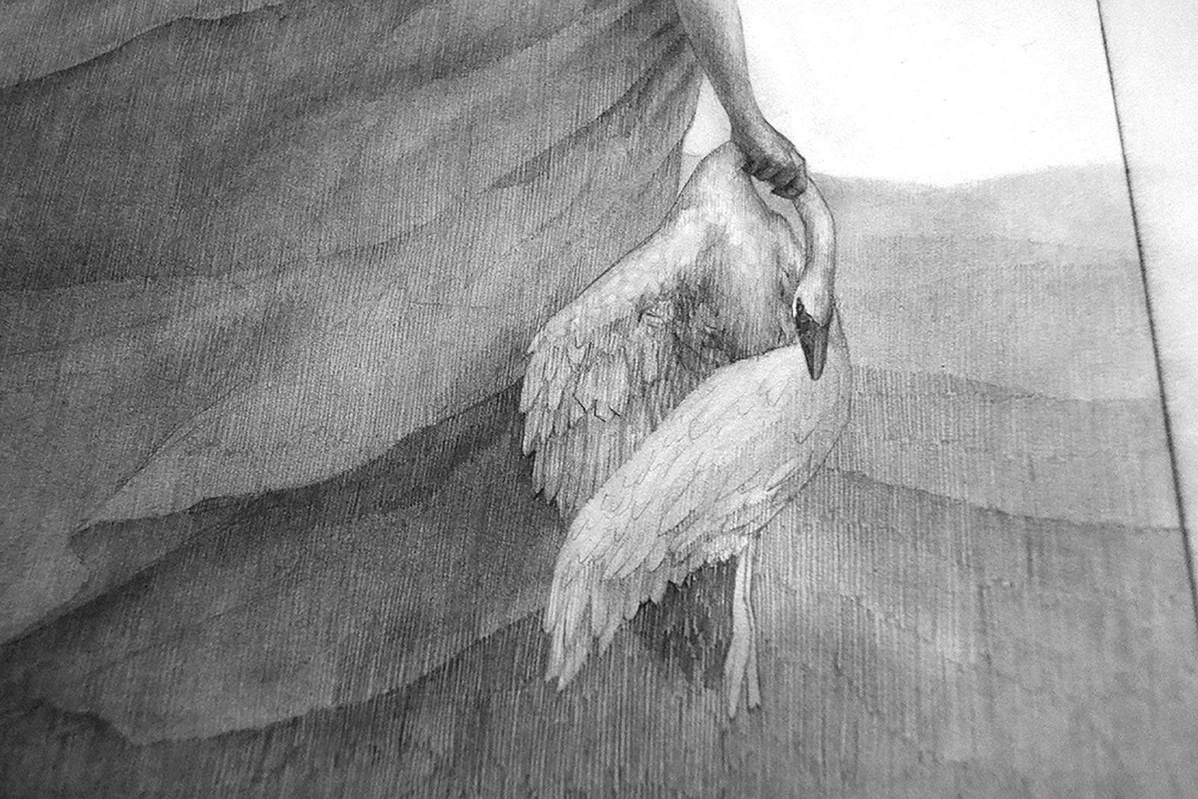
I've been avoiding the bird up to now. I'm not certain how to draw it, and although I try not to psych myself out too badly, it happens sometimes. The answer is to just dive into it. I focus on my reference and the gesture, and as soon as I begin to actually work on the bird, I realise it's not so bad.
10. Lift out errors
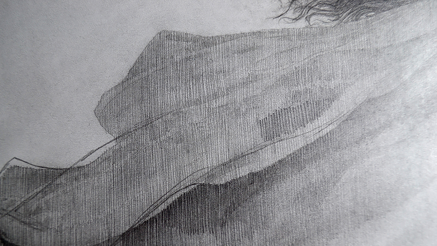
There's been something bugging me about the flow of the cloak, and I'm going to fix it. I draw in the new shape right over the existing graphite, and then with my kneaded and mechanical erasers lift out the graphite that's too dark or in the wrong place. Then I lay in new graphite hatching to patch the gaps.
11. Build an environment
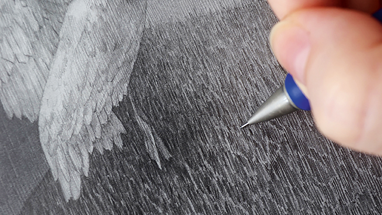
I've left the grass on the rolling hills until now because I consider rendering it tedious, but it's time to bite the bullet. Pencil hatching winds up being a great method for grass: just make varying shapes with slim gaps between them, then go over those with different shapes. Add in some individual blades, and you're done!
12. Darken the values
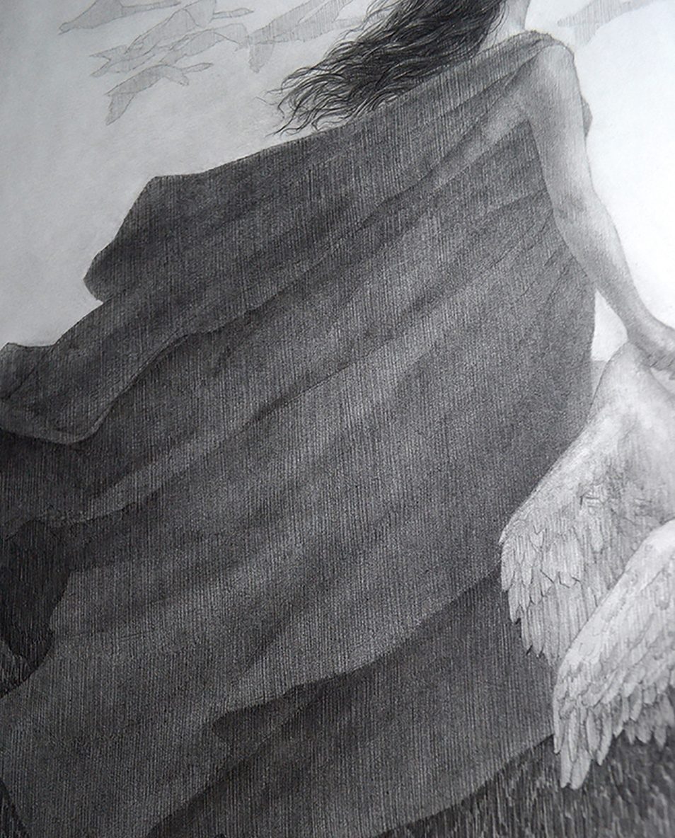
Having fixed the cloak's shapes, I realise that it's not nearly as dark as I want it. I could add more hatching to darken it, but it's much faster to do another dark scrub-in with powdered graphite. I'll have to go back over it with pencil to re-establish the texture, but it finally fits the value structure that I wanted.
13. Render the forms
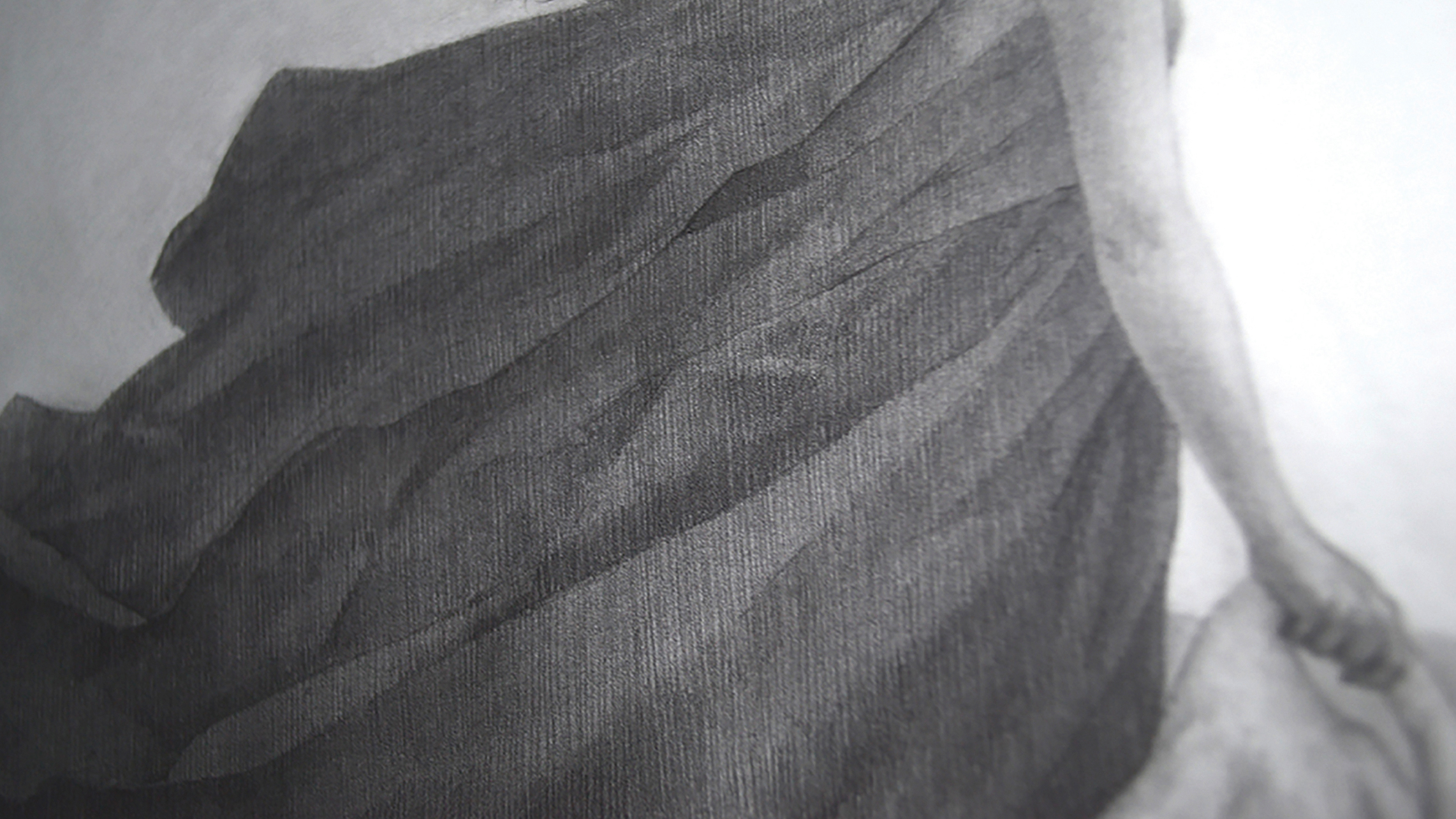
Now that everything's in place and I have my value range, it's time for my favourite part of the process: rendering! I'm using both the 2B and 4B pencils as needed, and I'm still using vertical hatching almost exclusively; details in the hair, nostril, ear, and finger joints are exceptions. I'm working from my reference, but allowing the drawing to evolve as well.
14. Sharpen the edges
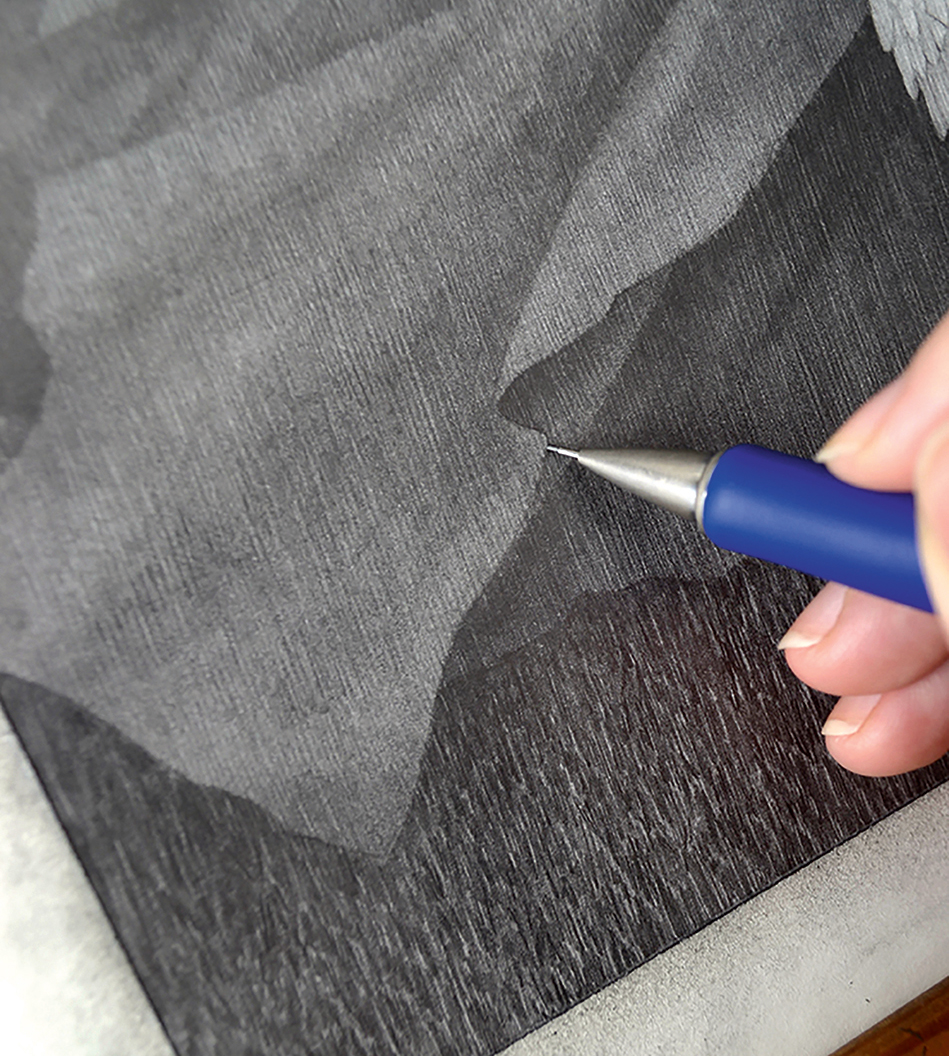
Edge control separates a pretty good drawing from a drawing that's finished. Not every edge should be hard: areas in shadow or far from the foreground can and should be softer. Things coming toward the viewer, or areas of desired high contrast become sharpened, although I'm trying not to make anything look "lined".
15. Add highlights and finish up
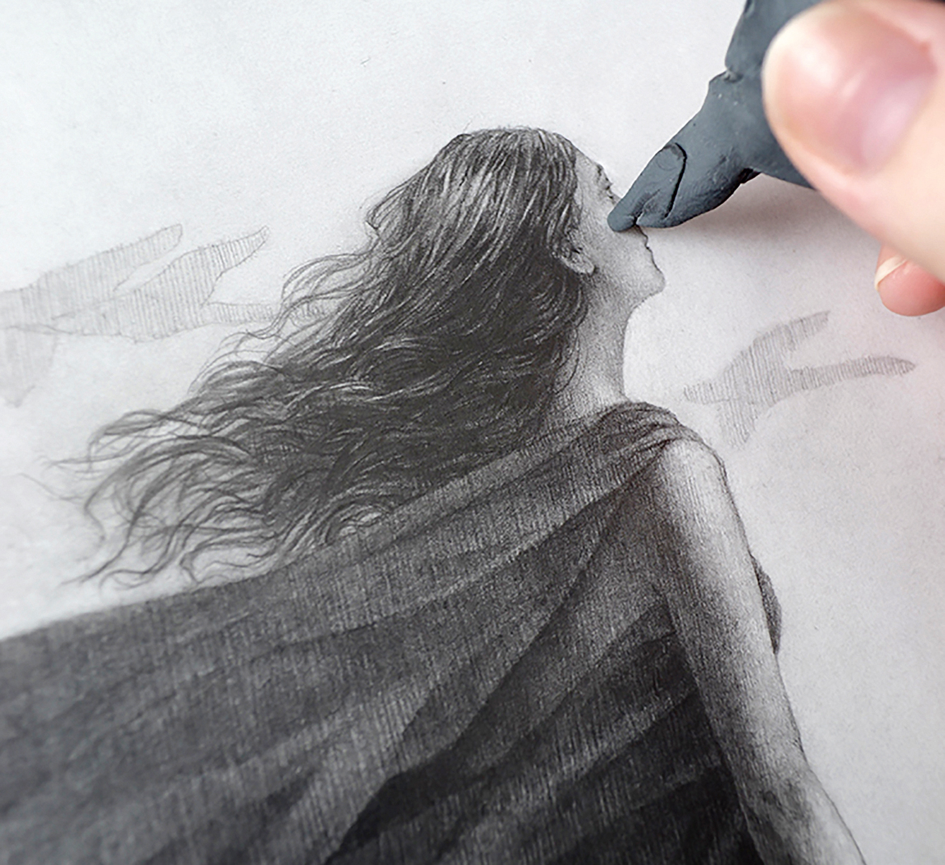
With my kneaded eraser, I go through the entire drawing and gently lift out highlights in the face, hair, bird and arm. Some volume and key highlights have become lost with all of the softening passes, so it's immensely satisfying to pull them back out as my final touch. After that, the drawing is done!
This article originally appeared in issue 168 or ImagineFX, the world's leading magazine for digital artists. Buy issue 168 or subscribe here.
Related articles:
- The best mechanical pencils for artists and designers
- 15 observational drawing tips
- The 10 best drawing books
