When painting ocean scenes in Photoshop CC, as with most of my painting projects, I start by gathering some marine photo references, to ensure that I've got a good grasp of the subject matter. I also find it useful to look at the work of great seascape painters from history, whatever art techniques they use, and whichever artistic movement they belonged to.
Marine waves are usually caused by wind that generates ripples across the sea surface. As the ripple effect increases, the sea surface starts to form a crest that then falls on itself in a shape that's more or less comparable with an irregular pipe.
I have to consider this tubular shape when illustrating waves, so I paint the light and shadow as I would for a cylinder, with a soft shadow in the lower part and in the hollow body. I also bear in mind the transparency of the water. In the upper part of the wave, near the crest, the water will be thinner as it comes to a point – and it catches the light, too. This means the blue-green colour needs to be more vibrant and saturated in this area.
Download Sara's custom brushes for this tutorial.
01. Start with a sketch

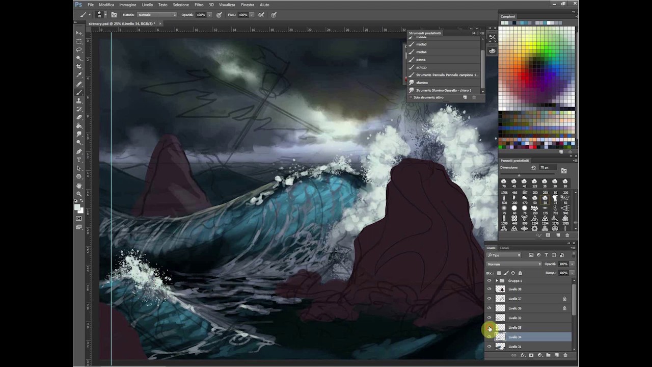
I begin laying down a quick sketch of the wave form, so I have an idea of its key elements: the crest and its hollow body. Sketching motion lines will also help me to keep in mind the flow of water, so I'm able to maintain a strong sense of dynamism and movement in the scene.
02. Take lighting into account

Because the water's transparent, the top of the wave will be affected by light, so I apply a light blue and green that's more saturated than the tone I use for the surface of the sea. I then choose a hard brush and add some neat brush strokes that simulate the water ripples.
03. Build up the crest

I start painting the crest from the top of the wave that drops down. I choose a very light grey and use my custom brush, set to Scatter and with irregular edges. This will mimic splashes and spurts of water. I add areas of white foam to help emphasise the tubular shape of the wave.
This article originally appeared in ImagineFX issue 150; subscribe here!
Related articles:

