Create an illustration with a limited colour palette
Robert Hanson shares his advice for digitally colouring your pen-and-ink illustrations using Photoshop.
Sign up to Creative Bloq's daily newsletter, which brings you the latest news and inspiration from the worlds of art, design and technology.
You are now subscribed
Your newsletter sign-up was successful
Want to add more newsletters?
This tutorial will be a guide to producing a simple hand-drawn illustration, digitally coloured in Photoshop. The simple techniques involved make it easy to work fast, and making amendments quicker and more painless - an essential part of producing illustrations for editorial.
This illustration is part of a series based on animals exhibiting either unusual or bad behaviour. In this case, a tortoise using a baby tortoise as a crash helmet. It's a small idea, but big enough to give the illustration a bit more interest than, say, just an animal on a bicycle. Here goes...
01. Initial sketch
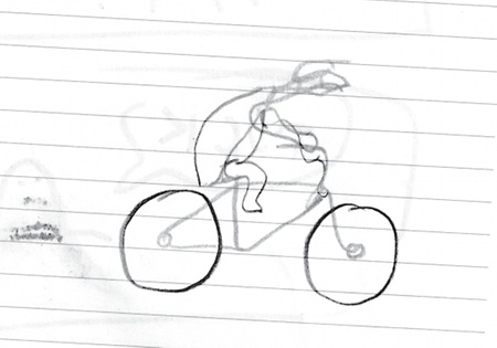
When creating illustrations, it's important to keep a sketchbook handy so you can quickly note down ideas while you can still remember the details. It doesn't matter how dodgy the initial sketch is, as you can see from this little drawing!
Article continues below02. Build up the sketch
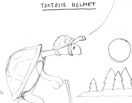
The first proper sketch is one of the most important stages and should be an attempt at getting the proportions of the drawing right. At this stage it's not just about making it look right but about trying to get a balance between personality and detail. It should be simple but not at the expense of character. This sketch is getting there but needs a bit more work.
03. Refine the sketches
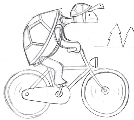
Using your initial sketches for reference, multiple versions enable you to get the illustration just right. Use cheap, thin paper so you can overlay the drawings, which makes it much easier to refine or alter details and proportions. If you have the time, try to do something else in between sketching so that you can keep looking at it with relatively fresh eyes.
04. Make an inked version
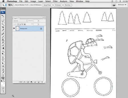
Once you have a sketch you are happy with, it's time to make an inked version. Using the same process as for sketching, put a new sheet of paper over the sketch to use it as a guide. Try to avoid directly tracing though, instead just use the sketch as a rough guide as this gives the line work a looser feel. Don't worry too much about any mistakes as they are easily corrected once scanned.
05. Basic keyline
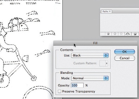
Now it's time to create a basic keyline to work with. Before selecting, you need to adjust the contrast to make the colour of the line a bit darker and more consistent. Go to Image>Adjustments>Curves. Once you have a solid dark line, you can select it using the colour range selection by going to Select>Colour Range and choosing Shadows from the selection options. Once selected, create a new layer and go to Edit>Fill to make the line work solid black.
Sign up to Creative Bloq's daily newsletter, which brings you the latest news and inspiration from the worlds of art, design and technology.
06. Tidy up mistakes
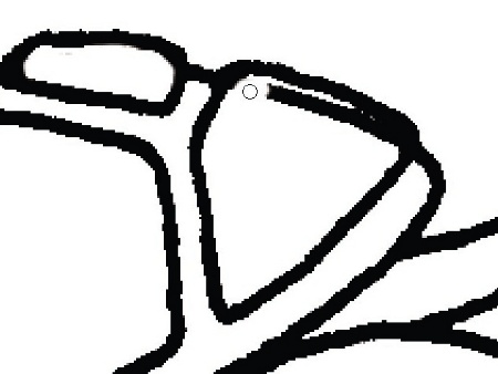
This is the point to tidy up any mistakes made when drawing the line work. Create a new solid white layer underneath so you can clearly see what you're doing and use the Erase tool to clean things up. Be careful to keep a consistent line width while not making things too neat.
07. Make a work path
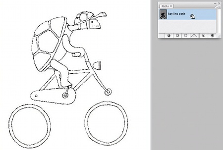
Once you have a keyline you're happy with, make a work path from it. Make sure your Paths palette is open (Go to Window>Paths), and select your keyline using the Magic Wand tool. Once this is done, select Make Work Path from the Paths drop-down options. Set the Tolerance to 0.5 and then double-click on the path in the window to give it a name.
08. Add more colour
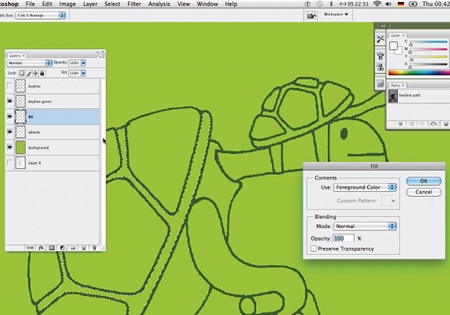
Using the path you've created, add a new green keyline on a new layer. Click on the path in the Paths window, choose Make Selection from the drop-down options with a feather radius of zero. Select a new layer and then use Edit>Fill to colour it in. We've also given this image a new green background and we're ready to start adding more colour. To do this, create a separate fill layer and using the Magic Wand tool select the areas of your illustration you want to colour (Edit>Fill).
09. Experiment with combinations

With more colour on the page it's easier to experiment. Try working with two or three tones of one colour alongside something with a much higher contrast, so that it really pops off the page. That said, unexpected combinations often work well so we've tried a pink background here. To keep things simple, it's a good idea to create a layer for each new colour option. That way you can easily see how different combinations work together.
10. Fill in more details

Here we've introduced a pinky red to see if warmer colours might work better. It's worth having a go as this bit of the process is partly just to try things and see what works. At this stage, you can start to fill in more details with colour too. Don't be afraid to keep trying different combinations and to keep changing your mind.
11. Make final changes
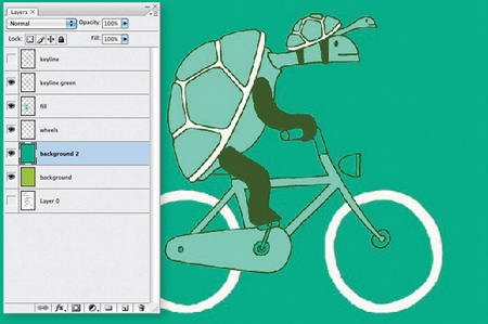
Here we've made some final changes and removed a colour. Try to do all this quite quickly to avoid agonising over it for hours. At this stage consider whether to add some extra details that might contrast well with the main figure. Maybe draw a few things like this on the page with the main drawing so you can easily drop them in and see how they look.
12. Finalise the illustration
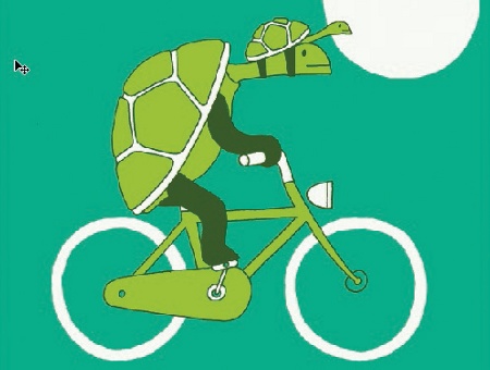
We've gone back to the initial green we used as a background, using it this time as a fill. The bright green colour sticks out and fits the character of the animal better. At this point, add some context - here we've added the sun to highlight the head of the small tortoise. Be careful though, as too much context can make the illustration cluttered. Have fun with it!
Words: Robert Hanson

The Creative Bloq team is made up of a group of art and design enthusiasts, and has changed and evolved since Creative Bloq began back in 2012. The current website team consists of eight full-time members of staff: Editor Georgia Coggan, Deputy Editor Rosie Hilder, Ecommerce Editor Beren Neale, Senior News Editor Daniel Piper, Editor, Digital Art and 3D Ian Dean, Tech Reviews Editor Erlingur Einarsson, Ecommerce Writer Beth Nicholls and Staff Writer Natalie Fear, as well as a roster of freelancers from around the world. The ImagineFX magazine team also pitch in, ensuring that content from leading digital art publication ImagineFX is represented on Creative Bloq.
