Create a modular grid system in Illustrator
Mark Bloom walks through how to create a flexible modular grid system that will change the way you approach design.
Sign up to Creative Bloq's daily newsletter, which brings you the latest news and inspiration from the worlds of art, design and technology.
You are now subscribed
Your newsletter sign-up was successful
Want to add more newsletters?
- Software: Illustrator CS4 and later
- Project time: 5 mins (grid only)
- Skills: Structure type and illustration more efficiently, Create a modular grid system in Illustrator
Made famous by Swiss graphic designers such as Josef Müller-Brockmann and Wim Crouwel as far back as the 1920s and 30s, the use of a grid system can be hugely beneficial to all creatives, especially designers and illustrators. Grids can act as an aid to achieve ordered structure within your design.
In this tutorial I’ll talk you through my personal approach to applying a modular grid system within Illustrator, working with simple geometric elements in a poster design.
Although the grid created in this tutorial is intended for use in print, similar grid systems are equally beneficial in web design, particularly when laying out text and images. Designing to a grid will not only strengthen your typography skills but will change the way you approach design.
Step 01
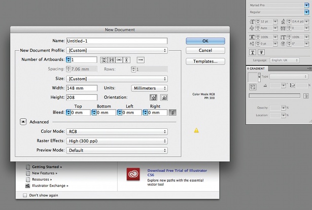
In Illustrator, set up a document for a flyer. In this example, I’m creating a slightly shorter A5 document measuring 148x208mm (normally 210mm). Now decide on your margins – I’m going with 10mm as this should give plenty of ‘safe space’ between the borders and the artwork.
Article continues belowStep 02
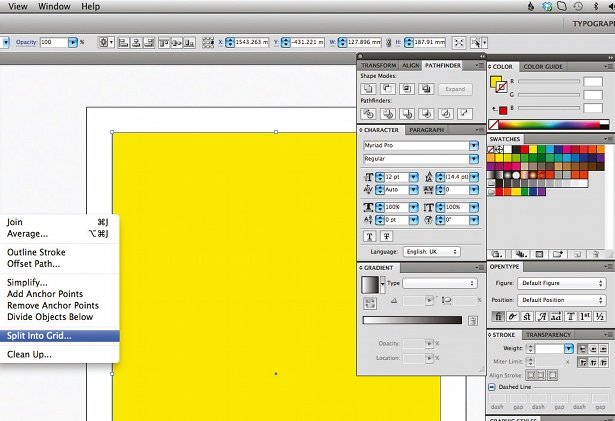
To create your grid, first draw a rectangle measuring 128x188mm. To calculate how big this rectangle needed to be, I subtracted the margins (10mm each side) from my page size. So in this case: 148 minus 10 (left margin), minus 10 (right margin) equals 128mm. Place this rectangle in the centre of your page (Align To Artboard>Horizontal Align Centre>Vertical Align Centre).
Step 03
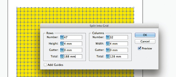
With the rectangle selected, go to Object>Path>Split Into Grid. I want modules that measure 4mm2, so to work out the number of rows take the height (188mm) and divide it by four. This gives 47, so input this in the Rows>Number field, and change the height to 4mm, gutter to 0 and total value to 188. For the columns, take the width (128mm) and divide it by 4. This gives 32, so enter that in the Columns>Number field. Change the width to 4mm, gutter to 0 and total to 128. Tick Preview to see the divisions.
Step 04
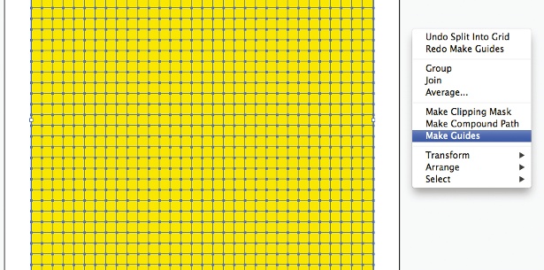
Once you click OK, you’ll have a rectangle that has been divided into 4mm squares. To turn this into guides, select the squares (Cmd/Ctrl+A). Then Cmd/Ctrl+click, select Make Guides and this will transform your grid into guides. Now you have a flexible modular grid to align your design to.
Step 05
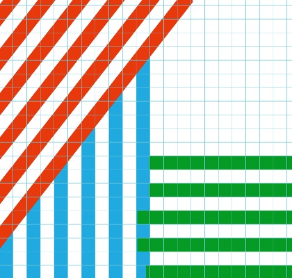
Now that your grid system is in place, start mocking up a rough layout using 4mm rectangles. This flyer design is inspired by the same lines and angles used in the BVD logo (Bike v Design). Using smart guides (Cmd/Ctrl+U), drag each rectangle into place ensuring they all sit within the 4mm grid. Guidelines can be distracting, so it might help to turn them on and off throughout this process (Cmd/Ctrl+;).
Sign up to Creative Bloq's daily newsletter, which brings you the latest news and inspiration from the worlds of art, design and technology.
Step 06

To break up the design and continue with the BVD logo theme, I want to add circles to my pattern. To ensure that these sit within my grid, I drew my first circle to a size of 140mm with a 4mm stroke weight. My second circle is drawn at 124mm, also with a 4mm stroke weight, which means there is now a proportionate empty space between the two circles. I continued to do this until I had five concentric circles that I then centred to each other.
Step 07
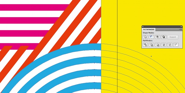
Once you’re happy with your design, check it against the grid to ensure that everything lines up correctly. Convert all stroke lines (such as the circles) to outlines (Object>Expand> Fill and Stroke). If you have any overlapping lines or circles, trim them to fit to my grid. This is done by placing an object such as a rectangle on top of the object you wish to trim, selecting both objects, and selecting Minus Front from the Pathfinder.
Step 08
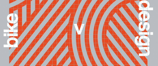
To finish off the flyer front, I’ve added a grey background that contrasts nicely with the orange pattern. I then ran text vertically on either side of the pattern and ensured that it all sits to the same baseline as the grid.
Step 09
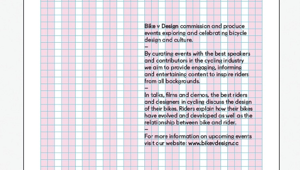
Now for the back. When laying out type, I find it useful to use a column grid rather than modular grid system. In this case the grid allows for 11 columns with a 4mm gutter (shown in pink). I aligned the paragraph of text to a column and checked that my leading allows all text to sit on the same baseline grid.
Step 10
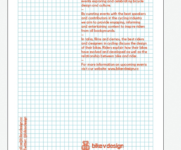
Continue to add the last few pieces of text to the back of your flyer. Finally, check the alignment of individual elements to your grid to ensure that everything is perfectly aligned.
Liked this? Read these!
- Illustrator tutorials: amazing ideas to try today!
- Great examples of doodle art
- Brilliant Wordpress tutorial selection
- Free tattoo fonts for designers
- Free Photoshop actions to create stunning effects
- Create a perfect mood board with these pro tips

The Creative Bloq team is made up of a group of art and design enthusiasts, and has changed and evolved since Creative Bloq began back in 2012. The current website team consists of eight full-time members of staff: Editor Georgia Coggan, Deputy Editor Rosie Hilder, Ecommerce Editor Beren Neale, Senior News Editor Daniel Piper, Editor, Digital Art and 3D Ian Dean, Tech Reviews Editor Erlingur Einarsson, Ecommerce Writer Beth Nicholls and Staff Writer Natalie Fear, as well as a roster of freelancers from around the world. The ImagineFX magazine team also pitch in, ensuring that content from leading digital art publication ImagineFX is represented on Creative Bloq.
