
Horror is a broad genre of contemporary illustration, but Victorian horror has a particular appeal to me. I'm fascinated by the psychological horror the great Victorian writers created.
Charles Dickens, Mary Shelley, Bram Stoker, Henry James and their ilk created stories that enable us to bring our own experiences to their work. The result is greater than the storyteller could have accomplished by dictating every nuance.
Early photography of the 19th century creates a definite sense of time and place. The sepia tone combines with the inherent authority of photography to say, "Yes, of course this is how things were" – and it was bleak. Victorian people obviously lived in full colour. But our nearly universal impression of the culture is one of shadowy, gas-lit black-brown.
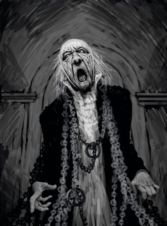
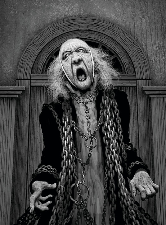
Finally, Victorians loved ghosts. This was the era when phantoms became characters for entertainment as well as edification. I chose a pivotal moment for Marley: when he has lost his patience with Scrooge's disbelief, and his wail is horrifying enough to bring the curmudgeon to his knees.
Scrooge's scepticism is symbolic of the Victorian embracement of the New Science (horrifyingly critiqued by Shelley's Frankenstein 20 years earlier), in which old superstitions weren't tolerated. Marley knows better and has to break through for the sake of his own soul.
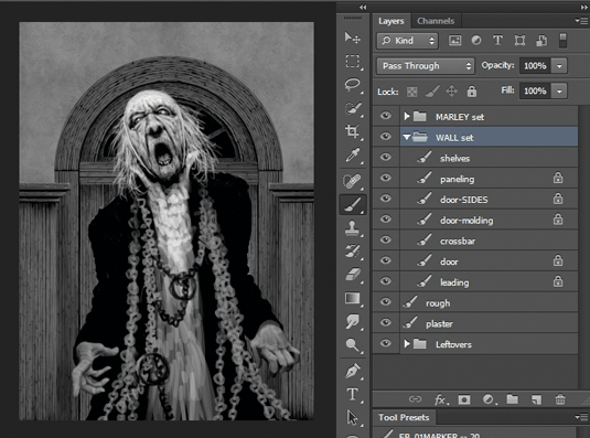
01. Starting in greyscale
I'll be drawing the image in greyscale and applying the tone later. It's essentially a workshop in digital drawing, and I demonstrate techniques that are standard in Photoshop along with my own processes. I also emphasise efficiency, since professional work must hit a deadline without sacrificing the impact of the final image.
02. Compositional thoughts
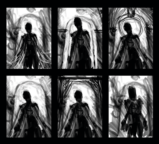
I always begin with fast sketches to try and find the composition. This enables quick experiments and also takes advantage of happy accidents. All I know is that I want Marley centred with a framing device around his head (probably a door), and an upward perspective that places the viewer slightly below him, as if they're kneeling.
03. Looking for personality
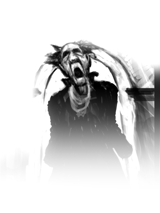
Once I find a composition that works, I scale the thumbnail up to full resolution and dimensions, and start looking for Marley's personality by painting white or lighter values on to the black silhouette. This technique also tends to create texture as I go, so I rarely remove something completely or start from scratch.
04. Editor sketches
I add elements to give the editor a clear notion of where I'm going with the image. Some clients want multiples to choose from, and in those cases I create variations that have substantial differences rather than subtleties. The illustration has to address the editor's needs, but I try to avoid submitting anything I'm not enthusiastic about – sometimes that's the one that gets chosen.
05. Initial textures
I paint the initial wood texture and add the foundation plaster on the wall. I do multiple passes on each silhouette, moving towards lighter values and smaller brushes. The first pass on textures such as woodgrain is done with parallel lines on a straight grid. The second pass is done freehand to create a more natural look. A third pass tightens details for more realism.
06. Painting a final pass
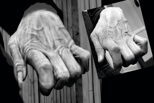
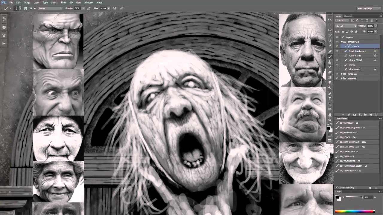
Here I'm using a light grey or white and a small brush. I try to bring reference images into the image for a couple of reasons: I don't have to look very far from my drawing to see the reference; and I do a lot of horizontal flips to check anatomy when I work, and now the reference flips with my drawing. You can also see the texture that's created by the multiple-pass approach.
07. Depicting realistic hair
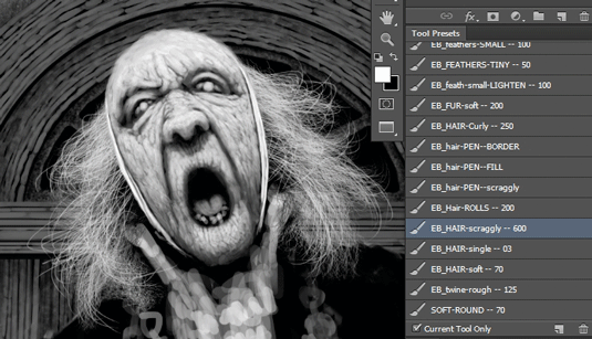
I replace the sketched hair with more realistic hair. I shape the hair using white, then lock the Layer Transparency and fill with black to create a hair silhouette. Then I switch the brush to white and paint white hair on top. This adds depth and realism by using the silhouette as shadow within the white hair, and maintains the shape as I work on depth and highlights.
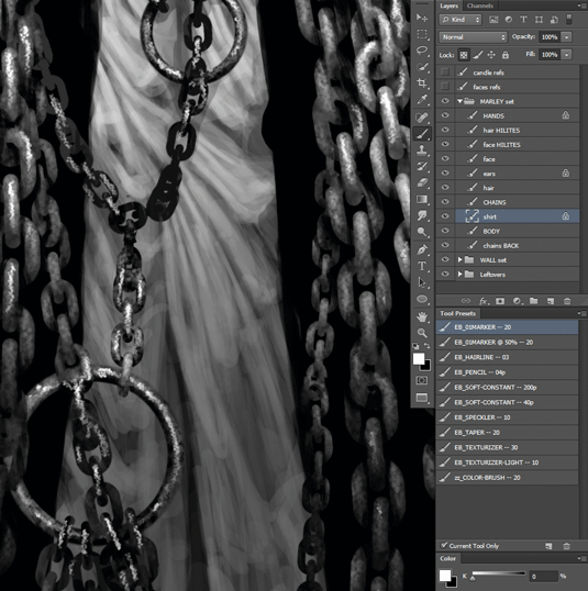
08. Realising the chains
The replacement chains are created from only three drawn links: a full-view link, a side-view link and a three-quarter-view link. I then combine them into a random-looking basic unit of about eight links merged together, and duplicate that unit to make the longer strands. Then I duplicate the longer strands to create the entire mass, and add a quick overall texture.
09. Introducing more detail
For lighter-value cloth such as linen or cotton, I let the early rough sketch suggest folds and pleats, refining what's already there. I've found this to be a more efficient approach than trying to duplicate details from a reference image. I just scribble, then see what I see, using reference only as a general guide while I add gradually lighter and more detailed passes.
10. Getting ready for print
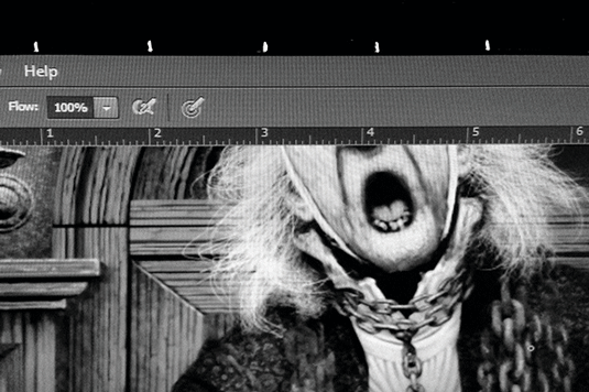
To help me judge how much detail to push toward, I've drawn one-inch tick marks with a metallic pen on the outer frame of my main monitor. Then I can show the rulers in Photoshop and match my Zoom level to the actual-size ruler on the frame. This enables me to judge my level of detail for print reproduction without having to produce multiple printouts.
11. Adding fabric to the coat silhouette
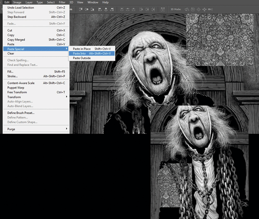
I copy a section of fabric, then load the Coat layer as a Selection. The Edit>Paste Special>Paste Into function creates a mask in the shape of the coat. I can then Transform, Duplicate and adjust the fabric within the shape, and paint on the mask to make the fabric conform to Marley's torso. I work on his torso and sleeves separately to ensure the seam at the shoulders stays strong.
12. With added spookiness
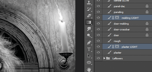
After creating the candles and sconces, I use my "Layer and levels" technique (see Pro Secrets, right) to create the spooky lighting. This is a great technique for antique-looking light effects, whether from candles, a fire or gaslight. And it's very fast because the object's details and textures are already drawn and I don't risk destroying anything.
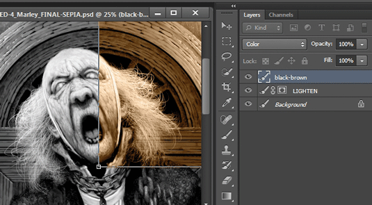
13. Finishing off
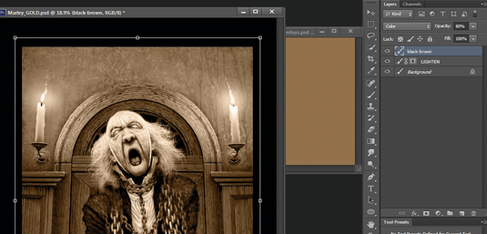
I save a flattened version, convert it to RGB and add a sepia-colour Color layer. Wherever the drawing values match the value of the brown from the drawing, the brown's saturation will be strongest. Then I adjust the sepia layer's Opacity to reduce the saturation. Finally, I duplicate the drawing layer, and Layer and Level it to enhance the candlelight effect.
Watch the full tutorial
Words: Ed Binkley
Ed is an art educator and freelance illustrator. His credits include Lucasfilm and a variety of books and magazines, plus a Gold Award in Spectrum: The Best in Contemporary Fantastic Art. This article originally appeared in Imagine FX issue 111.
Like this? Read these...

