06. Geppetto's Workshop
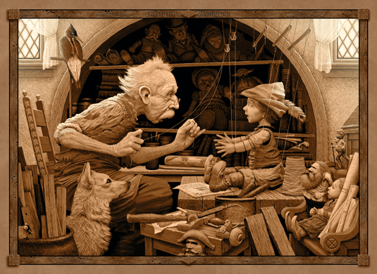
Ed Binkley's incredible portfolio of sepia artwork is based on medieval folklore. The Wisconsin artist and art professor uses Photoshop to re-create his Arthur Rackham-style tea-stained palettes.
These sepia or muted colours "tend to evoke an earlier era well," he says. "In my art I'm always very concerned about how the light/dark value structure in my images is affecting the mood, so I try to keep the colours fairly tame in order to let that structure dominate."
07. Path of Faith
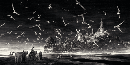
Nicolas Delort's etchings are reminiscent of fellow French artist, Gustav Doré, but with a slightly more updated version of the technique.
Beginning in Photoshop, the illustrator then transfers his images to clayboard - which is like un-inked scratchboard - and inks the areas he wants to scratch out. He scratches away the image with a fine nib.
08. Phosphorescent
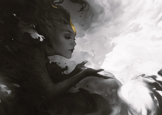
Imagine FX cover artist, Charlie Bowater, doesn't only work in black and white - but when she does, she excels. The British artist uses monochrome to calm her natural creative instincts.
"It's the simplicity of it," she says, "I'm quite a detail-obsessed individual a lot of the time and simplicity is something I am striving for."
09. Wolf Skull
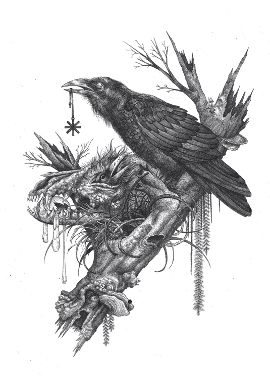
Shaun Beaudry's dark and detailed occult-ish drawings often begin with gestures. Using pen and ink, he then uses several layers of tracing paper while he keeps refining the sketch.
"After the basic line drawing is figured out I finish it using ink with brushes, mapping nibs and technical pens," he reveals.
10. The Knife
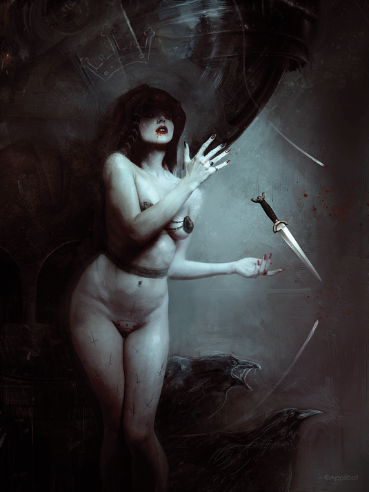
Bastien Lecouffe Deharme only ever adds colour when it's appropriate to do so. Working traditionally and digitally with pencils and paints, his work mainly emplys a limited colour palette.
However, here and there he'll use a splash of bright colour, to lift a focal point and add drama to an image.
This article originally appeared in Imagine FX issue 126.
Like this? Read these...

