6 best airline logos of all time (and why they work)
What we can learn from some of the world's best airline branding.
Branding a major airline is one of the most prestigious, large-scale jobs a design agency can land – and one of the most expensive to implement. Your work will be emblazoned across a fleet of aircraft, as well as every other touchpoint that customers experience, from terminal kiosks to tickets. It's a big responsibility.
Redesigning an airline logo is a decision not to be taken lightly, partly because of the huge cost, but also because people often get rather attached to the logos of their country's 'flag-carrying' airlines, and major rebrands often attract their fair share of controversy. American Airlines and United, both covered below, are prime examples of this – they ditched the work of luminary designers in the process, and went from some of the best-loved to the most-hated logos overnight.
Get it right, however, and the best logos for airlines can truly stand the test of time. Read on to discover six of the most recognisable airline brands from around the world, and what makes them so effective...
Article continues below01. Lufthansa (1963 version)
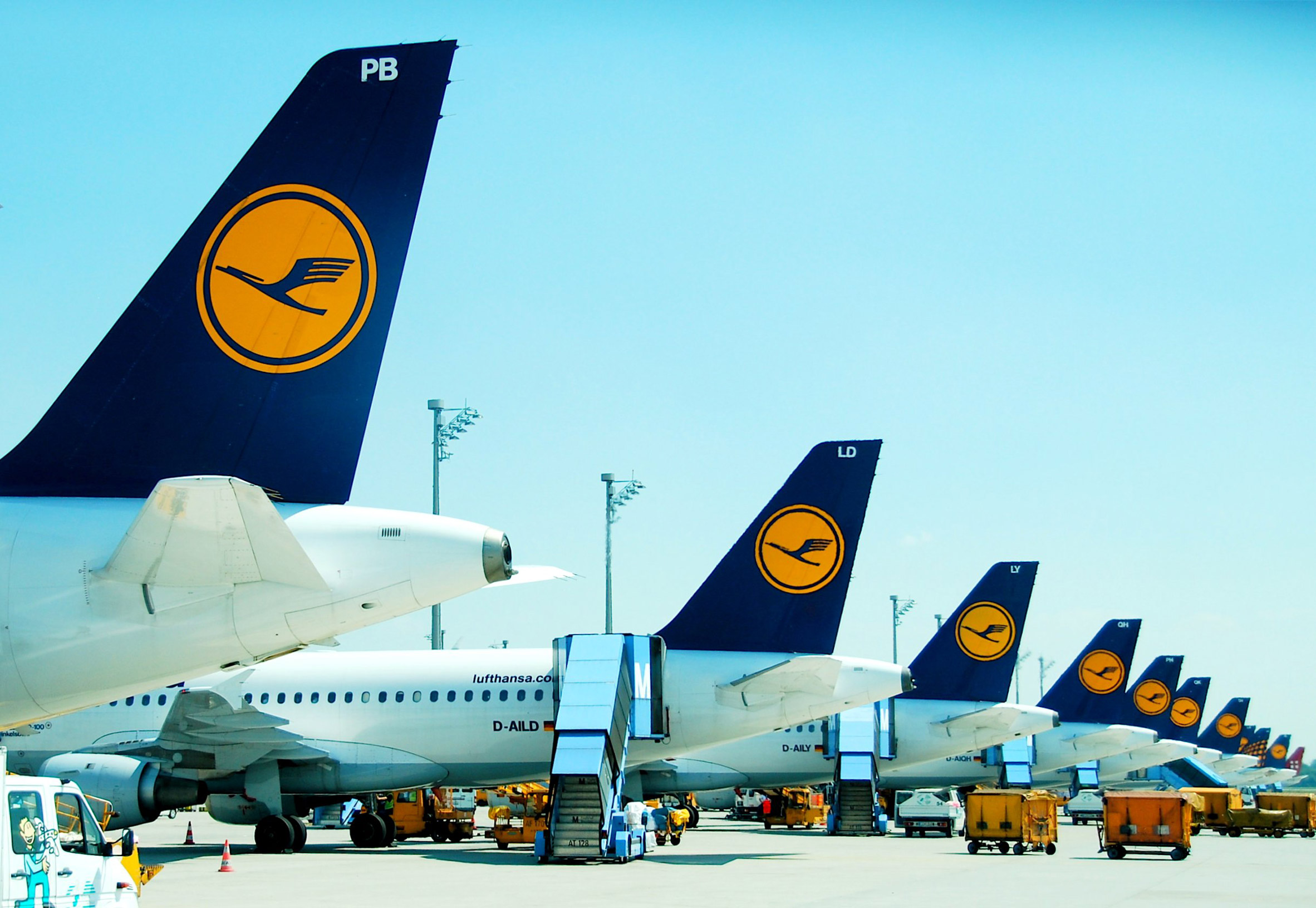
As the world's oldest airline, the German flag-carrier's stylised 'flying crane' motif dates back to 1918, when Otto Firle first created it for Lufthansa's predecessor Deutsche Luft-Reederei (DLR). In 1963, Otl Aicher added its distinctive rich ochre yellow as a brand colour – a masterstroke in terms of market standout.
Ownership of a colour in a sector largely dominated by red and blue can be crucial for standout – easyJet's grip on orange is another case in point – and that yellow became a key part of Lufthansa's identity, alongside the iconic crane.
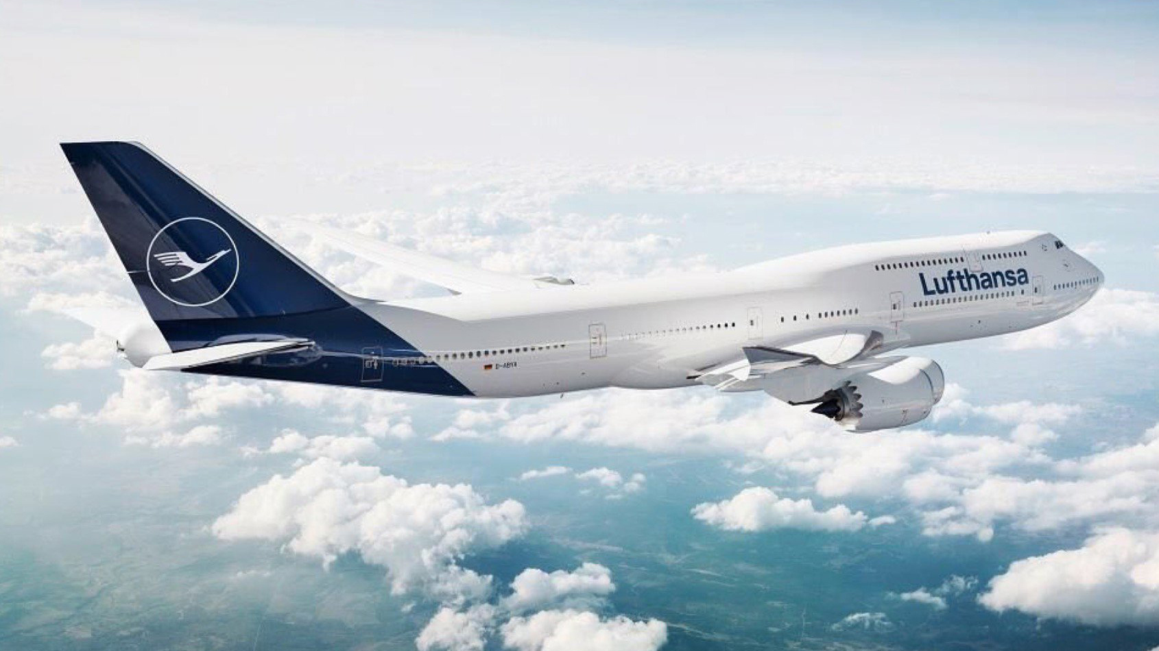
As a result, one of the most controversial aspects of Lufthansa's in-house rebrand earlier in 2018 was the downgrading of yellow to an accent colour, playing second fiddle to navy blue. It remains across many of the airline's touchpoints – such as tickets – but the backlash was strong. Lufthansa's 350-odd planes are now liveried exclusively in navy blue, with a slimmed-down crane.
02. American Airlines (1967 version)
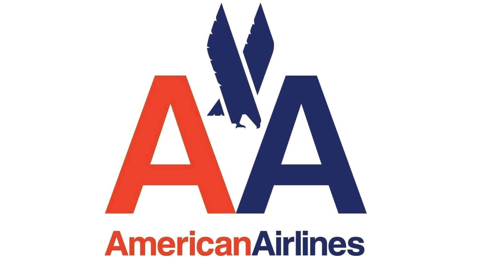
Designed in 1967, the late, great Massimo Vignelli's American Airlines logo combines a bold, confident 'AA' acronym with a heavily stylised, angular eagle that sits neatly inside the triangular negative space between the two letters. It's indisputably one of the most iconic airline logos of all time, which is why it remained a badge of honour for the US carrier for almost half a century.
Sign up to Creative Bloq's daily newsletter, which brings you the latest news and inspiration from the worlds of art, design and technology.
In arguably the most controversial airline rebrand of recent years, FutureBrand ripped up Vignelli's much-loved logo in 2013, and also moved away from Helvetica – still a relatively new, cutting-edge typeface in 1967 – as a brand font.

Dubbed the 'flight symbol', the new American Airlines logo incorporates an eagle, a star and the letter 'A' into one modern graphic shape, rendered in a distinctively American red, white and blue palette – albeit a paler, more sky blue shade than its predecessor. It's fit for purpose, but lacks the gravitas and confident simplicity of Vignelli's, and the designer publicly voiced his disapproval at the time.
03. KLM

Like American Airlines, Koninklijke Luchtvaart Maatschappij (better known as KLM) was treated to an iconic logo by a world-renowned designer in the 1960s – in this instance, F.H.K. Henrion in 1961. Where the two differ, of course, is that KLM's is still very much in use, bar some minor tweaks in 1991, and is widely cherished.
While Lufthansa is technically the world's oldest airline, KLM – founded in 1919 – is the oldest that still maintains its original name. That name translates to 'Royal Dutch Airlines', and the airline needs just four circles, a horizontal line and a plus symbol to form the beautifully timeless graphic crown that represents it to this day.
04. Qantas
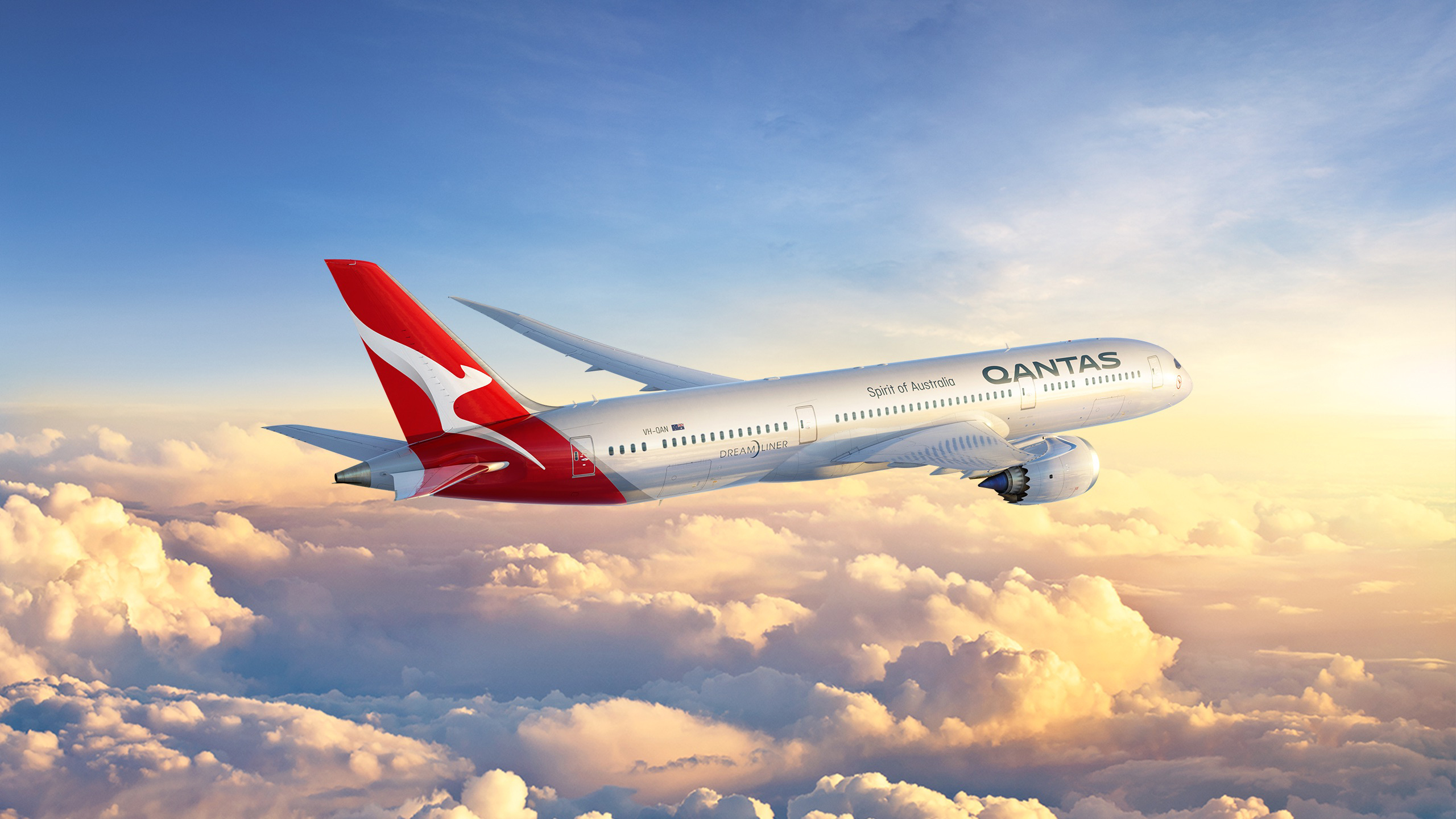
Established in 1920, hot on the heels of KLM, Queensland and Northern Territory Aerial Services (better known as Qantas) is Australia's flag carrier, with around 120 airplanes. In 2016, a Boeing 787 Dreamliner was added to the fleet – which gave the airline an excuse to overhaul its well-known logo and livery.
Australian design agency Houston Group worked on this latest Qantas rebrand, the fifth time the distinctive red-and-white kangaroo has been updated since 1944. The last rebrand was in 2007, to mark the introduction of an Airbus A380.
Houston Group's ambition was to give the emblem a more streamlined, contemporary look and feel, so it serves more as an abstract, ownable symbol than a literal representation of a kangaroo. The wordmark was also updated, losing the italicised text and giving everything more room to breathe. Ultimately, it retains the essence of the brand, and just gives it a modern, stylised twist – a rather different tack from American Airlines.
05. LEVEL
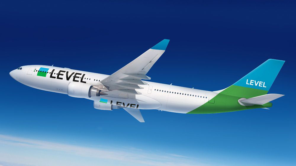
International Airline Group (IAG) needed a name and visual identity for its brand new low-cost, long-haul airline that could stand out in a crowded sector, and appeal to a new generation of global travellers. Up stepped Superunion.
Inspired by the idea of ‘levelling the playing field’ of long-haul travel, the agency decided on a name: LEVEL was born. Subverting the traditional flag motifs of the big ‘flag-carrying’ airlines, the airline sports a simple two-colour square for its logo, split into blue and green strips to represent the sky and Earth respectively.
This expands into a series of vibrant, animated patterns that carry seamlessly across every brand touchpoint. LEVEL was the most successful airline ever launched, with 52,000 tickets sold in its first 11 hours of business. It may be the newest airline brand on the list by quite some distance, but it's already proved its worth – and was highly commended at the 2018 Brand Impact Awards.
06. United (pre 2010)
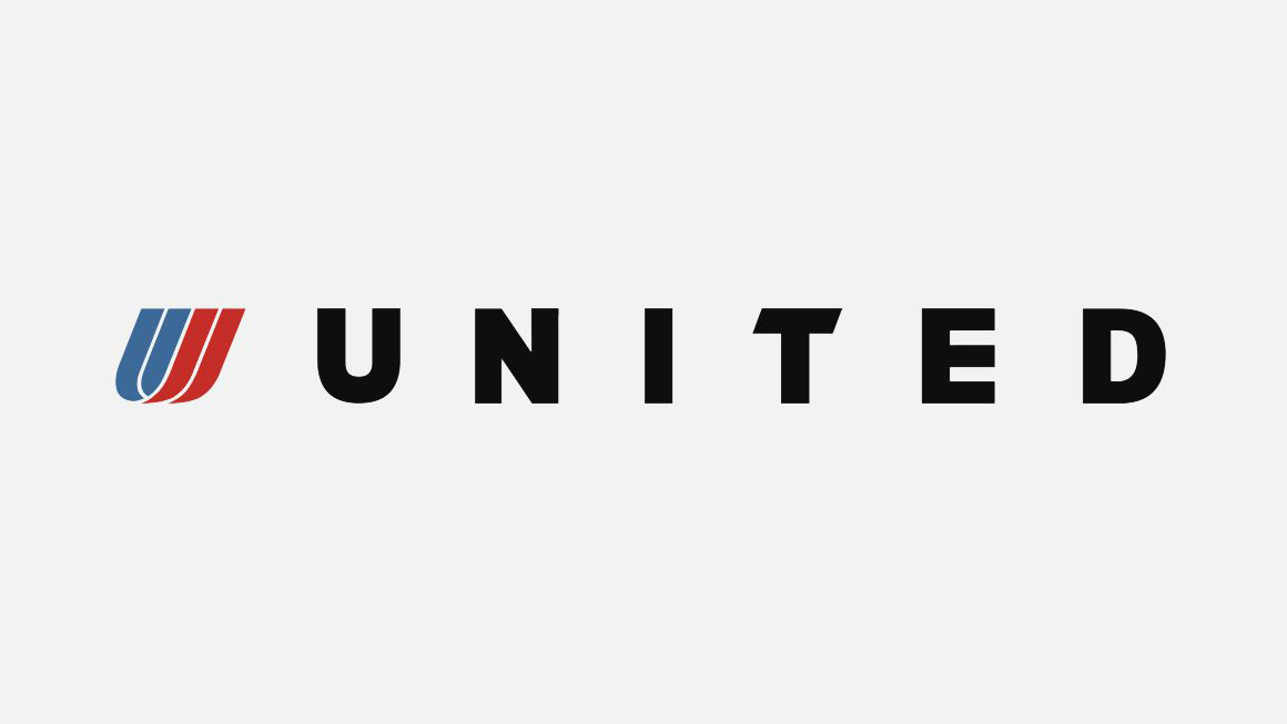
When a luminary designer like Saul Bass is behind a logo, it pays to hold on to that heritage. A pleasingly balanced emblem formed from four beautifully simple graphic shapes that curl around each other at the base, his 1974 'tulip' for United Airlines is instantly recognisable – and replaced a whole string of different 'crest'-based logo designs from the previous three decades.
While the design of the accompanying wordmark fluctuated – including a stylish rebrand by Pentagram in 1997, above – Bass' iconic tulip remained constant for over 35 years. That was until United merged with Continental Airlines in 2010, and in a spectacularly ill-advised tradeoff between name and logo, acquired Continental's nondescript blue globe and became, briefly, known as United Airlines.

That's right: three years before Vignelli's work was ditched by American Airlines, its US rival had already binned Bass. And then, as if that wasn't enough, it rebranded again just three months later, dropping the 'Airlines' to become 'United' once again, and changing sentence-case serif for all-caps sans. Unfortunately, the type was the least of their problems. The globe stayed – and the tulip sadly was no more.
Related articles:

Nick has worked with world-class agencies including Wolff Olins, Taxi Studio and Vault49 on brand storytelling, tone of voice and verbal strategy for global brands such as Virgin, TikTok, and Bite Back 2030. Nick launched the Brand Impact Awards in 2013 while editor of Computer Arts, and remains chair of judges. He's written for Creative Bloq on design and branding matters since the site's launch.
