Designers react to bizarre Gucci rebrand
Gucci took a big risk with its temporary new look. Did it pay off?

Sign up to Creative Bloq's daily newsletter, which brings you the latest news and inspiration from the worlds of art, design and technology.
You are now subscribed
Your newsletter sign-up was successful
Want to add more newsletters?
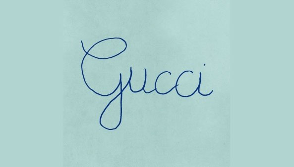
Gucci caused a stir with a new look last week. The temporary new logo and accompanying promotional materials form part of a campaign to launch the fashion house's Fall/Winter 2020 Men’s Collection, and drew attention for its use of a bizarre font that looked just like a child had written it (read our original story on the new Gucci logo here).
A little digging revealed the scrappy-looking branding was designed to evoke children's birthday parties – other promo materials feature the tagline 'Rave like you are five'. The unusual handwriting font was designed to mimic the style typically used by French children. Gucci certainly took a risk by adopting such an unpolished new look – but has it paid off? Now the dust has settled, let's take a look at what the design community thought.
- Explore our roundup of the best branding books for 2020
Amidst all the scathing commentary, strong arguments started to arise in favour of the naive new look. Some designers applauded Gucci's confidence in making a statement with the campaign, and argued it ties in well with the collection it's promoting.
Article continues belowChildish and courageous at the same time: @gucci’s new logo and corporate type for the Fall Winter 2020 Men’s Collection, which is to be debuted today. https://t.co/emgdIRxJes pic.twitter.com/ABkR4Ez9RQJanuary 16, 2020
Can't help but kind of love the new Gucci logo for the Fall Winter 2020 men’s show. Apparently the show will be looking to 'deconstruct the idea of masculinity'; the new logo design is a small but powerful icing on that cake. pic.twitter.com/KFRzrShDNuJanuary 20, 2020
"Sure, why not? It feels authentic and it does the one job of all high art/fashion well, which is to elicit an emotional reaction. I can dig it," wrote Valark on Under Consideration.
On the same site, JustJoeDesign drew attention to the unusual aesthetic choice: "In a day and age where penmanship is becoming a lost skill I think this is a great move for a campaign to stand out." The comment sparked a discussion about whether it would have been better to use traditionally 'good' calligraphy, which was rebuffed Corey Ken, commenting: "But then it would be just another ad with nice execution. This is conceptual."
Another strong argument in favour of the Gucci's design choice is that it offers a refreshing break from the current wave of bland rebrands.
"It’s unashamedly odd, and apparently blithely unaware of the accepted wisdom that a logo is a brand’s sacred symbol. And isn’t that what we want from the fashion industry? It’s meant to be weird and unexpected and rebellious," wrote Emma Tucker for Creative Review. Others agreed with her:
Sign up to Creative Bloq's daily newsletter, which brings you the latest news and inspiration from the worlds of art, design and technology.
Un-design. Quite refreshing they didn't just go with a Sans-serif.January 14, 2020
Say what you will but its better than another generic sans serif typeface revealing a whole collection as almost every fashion house does. Got to give at least some props to Alessandro Michele for giving the okay on this. #guccilogo https://t.co/kBp125GMo8January 16, 2020
However, there are many that remain unconvinced of the move. Plenty are cynical about Gucci's motives, suggesting it's just a stunt to get attention... although that's sort of the point of brand campaigns, so on that level at least it's a success.
Intentionally outrageous campaigns is the new black.As if we needed more reasons to not buy over-priced crap.January 14, 2020
And there's still just as many people happy to tear a strip off the high-end fashion house for its 'lazy' effort.
In response to the new @Gucci logo. We are updating our branding.#RaveLikeYouAreFive pic.twitter.com/tVrqTn1B4BJanuary 15, 2020
Did Gucci pay the logo designer with exposure or what??#GucciLogo pic.twitter.com/Jg4E9WbeveJanuary 15, 2020
Gucci's logo is legit my handwriting in my "Bang on the door" Groovy Chick 90s diary pic.twitter.com/3Zp08yKZt6January 14, 2020
So now that we've had time absorb the new look, what's our take? Well first up, while is certainly looks like it's been scrawled out in less than a minute, we imagine plenty of thought and effort will have gone into creating this campaign – even ensuring the messaging is legible is a challenge.
Second, anything that's revolutionary enough to make us look twice in the world of branding – and especially high-end fashion branding – is worth a certain amount of respect. And as it's a temporary campaign anyway, why shouldn't Gucci throw out the rulebook and do something radically different?
Read more:

Ruth spent a couple of years as Deputy Editor of Creative Bloq, and has also either worked on or written for almost all of the site's former and current design print titles, from Computer Arts to ImagineFX. She now spends her days reviewing small appliances as the Homes Editor at TechRadar, but still occasionally writes about design on a freelance basis in her spare time.
