Are these OTT brand guidelines as ridiculous as they seem?
Giant companies can take their brand guidelines in some pretty weird directions.

Sign up to Creative Bloq's daily newsletter, which brings you the latest news and inspiration from the worlds of art, design and technology.
You are now subscribed
Your newsletter sign-up was successful
Want to add more newsletters?
Creating a successful brand involves more work than just coming up with a snazzy logo or a memorable slogan then calling it a day. It's all about communicating the essence of the company at every touchpoint as effectively as possible. Big companies put a lot of time and effort into this, just check out some of the meticulous design style guides behind some of the most famous brands.
However giant companies can also be guilty of over-egging their brand guidelines as well. Some great examples of these over the top and frankly bonkers design specifications were recently shared on Twitter by software engineer Kat Michaela.
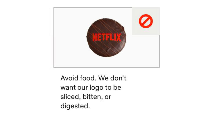
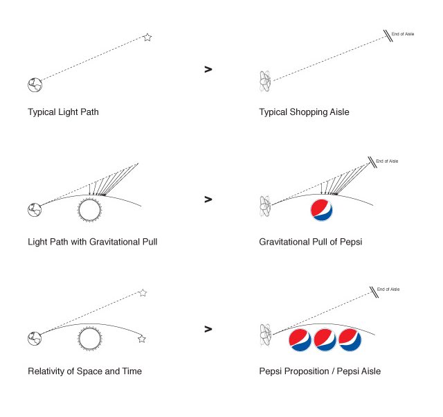
These include notes on the gravitational pull of the Pepsi logo, advice that the Netflix logo isn't to be bitten or digested, and the bizarre claim that the Twitter logo isn't a bird. You couldn't make it up.
Article continues belowone of my favorite things is checking out the absolute bullshit some designers came up with for some Giant Company's brand guidelines pic.twitter.com/Zqx43qxQ8INovember 28, 2019
In the tweet which kicked off her thread, Michaela says that "checking out the absolute bullshit some designers came up with for some Giant Company's brand guidelines" is one of her favourite things, and it looks like she isn't alone.
Before long Twitter users were commenting with their reactions and the strange feedback they've heard over the years. This includes such gems as @ianto_scorpius's story about when he was asked to use specific Pantone colours but the client refused to provide the codes, and the time @HesNotTheStig was forbidden from using cats or larvae in association with the Caterpillar brand.
Our favourite detail from this absurd thread though is the comparison drawn between the shape of the Pepsi logo and the Earth's magnetic fields. It's so idiotic and self-important that it even sparked an online hoax debate when it was originally unveiled.

But despite this madness, other Twitter users were quick to point out that these micro-managing guidelines are actually good design practice. While they might seem a little pedantic, @FoxxieAngel says they make sense: "I often have to warn my clients that their logos are not improved with lens flares, emboss looks and gradient overlays."
Sign up to Creative Bloq's daily newsletter, which brings you the latest news and inspiration from the worlds of art, design and technology.
Meanwhile @joar_lj comments: "The Pepsi one is famously insane, but as a graphic designer, uh, most of this stuff actually makes sense – don't animate the logo, don't put it in a box etc, its standard stuff. It's a visual identity, something that every org larger than a corner store uses."
And in defence of designers, lots of people highlighted the fact that it's often marketing and advertising teams who make these puzzling demands, not the creatives themselves.
So while these brand guidelines might seem laughably crazy to designers, perhaps they're saving other departments from headaches in the long run. Either way, we still can't take Pepsi seriously when it says "emotive forces shape the gestalt of the brand identity".
Related articles:

Dom Carter is a freelance writer who specialises in art and design. Formerly a staff writer for Creative Bloq, his work has also appeared on Creative Boom and in the pages of ImagineFX, Computer Arts, 3D World, and .net. He has been a D&AD New Blood judge, and has a particular interest in picture books.
