
We've been obsessed with kerning at Creative Bloq this week, so here's a little more... You may remember that Google changed its logo design earlier this year – the company has frequently come under fire for its type choice so it decided to improve the kerning, making it a little more aesthetically pleasing.
Getting kerning right is undoubtably one of the 10 commandments of typography. It's the process of adjusting the spacing between letters to achieve a visually pleasing result – which many get horribly wrong – and Google has decided to have a little fun with the process with a clever little kerning trick.
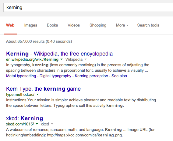
If you type 'kerning' into the search engine in one tab, and 'typography kerning' in another, you’ll notice a little extra breathing space between the lettering on the 'kerning' search results page. Discovered by Google UK's Pierre Far, it's a brilliant ode to the design discipline and one that will bring a smile to any typography geek's face.
[via Search Engine Land]
Do you know any Google tricks? Let us know in the comments box below!

