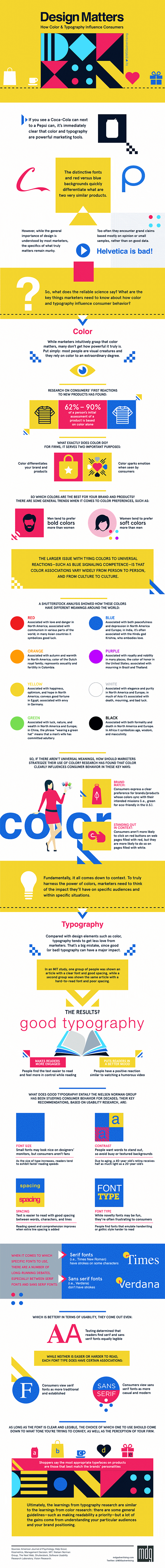
Most of us have a general idea of colour theory - the idea that particular colours in branding can trigger certain responses - but how much of it is fact and how much is fiction? To help you get to the bottom of just how much colour and typography influence the buying choices of consumers, MDG Advertising have put together this animated infographic.
On the face of it, colour theory seems to make sense. Red is a bold colour, so it's fair to assume that it helps to communicate a sense of urgency. Meanwhile blue has come to signify competence thanks to its calming effect. Without any data to back it up though, colour theory can quickly wither under the gaze of a managing director who already has their own design ideas in mind.
It's some consolation then to hear that 62-90% of a person's initial product assessment is based purely on colour, so picking the right palette is clearly essential. Further findings from a Shutterstock analysis also reveal that colours including green, yellow and purple among others all carry associations that vary from person to person, and culture to culture.
To learn all about these associations, and how you can tailor the colour and typography in your branding to suit a global market, check out the full infographic below. Backed up with references and studies to win over even the most sceptical of critics, this eye-catching animated infographic is sure to help nail down the look of your next branding project.
Related articles:

