The 17 best startup logos of 2017
Check out the startup world’s coolest logos right now.
Sign up to Creative Bloq's daily newsletter, which brings you the latest news and inspiration from the worlds of art, design and technology.
You are now subscribed
Your newsletter sign-up was successful
Want to add more newsletters?
When it comes to launching a startup, logo design is not usually at the forefront of people’s minds. And rightly so. Finding a product or service that people care about, recruiting the right talent, raising seed funding – those are your priorities at this stage. And many startups get by just fine in the early years with no logo at all.
If you do find time to develop a logo, though, it can help enormously with spreading the word about your nascent enterprise – as long as it’s done right, that is. Here are 17 logos for 2017 startups that we reckon hit the sweet spot.
01. Mush
Many new mothers are surprised by how isolated they suddenly feel. That’s the thinking behind London startup Mush, whose app helps new parents find each other locally, then chat, swap and sell items.
Article continues belowIts logo is appropriately fun, friendly and upbeat, using nicely designed icons to convey the kind of multitasking that motherhood demands. Normally, of course, you don’t want your logo design to be too cluttered. But here the different icons perfectly evoke the chaos of life as a new parent, without being too messy, so the approach works well in this particular context.
02. Naava
Naava is a startup based in Helsinki, Finland, providing smart walls that clean up indoor air and make it healthier to breathe. As its aim is to purify your environment and life, its logo is appropriately minimalist. And rather than aping the clinical minimalism of the average tech company, it brilliantly uses deconstructed letters, cast in the appropriate shade of pine tree green, to suggest a theme of trees and nature.
03. Uniplaces
Uniplaces is a startup based in Lisbon, Portugal, that has helped more than a quarter of a million students across Europe link up to landlords and find somewhere to stay. The cartoony lettering of its logo, and the marked absence of a dot over the eye, convey a relaxed sense of youth, while the icon evokes both the idea of living space and the broader sense that attending university ‘opens new doors’ in your life.
04. Paracosm
Florida-based startup Paracosm develops mobile 3D scanning, progress monitoring, and visualisation solutions to help construction teams build things. In these days of samey tech logos, it’s great to see it has gone for something… well, pretty different. We’re not sure how a flying space parrot ties in with its clever software, but we expect there’s a coding in-joke in there somewhere. Or perhaps they just think parrots are a cool play on its name, Paracosm.
Sign up to Creative Bloq's daily newsletter, which brings you the latest news and inspiration from the worlds of art, design and technology.
05. Shipyard
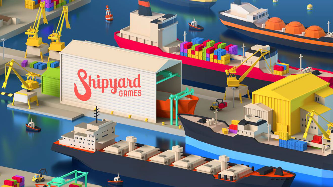
Another Helsinki-based startup, Shipyard Games develops location-based games and is backed by Supercell. As you can see from this website hero image, when it comes to visual branding it has taken the name of the company and run with it. We particularly love the way a stylised shipyard hook emblem has been incorporated as the opening letter S.
06. Monzo
Monzo is one of the hottest startups in the fintech world right now, having been granted a full banking licence in April. When you’re asking people to entrust you with their money, you can’t be too crazy with your branding, but as a startup you want to emphasise your youth and cutting edge approach. We’d argue this formal yet colourful logo strikes the perfect balance between the two positions.
07. Bundlelist
Bunch Design designed this logo for Bundlelist, an online platform aiming to help people decide which mobile bundle they should buy for their connected device. It’s a smart, original creation, catching the eye with its individuality while still remaining simple enough to be super-flexible.
08. Elevatr
New York startup Elevatr is aiming to help people suffering from mental health problems, via a free mobile community that connects them with others going through similar experiences. Much like the Naava logo earlier, this simple yet clever logo deconstructs the A and turns it into an ‘Up’ button, evoking both the idea of an elevator and a positive outlook in general.
09. Houndlabs
Here’s something a bit different: Houndlabs is working to create the first marijuana breathalyser. As more and more countries legalise the weed, they believe it’s important to be able to scientifically test when people are intoxicated, while driving or working heavy machinery, for example. The idea of ‘sniffing out’ a miscreant is neatly encapsulated by the hound icon, while the colour scheme and overall theme remain upbeat, ensuring that the company is seen as responsible, but not a ‘narc’ on an anti-dope crusade.
10. Bomberbot
Bomberbot is a startup in Amsterdam, the Netherlands, aiming to teach kids coding in a fun and accessible way. Its colourful, Nickelodeon-esque logo certainly brings the fun, but there’s also a geometric formality to it that suggests a structured approach to learning. Plus, who doesn’t like an old-school robot?
11. Norsepower
Finnish startup Norsepower builds sails for freight ships to help them save fuel and reduce emissions. It sounds like a wacky idea, but it’s based on solid science and engineering: the rotor sail device is based on a 21st century version of the Flettner rotor. Its logo helps to sell the seriousness of the project, too, with a formal approach and colour scheme that wouldn’t look out of place in an older company. (It’s a startup though, so of course it’s lower-case lettering all the way.)
12. Seenit
Seenit is a London startup that lets companies crowdsource video footage to save on employing a film crew. We love its logo emblem, based on a deconstructed S, which is instantly recognisable wherever you see it. Our knowledge of video production isn’t that deep, so we’re not sure if there’s a meaning to it or it’s just a cool looking shape. Either way, it works in our book.
13. Habito
Habito is a London startup that aims to make it easier for people to apply for mortgages. Its logo is simple but effective, hitting that sweet spot between fun and formal that’s so important in the new digital market for financial services. The raising of the O, especially, adds a sense of the upbeat and optimistic, which is entirely appropriate when it comes to people’s financial futures.
14. Revue
Dutch startup Revue is an online service that makes it super-easy to create and send newsletters. Compiling a newsletter is rarely a task anyone looks forward to, so the curvy and friendly letters of its logo, each one of which appears to be ‘smiling’, do a great job in encouraging you to give it a try. Netherlands-based logo designer Paul von Excite has written an article about how he designed the logo, here.
15. Varjo
Helsinki, Finland, VR startup Varjo is developing technology that mimics the natural behaviour of the human eye, and promises this will allow us to create products with up to 100 times the resolution of current VR/AR devices. Exciting stuff. Appropriately, Varjo’s cool geometric logo pushes abstraction to its limits, conveying just how boundary-pushing the startup is, without becoming totally illegible in the process.
16. Mellow
Lisbon, Portugal-based startup Mellow is developing a smart sous chef, in the form of a sous-vide machine you can control via your phone. The emblem shown above might not mean anything to you right now, but once you’ve seen the machine in question – which has that exact shape – its logo design makes perfect sense.
17. TravelPerk
TravelPerk is a startup in Barcelona, Spain, that allows you to book and manage multiple business trips in one place. Its simple logo cleverly uses Wi-Fi-style curved lines to convey both cutting-edge tech and a sense of movement. Which is, after all, what the travel industry is all about.
Related articles:

Tom May is an award-winning journalist specialising in art, design, photography and technology. His latest book, The 50 Greatest Designers (Arcturus Publishing), was published this June. He's also author of Great TED Talks: Creativity (Pavilion Books). Tom was previously editor of Professional Photography magazine, associate editor at Creative Bloq, and deputy editor at net magazine.
