UX design for startups: get it optimised
In the last of his articles on UX design for startups, UXPin CEO Marcin Treder explains why launching a new feature isn't a cause to celebrate, but an opportunity to optimise your product
Sign up to Creative Bloq's daily newsletter, which brings you the latest news and inspiration from the worlds of art, design and technology.
You are now subscribed
Your newsletter sign-up was successful
Want to add more newsletters?
At UXPin, we’re trying to be as agile as we possibly can. We launch new versions of our user experience design app every couple of days. Some features stay with us for good, some are killed soon after the launch, and some are improved in time to meet our (and our users’) expectations. We accept constant change and a never-ending quest for improvement. Let me explain the basic tenets of our approach and tell you how to use it in your startup.
The golden rule
When I used to work as an in-house UX manager, my UX team had one golden rule: “a designer never leaves a project”. We meant that the launch of a new product/feature doesn’t authorise anyone to have a crazy celebration. No champagne, no running about naked, no dancing around. There’s nothing to drink to or jump for joy. Launching a product is just an opportunity to measure your users’ behaviour, learn from it and optimise the design. It’s a time for crucial work and a feeling of anxiety rather than relief.

It sounds like we were no fun, right? But the point of this approach wasn't to become party poopers. It hung on one thing: the definition of success.
UX designers always try to influence the behaviour of users and improve their experience. That’s the ultimate goal. We succeed if the users succeed in using our product and their experience is magnificently good.
Our golden rule was meant to constantly remind ourselves about two things:
- A UX design is only as good as its measured performance
- Optimisation is constant. We just postpone it when the costs are higher than the assumed gain.
Interestingly, this approach proved itself to be even more important in a startup than in an established company. Accepting the constant effort to improve the user experience is a 'make it or break it' factor for every young organisation. UXPin would never have survived its initial stage if not for constant measurement and optimisation.
Most entrepreneurs I know are not eager to accept this. We all live in an extraordinarily tough and stressful environment. When we launch a new product or feature, we’re chasing our dreams. We believe that from now on, finally, everything will be just fine.
Usually, it isn’t. In many cases, nothing changes after a launch. In some situations, things might even get worse. You must be ready for this, have the knowledge to improve your situation, and convert losses into gains. Remember, as an entrepreneur, you must be goal-oriented, not relief-oriented. Relief after deploying code to production servers is not a success: a change in metrics is.
I know this is hard. Startups are hard. Startups that care for user experience are even harder.
But don't worry: what doesn’t kill you, makes you stronger. Constant improvement of your users’ experience will lead you to overall success. It might not happen overnight, but consistency will pay off.
Technically and actually working stuff
“A design isn’t finished until somebody is using it,” said Brenda Laurel, a great designer who used to work for Atari, among others, in the 80s. This is a condensed truth. Great designs don’t just look beautiful: they let people succeed in their endeavours.
A design actually works if people keep using it and their experience is great. This is the difference between 'technically working' and 'actually working'. Your team might claim that something works just because functionally it’s more or less all right. If you know how to perform a certain task, you can succeed – they say. It’s according to the spec – they say. It’s just as we discussed it – they keep saying.
The problem is that the users don't know, or care, whether the feature is as you discussed. They only care whether they like using it.
So does the feature work or not? In a company focused on user experience, it doesn’t. If users fail to use a certain feature, it doesn’t work. It just works technically – and technically is not nearly enough.
Sign up to Creative Bloq's daily newsletter, which brings you the latest news and inspiration from the worlds of art, design and technology.

Most successful startups are not in the programming business: they are in the 'creating a great user experience' business. So work until your startup will actually enable users to succeed – and beyond.
Seeing design through metrics
To cross the chasm between 'technically' working and 'actually' working, you need to see your design through metrics. You need knowledge to build a bridge between reality and your dreams. Metrics are your building material, sight-enhancement and super power!
We discussed what to measure and how in the last article; now it’s time to focus on optimising the design.
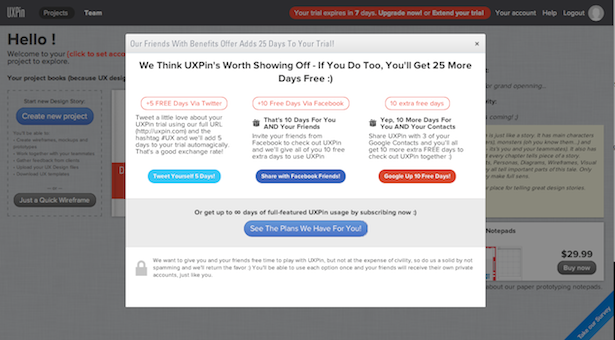
Let’s start with an example. A couple of weeks ago, UXPin launched a new feature. We were trying to implement a kind of viral loop inside our system. Our goal was to encourage people to share UXPin and as a result help us accelerate the growth of sign-ups.
We couldn’t give away server space as a reward for sharing as Dropbox did (in UXPin, it’s unlimited), so we came up with the idea of giving away trial days. You could extend your trial by up to 30 days if you gave your friends free trial days as a present. Awesome, right?
We implemented the whole feature in just three days and launched it quickly with a feeling of excitement about the upcoming huge shift in our company.

Still aware that our work might need some optimisation, we carefully planned what to measure. To remain actionable, we limited ourselves just to the most important metrics:
- Number of newly registered users who invited their friends to UXPin for free trial days
- Average number of invitations sent per user
- Number of invited friends who visited UXPin and registered
- Number of users who invited their friends and bought an account
- Number of invited users who bought themselves a UXPin account
Soon after the launch, people started to use our feature. After one week, the results looked promising: 36% of newly registered users extended their trial using our new feature, inviting an average of three friends to join UXPin. Unfortunately, only 5% of the invited friends visited UXPin and registered. After one week there were still no sales, but we weren’t surprised as everyone was still on the trial.
Then suddenly our sales dropped. We immediately started to check what was going on and which of the new features could be changing our users’ behavior. All the signs pointed to the viral loop thing, but since a lot of people were still on the trial, we decided to wait.
After another week, we noticed that the activity metrics (which show us the engagement of people with the app) decreased as well. We assumed that they had probably started to get bored with their long trial. There was not nearly enough stimulation to keep them interested in UXPin without converting them to customers.
We started to talk with our users to find out what was going on. Unfortunately, we were right. The longer trial made them postpone the decision whether to purchase for an indefinite time. They didn’t feel rushed to decide.
That wasn’t too good, but since we had all the numbers and we had talked to our customers, we knew what to do: we just changed the point at which the box offering the extension of the trial shows up, and we introduced wireframing templates to engage the users in the app right from the start. After two days of optimising and one week of waiting, our sales started to grow again. Amazing!
But if we hadn't measured things properly, we wouldn’t have enough knowledge to act on. Though technically, our beloved feature was brilliant, we could actually just have sat and watched our sales dropping day by day. Awful.
As you can see, viewing design through metrics is your insurance. Whenever you’re about to launch something, think carefully about how are you going to measure success and what knowledge you will need to optimise the feature later.
This is the secret of successful UX design – and one which you can implement in your startup straight away.
Enough is enough
Fair enough, you may say. But if you never leave your projects, you will either drown in a sea of projects, or constantly optimise just one, both of which will hold your company back.
Nothing could be further from the truth. You just need to know when to stop.

Whenever you’re optimising your product, make an assumption of how big the possible gain is, how big the cost is and how high the probability of success is. Try to specify both cost and gain in dollars (or whatever currency you use).
Let’s say you need three hours to design an optimised version of a certain feature and another five hours of development to launch the new version. And let's say that your time is worth $100 per hour to the company. That means the cost of optimisation is $800. What’s the assumed gain? Will it be $200 per month, for example, which means you’ll start earning on this optimisation after one month? What’s the probability that it will actually work? What will happen if you don’t optimise it?
All these questions are equally important. My rule of thumb is to deal first with anything that creates a loss. If something irritates your customers and makes them leave your app, that’s the first thing to optimise. If you don’t, you’ll always have a hole in your product.
The second step is to look for the cheapest solution that offers the highest probability of the highest gain. (Obviously, in practice, it's not quite that simple. Choosing the right optimisation requires solid knowledge about your users and a little bit of experience in making design decisions. But if you properly measure your users’ behaviour, you’ll get this with time.)
Finally, in a startup, try to avoid expensive solutions. Think what else you could be spending that money on. If you expend your entire development budget on a feature that will take three months to optimise, your competitors might gain such a lead on you that you'll never be able to catch up.
Final word
This is the end of our journey through the user experience design world – and hopefully, the beginning of your own adventure. I sincerely hope that I managed to inspire you into creating another UX-centered startup that will conquer the world. In today’s world, there is no place for bad design. And good design always has users at its heart.
Other articles in this series
The age of user experience design
Get to know your users
Efficient design techniques
Growth and design hacking
Main image: clevercupcakes.

The Creative Bloq team is made up of a group of art and design enthusiasts, and has changed and evolved since Creative Bloq began back in 2012. The current website team consists of eight full-time members of staff: Editor Georgia Coggan, Deputy Editor Rosie Hilder, Ecommerce Editor Beren Neale, Senior News Editor Daniel Piper, Editor, Digital Art and 3D Ian Dean, Tech Reviews Editor Erlingur Einarsson, Ecommerce Writer Beth Nicholls and Staff Writer Natalie Fear, as well as a roster of freelancers from around the world. The ImagineFX magazine team also pitch in, ensuring that content from leading digital art publication ImagineFX is represented on Creative Bloq.
