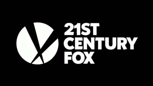
New logo for 21st Century Fox
Yes, you read that right. 20th Century Fox has swapped a zero for a '1' and released a new logo that's heavily influenced by (you guessed it) flat design...
Sign up to Creative Bloq's daily newsletter, which brings you the latest news and inspiration from the worlds of art, design and technology.
You are now subscribed
Your newsletter sign-up was successful
Want to add more newsletters?

When it comes to movie brands, 20th Century Fox is one of the all-time greats, with its 'da-da-da-da' ident an integral part of the excitement of seeing a new movie. So it wasn't that surprising that, when the year 2000 rolled around, the name and logo design remained intact, despite suddenly being 100 years out of date.
So the sudden appearance of a '21st' Century Fox logo is a bit of a shock to the system. Why now, in a random year like 2013, has 20th Century Fox swapped a zero for a '1'?
Division of assets
Essentially it's a business thing. Rupert Murdoch's megacorporation NewsCorp is currently going through the process of splitting into two parts, partly in response to shareholder anger over recent scandals involving phone hacking by its British tabloid newspapers.
Article continues belowConsequently, most of NewsCorp's entertainment and TV properties, including the Fox Entertainment Group, Fox News, and 20th Century Fox, will be split off from its publishing assets into a separate company. Which will be called - slightly confusingly - 21st Century Fox.
So what does that mean for 20th Century Fox itself? Will that company's name, logo, ident and music remain? Or will it turn into something like '21st Century Fox movies'? Or will it be split into several parts itself? No one knows right now - and it may depend in part on how the public react to this new logo and animation:
Design verdict
We'll admit we're a little underwhelmed by it ourselves. Though its bang on trend as far as the current penchant for flat design and minimalism goes, we're not sure that what works for a web brand like Microsoft is appropriate for a company with such a rich, colourful and glamorous history as 20th Century Fox.
The logo, designed by Pentagram, does pay tribute to the famous searchlights, but in such a reductive way as to be almost mocking them. The all-caps typography does the job but isn't hugely inspiring. And when compared to the brassy clarion call of the 20th Century Fox ident, the music on the animation doesn't really get the adrenaline racing.
Sign up to Creative Bloq's daily newsletter, which brings you the latest news and inspiration from the worlds of art, design and technology.
But then again, this a logo for a business, not a brand. Whether a logo 'works' is indivisible from what it is for, and so we should really wait to see how and where (if anywhere) it will be used before rushing to judgement.
That doesn't mean you can't, though. The Comments box is below - knock yourself out!
Liked this? Read these!
- Free Photoshop brushes every creative must have!
- Create a perfect mood board with these pro tips
- Our favourite web fonts - and they don't cost a penny

The Creative Bloq team is made up of a group of art and design enthusiasts, and has changed and evolved since Creative Bloq began back in 2012. The current website team consists of eight full-time members of staff: Editor Georgia Coggan, Deputy Editor Rosie Hilder, Ecommerce Editor Beren Neale, Senior News Editor Daniel Piper, Editor, Digital Art and 3D Ian Dean, Tech Reviews Editor Erlingur Einarsson, Ecommerce Writer Beth Nicholls and Staff Writer Natalie Fear, as well as a roster of freelancers from around the world. The ImagineFX magazine team also pitch in, ensuring that content from leading digital art publication ImagineFX is represented on Creative Bloq.
