New library logo contains a misspelling
As an institution devoted to promoting literacy deliberately misspells its own name, we ask: is this a new logo trend for the text-speak age?

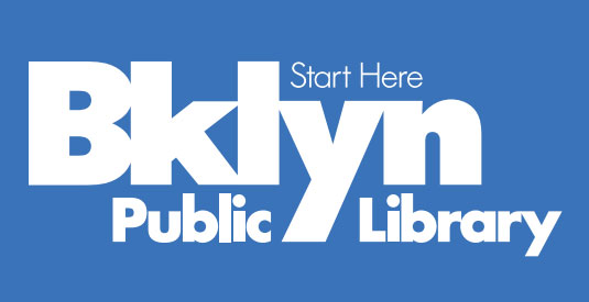
The first rule of logo design has always been to check your spelling. But in the case of the new branding for the public library in Brooklyn, New York, it appear rules are made to be broken. For it has launched a new logo which has the second, third and fourth letters deliberately missing from its place name.
For an institution devoted to promoting literacy, it's an interesting choice to spell Brooklyn as 'Bklyn' - a spelling that also appears in the URL for its revamped website.

The logo was designed by multidisciplinary design studio Eight and a Half, who are well known for creating logo designs for TV shows, including Saturday Night Live, 30 Rock and NBC's Olympics coverage.
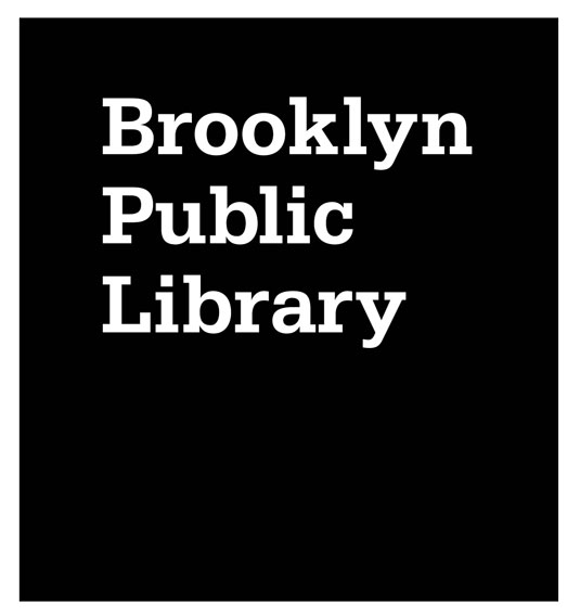
Article continues belowThe new logo replaces the minimalist black box-logo of old, and will clearly be more readable at smaller sizes - an important consideration in the smartphone age.
But whether the spelling decision will lead to the kind of traditionalist backlash that killed the University of California's aborted new logo remains to be seen. Update: Some, including the first commentator below, have pointed out that the new logo works as a clever play on words (turning 'Brooklyn' into 'Book-lyn'). Point taken, although if that was the intention, it was a bit too clever for us...
Learn more about logos:
- Brand a logo: 15 design trends for 2012
- The ultimate guide to logo design - 25 expert tips
- 2012's biggest logo redesigns
- What do you think of the new logo? Share your thoughts with the design community in the comments box below!
Sign up to Creative Bloq's daily newsletter, which brings you the latest news and inspiration from the worlds of art, design and technology.

The Creative Bloq team is made up of a group of art and design enthusiasts, and has changed and evolved since Creative Bloq began back in 2012. The current website team consists of eight full-time members of staff: Editor Georgia Coggan, Deputy Editor Rosie Hilder, Ecommerce Editor Beren Neale, Senior News Editor Daniel Piper, Editor, Digital Art and 3D Ian Dean, Tech Reviews Editor Erlingur Einarsson, Ecommerce Writer Beth Nicholls and Staff Writer Natalie Fear, as well as a roster of freelancers from around the world. The ImagineFX magazine team also pitch in, ensuring that content from leading digital art publication ImagineFX is represented on Creative Bloq.
