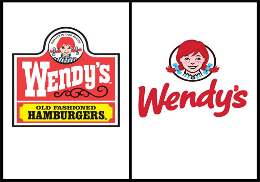
Burger giant Wendy's gets a logo makeover
As the second biggest burger chain in the US, it's always going to be difficult to reinvent yourself. Is Wendy's new logo a worthy update to its 1983 version?

For the first time since 1983, one of America's best loved burger-joints has decided to give its girl a makeover. Although we've all grown to love the old-fashioned typography and classic red, white and yellow colour scheme, the time has come to give the company a new look.
A new direction
Wendy's new look features the chain's name in a casual red font against a clean white backdrop. The classic image of Wendy herself has also been altered to look a little older; paving the way for Wendy's new transformation into a higher-end hamburger chain.
It's only the company's fifth logo update, since they first opened back in 1969 and could arguably be their most important. At a time when competition is rife, Wendy's continue to battle for their fast-food place.
Article continues belowThe CEO is making changes
As well as the logo revamp, CEO Emil Brolick is also planning on making changes to the many Wendy's restaurants which include, natural lighting, flat-screen TVs and a variety of seating options, including cushy chairs in nooks.
So what do you make of the new logo? Should Wendy's stick to their traditions? Let us know in the comments box below!
Sign up to Creative Bloq's daily newsletter, which brings you the latest news and inspiration from the worlds of art, design and technology.

The Creative Bloq team is made up of a group of art and design enthusiasts, and has changed and evolved since Creative Bloq began back in 2012. The current website team consists of eight full-time members of staff: Editor Georgia Coggan, Deputy Editor Rosie Hilder, Ecommerce Editor Beren Neale, Senior News Editor Daniel Piper, Editor, Digital Art and 3D Ian Dean, Tech Reviews Editor Erlingur Einarsson, Ecommerce Writer Beth Nicholls and Staff Writer Natalie Fear, as well as a roster of freelancers from around the world. The ImagineFX magazine team also pitch in, ensuring that content from leading digital art publication ImagineFX is represented on Creative Bloq.
