GitHub's streamlined new logo
The social coding service has updated its visual identity, with a new logo design and mark - and you can download the assets right now to use on your own sites and apps.
Sign up to Creative Bloq's daily newsletter, which brings you the latest news and inspiration from the worlds of art, design and technology.
You are now subscribed
Your newsletter sign-up was successful
Want to add more newsletters?

GitHub, the popular social network for web developers and programmers, has released a new version of its visual identity, including an updated logo design (shown above) and an official mark based on its mascot, the Octocat.
The new logo design streamlines and standardises the previous typography-based design. Most notably, the title has been changed from all-lowercase to camel case (where a middle letter creates a 'hump' in the middle of a word), and the 'social coding' tag of the old logo design (below) has been removed.

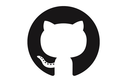
The mark (shown below) - a pared-down, negative silhouette of the Octocat's upper body - also offers a more formal approach to branding GitHub.
Article continues below 
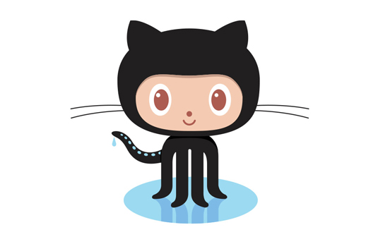
The Octocat itself - shown below - appears unchanged, though (and still, confusingly, only has four legs).

"We've worked hard to preserve the things that both we and the community love about the GitHub identity while improving the things we felt didn't fit," says a statement on the GitHub blog. "We have big dreams and now an identity that will suit them well.
Github has made all these assets free to download here to use on your sites and apps, as long as you do not imply that they represent your own products. Approved uses of the assets include the following
- Use the Octocat or GitHub logo to link to GitHub
- Use the Mark in social buttons to link to your GitHub profile or project
- Use the Octocat or GitHub logo to advertise that your product has built-in GitHub integration
- Use the Octocat or GitHub logo in a blog post or news article about GitHub
What do you think of GitHub's new logo? Share your views in the comments below!
Sign up to Creative Bloq's daily newsletter, which brings you the latest news and inspiration from the worlds of art, design and technology.

The Creative Bloq team is made up of a group of art and design enthusiasts, and has changed and evolved since Creative Bloq began back in 2012. The current website team consists of eight full-time members of staff: Editor Georgia Coggan, Deputy Editor Rosie Hilder, Ecommerce Editor Beren Neale, Senior News Editor Daniel Piper, Editor, Digital Art and 3D Ian Dean, Tech Reviews Editor Erlingur Einarsson, Ecommerce Writer Beth Nicholls and Staff Writer Natalie Fear, as well as a roster of freelancers from around the world. The ImagineFX magazine team also pitch in, ensuring that content from leading digital art publication ImagineFX is represented on Creative Bloq.
