Google's top secret lab gets a new logo
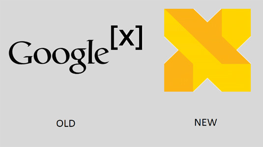
The mysterious Google X has changed its name and been given a futuristic new logo.

It appears it's all systems go when it comes to logo design in 2016. Hot on the heels of Microsoft's new logo for Bing, Google has rebranded its semi-secret research facility, Google X. Now christened as the even more cryptic X, this subsidiary of Google's parent company Alphabet also comes with a new logo.
X, the research facility famed for experimenting with futuristic technologies like Google Glass, driverless cars and drones, is now represented by a vibrant two-tone letter X that confuses the eyes with its optical illusion-style shading.
Quite why a secret research lab needs a distinctive logo isn't clear, but it's sure to generate strong opinions from designers who reacted to Google's controversial new logo last year.
The new name, however, reflects that X is separate from Google. This is a big benefit for investors who were growing concerned about the interchange of finances between the two different businesses.

So is this rebrand a clever piece of design work or a further step in the direction of cartoon villainy for a notoriously intrusive technology company? Let us know in the comments!
Liked this? Read these!
Sign up to Creative Bloq's daily newsletter, which brings you the latest news and inspiration from the worlds of art, design and technology.

Dom Carter is a freelance writer who specialises in art and design. Formerly a staff writer for Creative Bloq, his work has also appeared on Creative Boom and in the pages of ImagineFX, Computer Arts, 3D World, and .net. He has been a D&AD New Blood judge, and has a particular interest in picture books.

