Typographic illustrations for Ford's new ad campaign
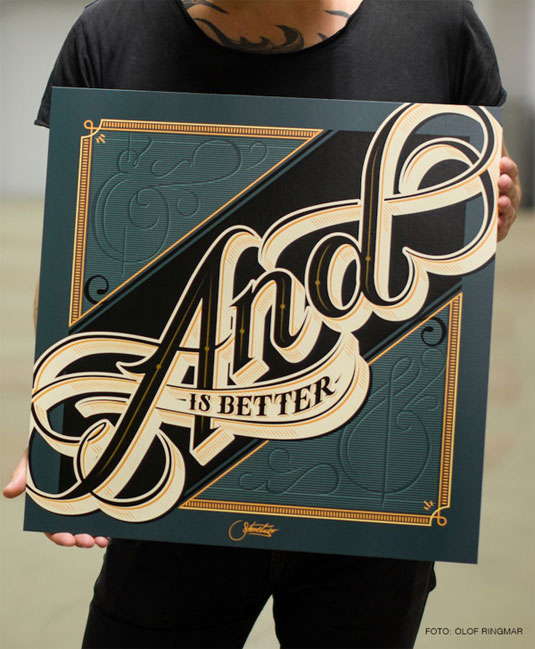
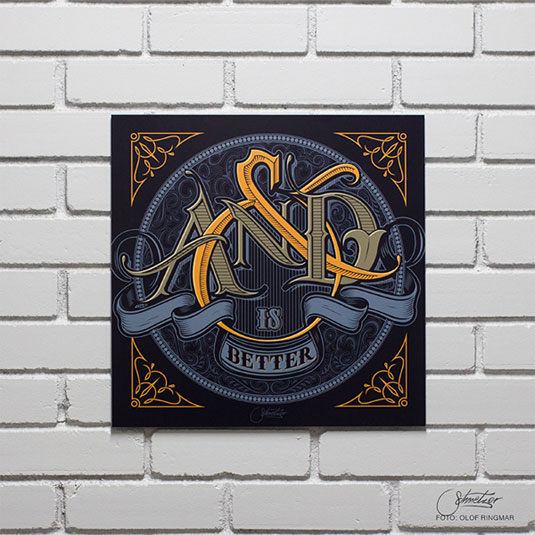
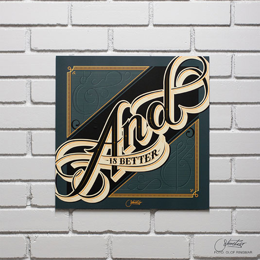
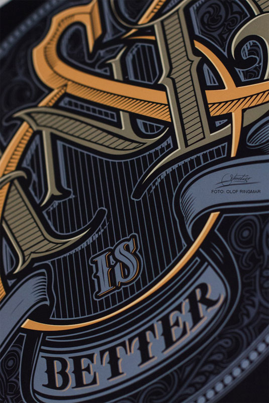
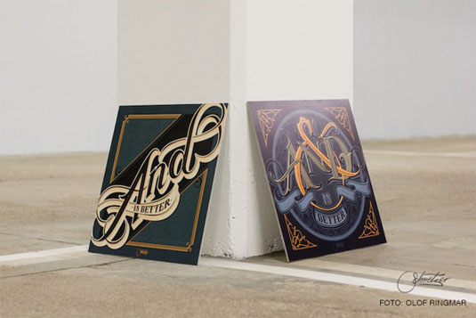
Martin Schmetzer was asked to design a couple of typographic illustrations for Ford Social and the results are beautiful.
Sign up to Creative Bloq's daily newsletter, which brings you the latest news and inspiration from the worlds of art, design and technology.
You are now subscribed
Your newsletter sign-up was successful
Want to add more newsletters?
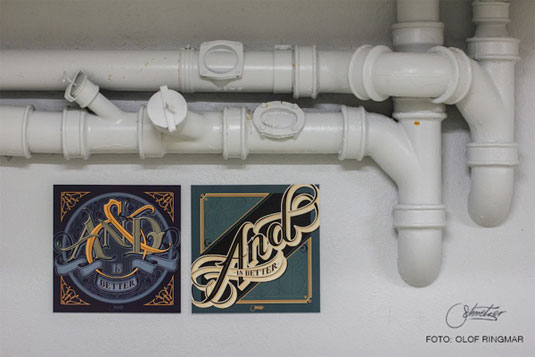
Stockholm based artist Martin Schmetzer was approached by Team Detroit to design a few typographic illustrations for car giant Ford's latest venture - Ford Social. As an artist specialising in hand-drawn typography with a high level of detail and diligence, Schmetzer has created two really rather wonderful logos.
Focusing on Ford's motto - 'there are times when less is more.
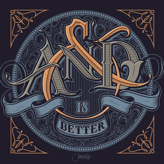
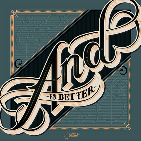
And there are times when more is more' - Schmetzer focused on creating a series of illustrations using the phrase 'and is better'.
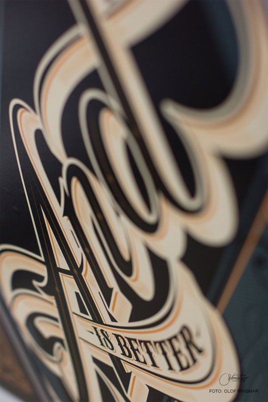
The grand scheme of the design makes Schmetzer one talented typographer. The swooping shapes, careful outlines and intelligent use of colour enables these typographic illustrations to give Ford a fresh, updated, yet classic look.
See more about the project via the And is Better tumblr.
Like this? Read these!
- Create a perfect mood board with these pro tips
- The best Photoshop plugins
- The ultimate guide to designing the best logos
What do you make of these designs? Let us know in the comments box below!
Sign up to Creative Bloq's daily newsletter, which brings you the latest news and inspiration from the worlds of art, design and technology.

The Creative Bloq team is made up of a group of art and design enthusiasts, and has changed and evolved since Creative Bloq began back in 2012. The current website team consists of eight full-time members of staff: Editor Georgia Coggan, Deputy Editor Rosie Hilder, Ecommerce Editor Beren Neale, Senior News Editor Daniel Piper, Editor, Digital Art and 3D Ian Dean, Tech Reviews Editor Erlingur Einarsson, Ecommerce Writer Beth Nicholls and Staff Writer Natalie Fear, as well as a roster of freelancers from around the world. The ImagineFX magazine team also pitch in, ensuring that content from leading digital art publication ImagineFX is represented on Creative Bloq.
