10 golden rules for digital icons
Iconography in the digital world is booming. Sandi Wassmer guides you through her 10 golden rules for successful icon design.
Iconography adds invaluable assets to an increasing portfolio of interactions. While icon design abides by principles of good design, it plays by its own rules. Here are 10 to get you started.
01. Design on purpose
Icons, like all elements of good design, must have a clear purpose. Before you even think about what sort of icons you want, you need to ask yourself: why? If your answer is "because they're pretty", then you should think twice before steaming ahead. In a visually overcrowded digital world even the prettiest icons will soon lose their lustre without meaning or purpose.
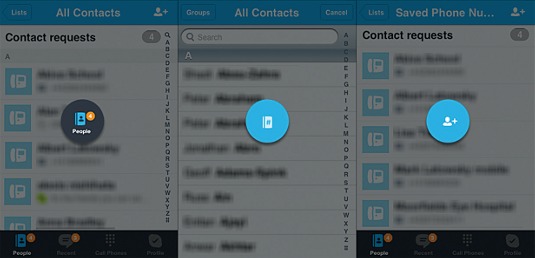
We're going to start by looking at navigation. Facebook and Twitter are great examples of very simple and practical usage of icons for navigation. Having text alongside the icons is vital for users. There are far too many instances where abstract icons are used inconsistently with or without text, or where conventions are disregarded, resulting in users being unable to find what they're looking for easily. For example, in the Skype iPhone app, there are three different icons used for finding people. The icon in the bottom navigation bar is a modified version of the iOS Contacts thumbnail icon. The icon for finding your contacts when using the dialpad is a notebook with a # in the centre. The icon for finding Skype users not in your Contacts is a head, shoulders and a +. Eh?
Article continues belowWhen it comes to UI design, whether you're creating an interface from scratch or modifying an existing one, icons can bring cohesion and meaning to your design. If you're designing an ecommerce site, it's a given that you will have a checkout icon in a prominent location somewhere near the top right of the screen, not just a link. You may call it Checkout, Basket, Your Items or Shopping Cart, but in accordance with the principle of consistency, the icon used should reflect its name.
Amazon calls it a basket and uses a hybrid basket and trolley icon. Majestic Wine's shopping trolley features its minimum-six-bottle purchase policy. With each bottle added, one of the six greyed-out wine bottles change colour to let you know when you've met the minimum requirement. Sweet. ASOS defies convention and doesn't use an icon, so users have to look that little bit harder to buy their stuff.
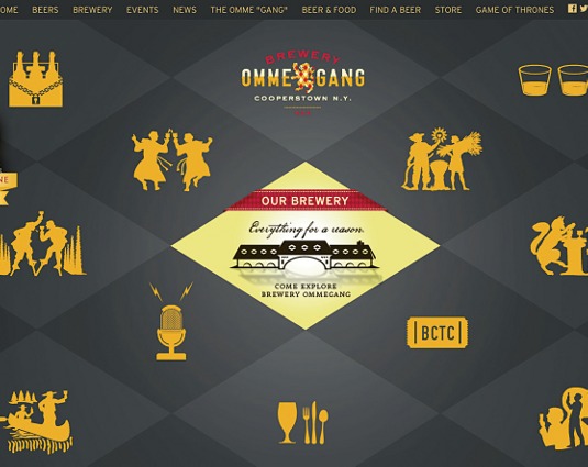
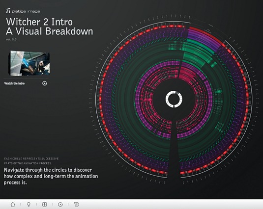
The bigger picture of overall UX benefits from this fine attention to detail as much as it does from finding the right balance in the interplay between icons and other graphical elements. Go too subtle and icons can get lost. For example, navigation icons on the The Witcher site are tucked away at the bottom of the page and are completely overwhelmed by the design. But make icons too prominent and they overcrowd your design, as is the case with the Brewery Ommegang website; so much time and attention has gone into icon interaction, but it doesn't need so much. This is where the 'less is more' philosophy prevails.
Although the thought of tables may make you want to run for the hills, the use of icons and a clear legend within a tabular structure can bring order to unwieldy information. The summary five-day BBC weather forecast is the most immediate and prominent feature on the BBC Weather site. Using conventions that are understood all over the world, it even circumvents the need for a legend.
Sign up to Creative Bloq's daily newsletter, which brings you the latest news and inspiration from the worlds of art, design and technology.
With limited real estate and even more limited attention spans, iconography in the digital domain could easily become a language in its own right, but this would be a dangerous game. To bring text to life, simple icons are now being used rather than images or other graphical elements. The Symbolicons website demonstrates a fun way to tell a story with a mix of text and icons. The Veggie icons are warm and welcoming.
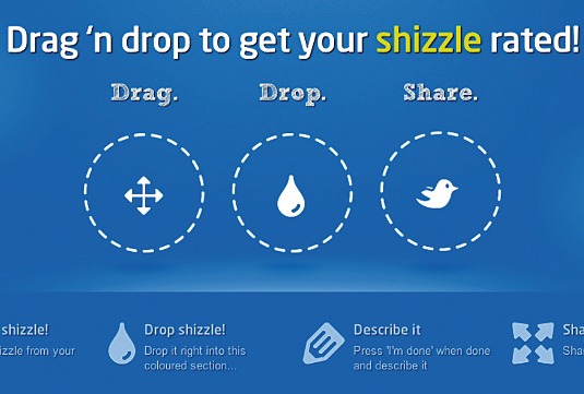
Whether they are in digital or hard copy format, text-only instructions make for strenuous reading. Such text is easier to understand with the inclusion of well-paced icons. The right amount of white space is part of the equation, but strategically placed icons serve to summarise as well as enhance. Rate My Shizzle's instructional icons flow with the copy, providing complementary text and graphical routes to Shizzle success.
Emoticons come to mind when mood and emotion are mentioned. But, influencing feelings is much more subtle than using emoticons, which makes it difficult to get right. Assuming that you've got your colour theory in check, it's all about metaphors. When the wrong meaning is conveyed, things can go terribly awry. eHarmony's icons are intended to evoke the desire to date, but they are too clinical and leave users feeling cold.
02. Know your audience
Understanding how your users will interpret your icons relies on a few sub-rules.
- Don't assume: We all know what happens when we ASS U ME.
- Five Ws and one H: You need to know who your users are and why, what, how, where and when they use your service.
- Make metaphors meaningful: You can't please all of the people all of the time, but if your metaphors don't convey the same meaning to a high majority of your users, then find new ones.
- Consider cultural norms: In most countries around the world, thumbs up is understood as a sign of acceptance. But in Thailand it's the equivalent of sticking your tongue out at someone.
- Use the appropriate language: If you are only serving one country, or you can localise your service, then consider language variations. If your service is global, appropriate icons are great for overcoming language barriers.
03. Planning is essential
Creating and integrating icons into your overall design requires careful planning and attention to detail.
You'll need to consider:
- Where icons are needed. Map out where in your design you want to use icons. Consider how integral they are to your design. Do you only want to use them in global sections, such as the footer, or do you want to use them intermittently with specific content types, such as on product pages in an ecommerce site?
- How often icons will be used. Consider how many icons will be used more than once, or how many variations of a single icon are required. Think about the different applications of the icons. Let's say you're using a responsive design framework for your website and you're also designing an iPhone app. You may be able to use the same icons in the website and app, or it may be best to serve these platforms separately.
- How icons sit in the overall design. In terms of the look and feel, the icons will need to work within the whole interface. Of equal importance are decisions about location, size and how many to use. This includes how your icons will work alongside other graphical elements.
- Will text suffice? Once you have considered the detail, stand back and ask yourself if text will suffice. If text will do the job, then let it. The internet is cluttered enough as it is.
Before going ahead, you'll need to get to grips with the key aspects of planning and workflow.
Stage 1: Plan
Get the niggly bits out of the way and then get on with being creative. Ask yourself the following questions to help you with planning.
- What's the message to convey? If you've gotten this far, then each icon you want to create has a purpose and it's now imperative that you are absolutely clear about how you want to communicate that purpose. Your icon can be literal or metaphorical, but you'll need to make sure that you get the meaning right.
- Is there a convention? Whether literal or metaphorical, if a convention already exists, you should follow it. If there's no convention, proceed to the next step.
- What's the context? Context is like glue. If your icons are right, they'll stick to it. If not, they'll stick out like a sore thumb. You're probably familiar with the safety sign used on building sites to indicate that hard hats must be worn. If you take this out of context and place it next to the cloakroom area in a restaurant, visitors could be forgiven for thinking they were meant to hand in their hats. Even though a convention exists, it's reliant on context.
- Does it make sense? This is pure logic, but when you're getting into the minutiae you may lose perspective. It's helpful to question whether the purpose, message, design and context of a site are coherent.
- Does it already exist? After all of that, you may find that the same or similar icon is already in use somewhere else in your design. Check and double-check.
- Can you draw inspiration from elsewhere? Surf the internet, look at books and see what's current, what's outdated, and what other people are doing. I'm not suggesting that you copy others' work; I'm suggesting you draw inspiration from wherever you can find it.
Stage 2: Design
Whether you're designing a 16-pixel icon or a 16-room house, getting a sketch pad out is a vital part of the creative process. Once you click that mouse, you're constraining your creativity to the available hardware and software. Of course, without hardware and software, designing for mobile and web platforms would be impossible, but don't start digitally.
Fonts, icons, colours and styles need to be consistent within their own families and harmonious within their extended families. If all of the elements work across one platform, replicating the same balance is necessary so all of the designs for the individual platforms also form a harmonious family. Gradients, shadows and perspectives must be consistent too.
Think hierarchically and consider all of the elements in order of importance. Approach this in the same way you do header nesting in HTML and apply the right sizes, shades and opacity to levels of importance.
04. Size really matters
The promise of nascent technologies, such as SVG and icon fonts, is yet to be realised, so for now we have to think about size and scalability. Most icons are output as .png files, which allow for pixel perfection and are a significant improvement on their predecessor, the .gif.
However, the .png doesn't scale, so you can't just design a single icon and resize it. Not only does this result in pixelation when you scale up and blurriness when you scale down, it hampers creativity and decreases the quality of the whole design. Smaller icons require less detail, with larger icons requiring a deeper and richer design. Whatever the size, icons must be born of a single design and subtly adapted for each size iteration.
You must design for specific destinations and contexts. The different mobile, tablet and desktop platforms specify sizes for consistency within each platform but there is no consistency between platforms. However, favicons are generally 16 pixels and common sense prevails when designing icons to be used in situ.
There are different schools of thought about how to approach icon design. The top-down approach is to design for the largest screen size (most likely desktop) in the most detail and to refine for each iteration down the scale to achieve the crispest icon in the smallest size.
There's also the mobile-first approach, designing the smallest icon first and then adding detail as you scale up. Both have their merits, but if you're not an experienced icon designer than you'll probably find it best to work top-down as it's easier to refine and remove detail than add it.
05. Use a single icon family
It's essential to get the right balance of consistency within icon families to prevent the overall design becoming uniform, flat and dull. Harmony prevails when it comes to marrying icons with UI and other graphical elements. For example, Luhse Tea's navigation icons are cohesive; they look, feel and tell the same story. In contrast, the relationship between JIB's icons is a mystery, even though they have the same design style.
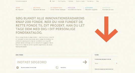
With apps, a lot of the decisions about style and size have already been made, but it's important to apply the same sort of reasoning that lies behind the different SDK guidelines. Align purpose with size and style. When using icons for navigation, for example, make sure that the size, style and colours let the user know these are navigation icons. Don't use the same icons in other instances: it will be confusing. Make it easy for users to identify the focus of your site. If navigation is less important than search in your design, then ensure navigation icons are less prominent in style, size and weight to allow users gravitate towards search. For example, on the GOV.UK website, the use and positioning of the elements creates a clear focus on search. On the other hand, the use of an arrow as both a decorative and interactive element on the Innovationsradar website disturbs the flow.
06. Don't reinvent the wheel
Similar to adhering to conventions, if there's an open-source or off-the-shelf icon family that meets your needs (or even that nearly meets your needs and would only require a bit of tweaking), then it's probably the best bet. Only if you're working for an internet giant is bespoke best. EqualEyes is an Android app for making smartphones more accessible to the blind, visually impaired and elderly. It uses the open-source Font Awesome family, which is ideal for its target audience and platform and a great example of when off-the-shelf suits.
While it's important to stick with conventions, you can and should put your own stamp on things: just not to the point of abstraction. Alexander Bickov's campaign to save Christmas trees from extinction may be well intended, but misses the point by using arrows instead of trees. And remember that whatever you create must stand up under the scrutiny of brand guidelines.
07. Be familiar with formats
Although .png is the most common image format, particularly for multi-platform design, understanding different formats and being able to assess their merits in light of your project's needs is best practice. Here's a quick overview:
- GIF: Graphics Interchange Format. The granddaddy of image formats. With only 256 colours, quality is an issue. GIFs don't scale, only support a single transparency and should take early retirement.
- PNG: Portable Network Graphics. The successor to the GIF is higher quality, with millions of colours and supports alpha transparencies. However, like the GIF, PNGs aren't scalable. In the absence of any fully supported alternatives, PNGs are the best format.
- SVG: Scalable Vector Graphics. Universal and scalable vector graphics are the ideal. However, this format isn't fully supported by older browsers, suffers from anti-aliasing and, despite its scalability, one size still doesn't fit all.
Icon fonts
With cross-browser compatibility and total scalability, icon fonts may seem like a viable solution. However, the lack of pixel precision, onerous rendering processes and the resulting semantically incorrect markup make these a no-go.
The pixel is a single unit of measurement and is still the smallest unit on any screen. But not all pixels are treated the same. The myriad of different screen sizes, coupled with higher-quality screen technologies such as the retina display, have effected a change in the life of the pixel. Screen resolutions are no longer about a device's size, as the PPI (pixels per inch) setting is now just as important as the number of pixels.
In order to complicate matters even further, Android has introduced the DP or DIP (density-independent pixel) to deviate from the good old-fashioned pixel, but time will tell if it persists.
08. Leave other brands alone
It's standard practice in the interactive universe for designers to take other brands' icons and logos and manipulate them to suit their own design. Don't do it.
There are too many instances of social media graphics being stretched to obscurity to convince this marketer otherwise. The Twitter and Facebook logo mashup on the Lost Phone Experiment is proof positive.
09. Keep icons in their place
Just because there are icon sets popping up all over the internet doesn't mean that you're obliged to use them. Icons will bring drab content to life, but they shouldn't take on a life of their own. Instead they should play a supporting role. As a rule, they should never take centre stage; that's reserved for a brand's identity.
The emerging best practices for icon design on digital platforms are born of generally accepted design principles and specific attention is being paid to the placement of icons.
- Backgrounds. The evolution from the GIF to the PNG has brought increased flexibility with transparencies. With GIFs, it's like an on/off switch, as you can only select one colour to be transparent. With the PNG format came the alpha channel, allowing for gradients, opacity and anti-aliasing, so backgrounds can be manipulated for greater effect, within the icon itself and in light of integration with your entire design.
- Positioning. Where icons sit is one thing, but the concept of positioning is just as much about perspective, depth of field, shadows and dimensions.
- Contrast. It's important to set some rules out for contrast early on. Considering how much attention each icon or group of icons will have at the outset will give your overall design a feeling of balanced space. Not doing so invariably results in bottlenecks and makes your design feel off-kilter.
10. Balance form and function
Form and function in design is an area that's frequently debated, with some backing form over function and vice versa. The reality is that neither is more important than the other. Designing great icons is a constant balancing act, where form and function meet in a seemingly effortless union.
After all is said and done, your icons will be a success if they are simple, symbolic and iconic.
Words: Sandi Wassmer
Sandi Wassmer is a digital technologist, inclusive design radical, marketer, writer, speaker, government adviser and occasional sleeper. Her zeal for UX is inspired by good design, in particular industrial design and architecture.
This article originally appeared in net magazine issue 247.
Liked this? Read these!
- The best places to find high quality free icons
- The ultimate guide to logo design
- Our favourite web fonts - and they don't cost a penny

The Creative Bloq team is made up of a group of art and design enthusiasts, and has changed and evolved since Creative Bloq began back in 2012. The current website team consists of eight full-time members of staff: Editor Georgia Coggan, Deputy Editor Rosie Hilder, Ecommerce Editor Beren Neale, Senior News Editor Daniel Piper, Editor, Digital Art and 3D Ian Dean, Tech Reviews Editor Erlingur Einarsson, Ecommerce Writer Beth Nicholls and Staff Writer Natalie Fear, as well as a roster of freelancers from around the world. The ImagineFX magazine team also pitch in, ensuring that content from leading digital art publication ImagineFX is represented on Creative Bloq.
