10 pro tips to get people to trust your site
Users decide quickly if they trust an interface based on its appearance. Keep them on your side by following Jason Cranford Teague's UX tips.
In the report 'Truth, Lies and the Internet', think tank Demos found that a third of teens polled in the UK believe any information found online was true without qualification. Even more staggering is that 15 per cent of that group admit to making a decision about the truthfulness of the content of a web page based on appearance alone.
Design serves a single primary purpose: to gain the trust of its intended audience. Research shows that within the first second of viewing a design, even before reading a single word, we've already determined our opinion about the likely quality and trustworthiness of what we're looking at.
Once that basic line of trust is established, it's only then that the experience design can work to help turn data into knowledge and knowledge into understanding. However, a poor user experience can serve to turn the user off as they begin to distrust the product or even the entire brand.
Article continues belowExplaining design decisions to non-designers is a challenge. What I've come to realise over the years, though, is that the decisions that I make are not just instinctual. These decisions are based on what I feel will appeal to my audience's sense of trust. That is, what will make them feel most comfortable and trusting in my designs. When I can explain decisions from that context, I find it's a lot easier to get clients, managers and other team members on board with the direction I want to take.
Based on my experience, here are 10 top tips for building trust through design.
01. Keep promises
The most obvious way to lose trust is by breaking promises. As soon as you promise something and that thing does not happen, your audience immediately becomes suspicious of everything you do. Broken promises in a user interface can happen in a variety of ways, but they occur most often when business or technical needs conflict with user experience.
For example, not too long ago, when you clicked the mail link on Yahoo, rather than taking you to your email, an advertisement would take over the screen forcing you to be marketed to. When I click the link to go to my email, the implicit promise is that my email will be the next thing I see.
Sign up to Creative Bloq's daily newsletter, which brings you the latest news and inspiration from the worlds of art, design and technology.
This ad 'hijacking' is an all too common pattern in web products that are trying to monetise every click. But, if you find yourself thinking of doing this ask, 'Am I training my users to distrust that they will immediately get where they said they wanted to go when they clicked on my link? Will they then go someplace else?' The good news is that Yahoo seems to have amended its ways. Updates to Yahoo mail will take the user immediately to their email.
02. Be consistent
An inconsistent interface is a special form of a broken promise. When you set expectations about how a particular interface element works and reacts, changing that interaction or introducing different UI patterns to achieve similar goals will confuse your users. The problem is that, especially if you're working with a large or distributed team, decisions can be made in a different place or time that are inconsistent, and these inconstancies can become magnified over time.
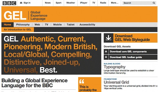
More than simply a style guide, a strong design guide can help alleviate the problem of inconsistent user interfaces. The design guide forms a central point that all team members can go to for consistent answers and design patterns as well as the design philosophies being applied that will help guide the decisions of new patterns.
For the most part, design guides are closely held trade secrets, but The BBC Global Experience Language, or GEL, is an example open to the public.
03. Be clear
Unclear design can lead to user confusion and distrust. Guidelines for optimising clarity can often feel at odds with design, especially when it comes to considering how text and colours work on the screen to improve readability. Yet users who have to struggle to read content are less inclined to trust it.
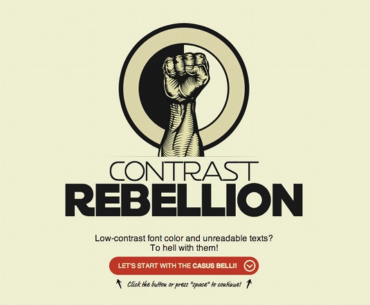
The website Contrast Rebellion rallies against the use of low contrast foreground-background colours in design, arguing that these designs are unclear and difficult to read.
The site urges, "Don't give your visitors a headache only because grey or any other low-contrast font colour looked better on the design comps than black."
04. Respect context
If content is king, then context is queen. The architect Eliel Saarinen observed that we should "always design a thing by considering it in its next larger context – a chair in a room, a room in a house, a house in an environment, an environment in a city plan." This is true of web design as well.
A button is never just a button. Consider it in context: a button in a module, a module in a section, a section in an article, an article in a web page, a web page in a website.
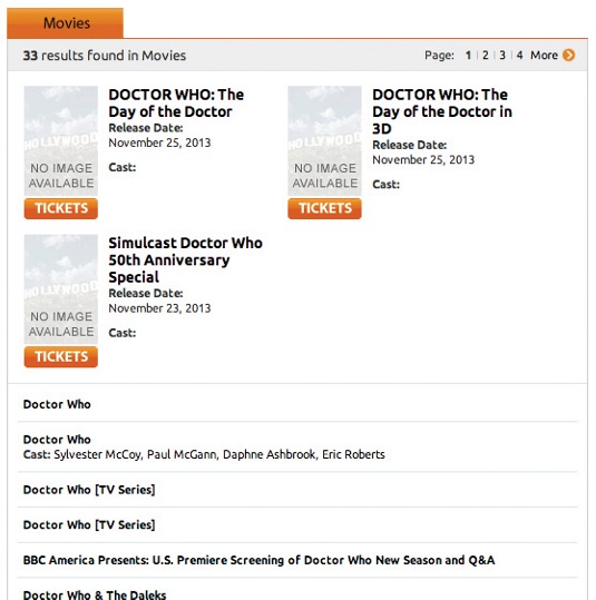
I recently attempted to purchase tickets for the Doctor Who 50th anniversary simulcast from a popular US ticketing website. I knew tickets would go fast, so I logged in early, found the event, and clicked an image above a button that said 'Tickets'. This took me to a 'Coming Soon' page, which I assumed meant the tickets were not for sale yet. I waited patiently, refreshing the screen every so often but the message never changed. I waited past the announced open time. I finally started over, this time casually clicking the button that said 'Tickets' rather than the image immediately above it. I was taken to a completely different page where I could have purchased tickets if they hadn't already all sold out.
The button placed in context to the image above fooled me into believing that they were a single entity when they were two completely separate actions. As a result, I missed out getting tickets to the Doctor Who 3D simulcast.
05. Know your voice
A strong voice can change the world. People inherently trust a confident and unwavering voice, but that voice needs to be your own.
Lauren Bacon, founder of Curiosity Labs and author of Curious for a Living: How Asking Better Questions Makes You Indispensable, tells me, 'I've had clients ask me to design them something 'just like [insert brand here]' , and my response to that has always been, 'great – tell me what you love about that brand/company/website'."
Clients will often ask to look like other products that they know and respect, but this is really just shorthand for saying that they want to be perceived in a similar way to that brand. Yet as designers it is our job to help them express themselves and their own unique values. Bacon recommends, "Each time it happened, I simply pointed to the legalities of copyright and then steered them into a discussion about the importance of differentiating themselves from the other brands in the marketplace, and that sufficed to get us back on track."
06. Show results immediately
Cause should always lead to effect as quickly as possible. When visitors put something into a system, they expect to see results without delay. This can happen in small ways by having controls that respond to user actions with colour changes or small movements, but it also happens in larger ways, such as when the user begins to search, displaying changes to the results updating in real time.
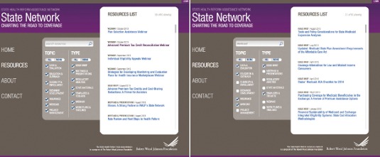
In a recent project I designed for the State Health Reform System Assistance Network, I designed a search engine for its resource documentation that immediately filtered the list of options.
07. Transition changes
Humans suffer from change blindness. We have difficulty detecting even substantial changes in our environment unless there's an obvious transition in the states. One famous experiment had hotel guests walk up to the reception desk, where the clerk would engage with the customer for a few seconds and then pretend to drop their pen, disappearing behind the reception desk. After a few seconds a completely different person would stand up and pick up the conversation where their counterpart had left off. The overwhelming majority of customers didn't notice that they were dealing with a completely different person. I suspect more than a few of them did feel that something was not quite right even if they didn't know exactly what it was.
This is how the web works, with uncomfortable breaks as pages load or change, disrupting the user and making them feel uneasy as to what is different.
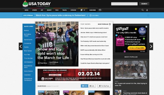
One way USA Today has overcome change blindness on its website by creating definitive and consistent transitions either using slides, cross fades and pop-ups whenever new content is loaded, so that the user never loses the context of where they came from.
Andres Quesada, the creative director in charge of the USA Today redesign, says, "We wanted the user to feel like they never left the experience. It was important to us from the beginning to set that as a rule. Loading the article or section front was too disruptive."
08. Guide, don't dictate
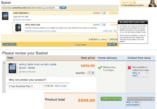
No one likes to feel coerced or tricked. When you take choice away from your audience or make choices for them that they wouldn't likely make for themselves, then, you're betraying their trust.
One common pattern we see this in is with pre-checked options that often have us sign up for newsletters or offers from third parties. In some cases, even purchasing add-ons we may have to pay for but don't even realise were paying for.
09. Make it simple, not simplistic
Steve Krug tells us 'don't make me think' in his book Don't Make Me Think, Revisited: A Common Sense Approach to Web Usability. However, he doesn't tell us 'don't let me think'. This is an important distinction. Your audience is not stupid, and as soon as you begin to treat them as anything other than intelligent human beings, they will turn on you and look to someone who treats them with some respect. User interfaces should feel natural and easy to use, but that doesn't mean that you also remove all options, only that they are presented honestly, constantly and clearly.
10. Never leave them wanting more
The old theatre adage is to 'always leave them wanting more'. But, why would you want to take advice from a bunch of thespians constantly telling each other to break a leg?
With user experience, the exact opposite is true: you never want to leave your users without options or lead them down a blind alley. As soon as you do, you've lost them. Use these 10 top tips as a starting point towards establishing and maintaining users' trust.
Words: Jason Cranford Teague Illustration: Mike Brennan
Jason Cranford Teague is a UX lead at Gannett Digital and author of the bestselling 'CSS3: Visual Quickstart Guide' and forthcoming 'The New Web Typography'. This article originally appeared in net magazine issue 252.

The Creative Bloq team is made up of a group of art and design enthusiasts, and has changed and evolved since Creative Bloq began back in 2012. The current website team consists of eight full-time members of staff: Editor Georgia Coggan, Deputy Editor Rosie Hilder, Ecommerce Editor Beren Neale, Senior News Editor Daniel Piper, Editor, Digital Art and 3D Ian Dean, Tech Reviews Editor Erlingur Einarsson, Ecommerce Writer Beth Nicholls and Staff Writer Natalie Fear, as well as a roster of freelancers from around the world. The ImagineFX magazine team also pitch in, ensuring that content from leading digital art publication ImagineFX is represented on Creative Bloq.
