10 website trends that defined 2015
How did the web look and feel in 2015? We look back at some of the biggest web trends of the year.
Sign up to Creative Bloq's daily newsletter, which brings you the latest news and inspiration from the worlds of art, design and technology.
You are now subscribed
Your newsletter sign-up was successful
Want to add more newsletters?
What makes a site look modern and what makes it look dated? Every year, survival of the fittest chooses which trends work and which ones don't. With 2015 coming to a close, we can now pinpoint the most successful trends of 2015, the ones that define the year's style and show enough strength to carry forward into the new year. Here are our top ten design trends expressed in 2015.
01. Long scrolling
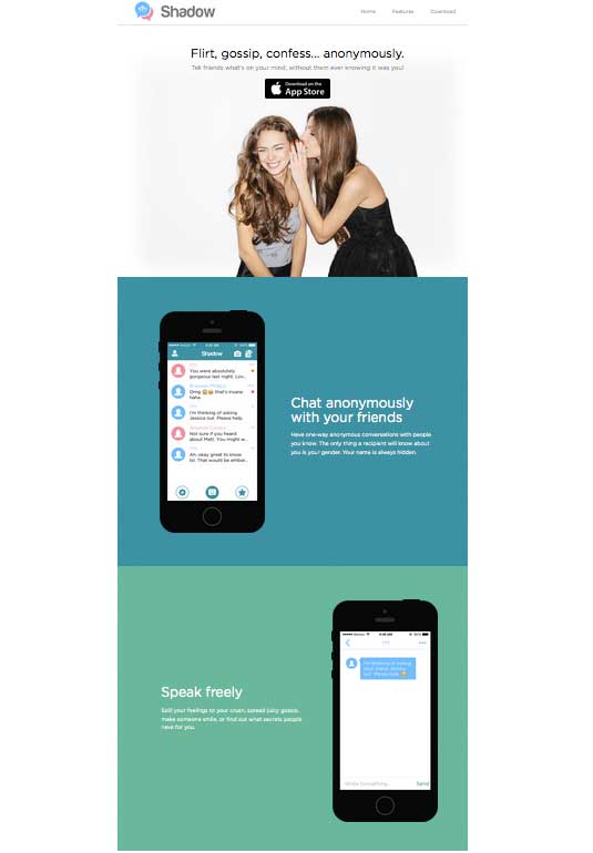
With mobile browsing now exceeding desktop, 2015 saw web design catering more to smaller screens. Like many of the trends on this list, long scrolling became popular for its usefulness in responsive design: smaller screens means longer scrolls.
In the past, designers feared placing content below the fold, but new research proves that users don't mind scrolling. Today, designers and users alike are recognizing the value of long scrolling: more creative freedom, improved storytelling, stronger interactions, and simplified navigation (if the site is small enough).
These benefits come at a cost, though; negative SEO effects and longer loading times, among the worst. Long scrolling works best for sites with heavy mobile traffic or frequently updating content, and is less effective for sites with heavy media like videos.
Best practices
- Use a sticky navigation menu or a jump-to-section option to improve navigation. Long scrolling and single-page sites are susceptible to disorienting users, so put a safeguard in place.
- Draw out the playful aspects of long scrolling with effects such as parallax and scrolling-triggered animations
- Avoid the negative SEO effects by following the advice in this Moz article.
02. Card layouts
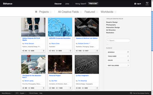
Another practical trend popularized by the mobile movement, card layouts display a wealth of content in a clean, organized manner. This makes them best suited for browsing diverse and dissimilar content, especially linking to external sites: users intuitively know clicking on the card brings them to the related post.
As explained in the guide Web Design Trends 2015 and 2016 by UXPin, cards work best as separating content into digestible doses, each one containing only the data a user needs to know:
Sign up to Creative Bloq's daily newsletter, which brings you the latest news and inspiration from the worlds of art, design and technology.
- Title
- Enticing image
- Description (or relevant tags)
- Control panel with options like favoriting, commenting, etc.
Cards work exceptionally well with responsive design, because their rows and columns can be automatically rearranged to fit different screen sizes.
Best practices
Make the entire card should be clickable, as opposed to only the image or textual links. Fitts's law states that this makes interacting easier.
Combine cards with animation, especially hover-triggered effects. Small extras — changes in colour or the entire face of the card, or even spinning or twirling effects — add life to the heavily structured format, but new and creative applications can set your site apart from the many others using cards.
The negative space between cards, called "gutters," should be clearly defined. Don't make users guess the boundaries.
03. Flat design reimagined
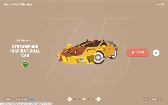
Years ago when skeuomorphism was (ironically) a modern trend, flat design emerged as an adversarial alternative.
However, the flat design today is a far stretch from its origins. The new, more nuanced iteration of flat design — Ryan Allen calls it 'Flat Design 2.0' — offers more opportunity for details and flourishes. The new flat design that dominated 2015 took on the characteristics of:
- Lighting glares and highlights
- Gradient and/or drop shadows
- Greater values for detailing
All-in-all, though, flat design remains flat at heart.
The general simplicity and minimum embellishments haven't gone anywhere. Its almost-cartoonish graphics, legibility-first typography, and playful colours remain unchanged, and keep the style as one geared for easy comprehension.
Best practices
- Ghost buttons, with transparent backgrounds framed only by an outline, emerged as a trend within a trend. Fortunately, ghost buttons can be used outside of flat design: these functional controls don't detract from a prominent background image, making them a popular addition to hero images.
- The beauty of flat design's simple graphics is that loading is a breeze. This works perfectly for responsive design.
- Flat design pairs well with the minimalism trend (see 10). Both strive for increased comprehension through simplicity, and both adhere to "less is more."
04. Powerful animations
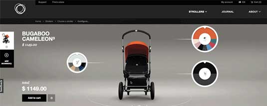
Animations took on more duties and responsibilities in 2015, reaching beyond aesthetic value to serve more practical roles.
Because motion attracts attention, animation can influence the visual hierarchy of what gets seen first. Animated effects can advertise certain elements over others, with the potential to contend with more traditional aspects such as size or colour.
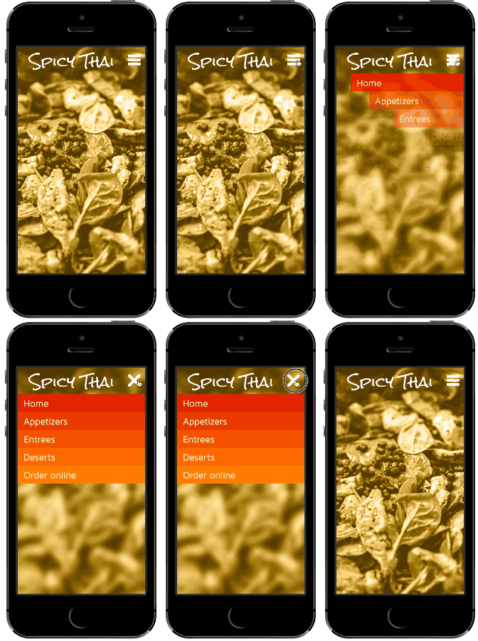
Animations also have the power to show relations. Think of an animated effect around minimizing a window, where it shrinks and then flies into the menu — this animation first confirms the action's success, but also shows the user where on the menu they can view the window later.
The fly-in menu, as prototyped below in UXPin with the no-code animations editor, demonstrates this principle perfectly.
At the very least, animation highlights otherwise dull actions. A hover animation shows a link is clickable more than a simple colour change.
Best practices
- Web and app animations can still make use of Disney's classic 12 rules of animation.
- Long scrolling formats rely heavily on animation to create the appearance of smooth scrolling. When done well, animations triggered by scrolling create a more immersive and entertaining site.
- Loading screen animations are a staple for good reason: they give users an estimation on time, and entertain them while waiting.
- Subtle animations in a background image can energize a page and keep it from being dull… as long as they're not excessive. Too much background movement distracts the user from the main content, not to mention increases loading times.
05. Mesmerizing photography
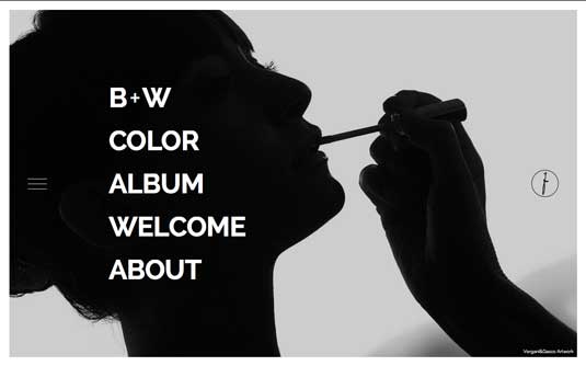
With the popularity of HD screens in 2015, designers started paying more attention to the artistic quality of photographs. More sites rely on breathtaking photography for their visual presentation instead of digital graphics.
Among the photography trends of the year, the hero image reigns supreme. By filling the entire background with a single image, sites create highly immersive experiences that can draw users in more quickly, making them perfect for landing and login pages.
There is a lot of flexibility in hero images, too. The tone and message can be changed for any site, as long as the photograph matches the goals.
Best practices
- While custom photography is often more personal, stock photography is a viable option for designers trying to save time or money. For the best of both worlds, combine them in such a way that the custom photos make the stock photos also seem custom — for example, consistent themes through both custom and stock. For free stock photos, try Unsplash, Pixabay and Pexels.
- Colour overlays allow designers to manipulate how an image is perceived based on the colour's attributes. Giving an otherwise dismal photo a yellow or orange overlay will make it appear more upbeat and friendly.
- Ecommerce sites have started replacing traditional product images with photographs of the product in their natural environment. Providing context around what it's like to actually own the product has been proven to increase sales.
06. HD backgrounds
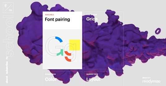
Working together with trends in photography, the use of HD backgrounds also rose in popularity this year. With more and more people owning HD devices, it was just a matter of time.
We see HD quality for video, as well as the hero images described above. Browsers and internet speeds can now handle more video, and cinematic backgrounds tend to be more effective at atmosphere and emotional connections than a stagnant photograph.
HD is another resolution greater than 200 ppi (dpi), while standard definition is 72 ppi. This makes images designed with SD in mind appear blocky or blurry on HD devices, but HD images appear fine on SD. That means users with SD displays won't notice the difference — but those with HD wil.
Best practices
Scalar vector graphics (SVG) translate images using lines and points, not pixel-for-pixel like raster formats (.jpg, .png, .gif). Use them when you can for new graphics, and save raster formats for real-life images and video because they have a fixed number of pixels from the start — that's why it's important to capture the media in HD from the beginning.
Most devices' backgrounds will not conform to the usual 1:1.5 aspect ratio of cameras, so take an active role in cropping. Otherwise, you won't control what's cut and what's seen.
Don't let the superior visuals of the background overshadow the more important elements of the page.
07. Bold typography

With font rendering no longer a concern and the availability of new, free fonts, typography has begun playing more of a role in web design.
Bold typography refers to text that draws attention to itself, but is not necessarily wild or elaborate. In fact, simple typography is sometimes the most bold. Along with flat and minimalist trends, current typography also favors simplicity. A sans serif typeface set in a thick styling makes a visual statement while improving readability.
Regardless of the font, one of the most common uses of typography this year is extreme size. This could be large or small — the trend is simply bringing typeface to its extremes.
Best practices
To keep it simple, start with just two fonts per site. For variety, experiment with more typefaces, but stick within the same typeface family.
Remember the primary goal of typography is legibility and readability. It doesn't matter how impressive your typeface is if it's not understood.
With enough emphasis on visuals, bold typography can take over the role of an image on the page. Text can also be eye candy, and it's common to see pages with beautiful text as the central focus.
08. Involved interactivity
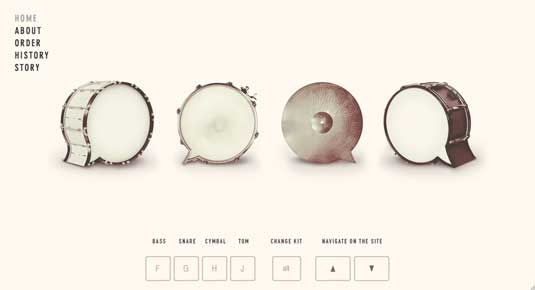
The advancements of HTML5, CSS, Javascript, and jQuery now allow deeper interactions, a powerful tool for all businesses. Users are now more involved, with more visual stimulation, stronger content, and more engaging controls. This year saw an increase in:
- Clickable/swipe-able elements
- Personalization (especially geolocating)
- Control over revealing content
- Video and animation
- Scroll-based navigation
- Transitions and loop functions
- Push notifications
The increase in interactions also means an increase microinteractions.
As explained in Web Design Trends 2015 & 2016 by UXPin, microinteractions are the minutiae of interactivity: a ding sound when you send an email, or an animation to draw attention to a new notification. Interaction design will only get more intricate, making this a trend that's sure to stick around for a while.
Best practices
Well-known signifiers — such as a hamburger icon labeled "MENU" to communicate a pullout menu or a play button representing a clickable video — bypass explaining functionality and so make interacting easier.
Keep the user's goal in mind. Every step of the design process should be tweaked to help the user accomplish their goals faster. Personas, user scenarios, and experience maps mentioned in UX Design Process Best Practices work best for understanding your users and their goals.
A product's interactivity is its role in the conversation with the user. To better understand user flows, try role-playing between user and interface, where one person actually speaks for the future site.
09. Bright colours
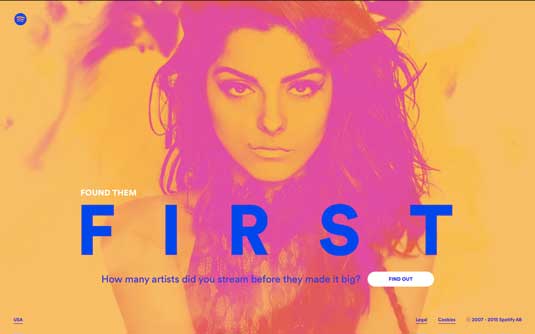
As we see with the popularity of flat design, the general trend with visuals is happy and more upbeat.
Bright, "happy" colours match that tone with a lighthearted, friendly appeal, and are today more accessible. In the past designers were limited to 216 web-safe colours, but now there are millions, an advancement timed nicely with the rise of HD screens.
Bright colours offer more than just a more upbeat aesthetic. Attention-grabbing colours reduce the likelihood of a site appearing dull — minimalism's natural weakness. When used actively with typography, colours can draw attention to certain words or phrases. Moreover, colours serve a valuable function for suggesting usability: think of cards that change colour when hovered over, an obvious indicator of interactivity.
Best practices
- Each colour elicits a different emotion, so choose the right ones to match your product's personality.
- More colours isn't always better. Monochromatic schemes use different shades of the same colour to create a more unified interface, and make a strong visual statement when paired with bold typography.
- The 3 main colour schemes can create the perfect contrast on your site.
10. Minimalism
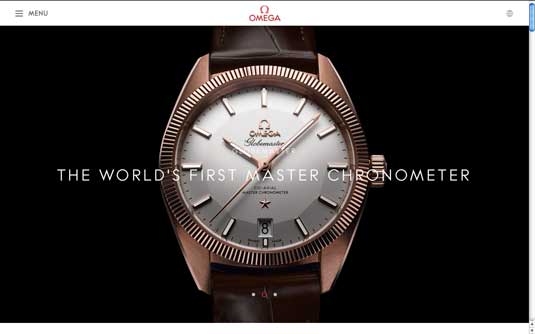
I'll end with another result of increasing mobile traffic: minimalism, a style defined by using only the bare essential, or minimum, elements.
In the example above, OMEGA includes only what's necessary: language settings, expandable menu, and the logo for returning to the home page. This draws attention almost exclusively to the hero image of the product.
Visually, minimalism adds an air of sophistication to the site, no matter the genre. But on a more practical level, trimming the fat cuts down loading times, enhances readability, and creates interfaces so simple they can be understood at a glance. Fewer elements makes responsive design is easier, as well.
Best practices
- Conserve space by hiding navigation menus in slideouts or pulldown menus.
- Applying different degrees of symmetry makes the few remaining elements more potent. Consider asymmetry if you want a single element to stand out, like a large product image offset by a small block of text.
- Given the emphasis on the content, minimalist sites work well with hero images and video backgrounds: there are simply less UI elements to compete with the graphics.
Conclusion
If you'd like to learn more, the free guide Web Design Trends 2015 & 2016 elaborates on techniques incorporating all these trends, with even more best practices and 100 online resources.
You can read about why they work and how to apply them, plus see the trends practiced in over 160 hand-picked examples from household sites like Google, Apple, Dropbox, Spotify, BMW, Versace, Reebok, Adidas, and more.
Liked this? Read these!
- Top web design trends for 2016
- 7 on-trend colour tips for 2015-2016
- Download free textures: high resolution and ready to use now

The Creative Bloq team is made up of a group of art and design enthusiasts, and has changed and evolved since Creative Bloq began back in 2012. The current website team consists of eight full-time members of staff: Editor Georgia Coggan, Deputy Editor Rosie Hilder, Ecommerce Editor Beren Neale, Senior News Editor Daniel Piper, Editor, Digital Art and 3D Ian Dean, Tech Reviews Editor Erlingur Einarsson, Ecommerce Writer Beth Nicholls and Staff Writer Natalie Fear, as well as a roster of freelancers from around the world. The ImagineFX magazine team also pitch in, ensuring that content from leading digital art publication ImagineFX is represented on Creative Bloq.
