7 on-trend colour tips for 2015-2016
As the trend cycle goes ever faster, we fill you in on the latest colour trends online.
Sign up to Creative Bloq's daily newsletter, which brings you the latest news and inspiration from the worlds of art, design and technology.
You are now subscribed
Your newsletter sign-up was successful
Want to add more newsletters?
Just as fine art goes through movements and periods, visual web design also fall into trends. The only difference is that our industry's cycle is far quicker, with tastes changing every few years instead of every few decades.
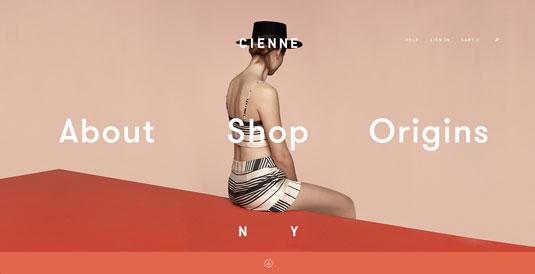
Today, bright and vibrant colours are the new baroque, but before you slap some pastels on your site and call yourself cutting edge, you should know it's not that simple.
In this article we'll explore seven of these recent colour trends. We'll explain the logic behind each, and show examples of sites that get it right.
01. Monochromatic schemes
In fitting with minimalist sensibilities, the popularity of monochromatic schemes — sites that uses varying shades of the same colour — is rising.
As described in the free ebook Web Design Trends 2015-2016, these schemes suit vibrant colours: with less distraction and contrast among colours, designers can make more bold and experimental colour choices.
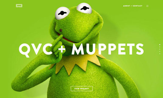
The Line Equality example above demonstrates this, as lime green is a colour that typically does not play well with others. By using the same colour, the interface accents — instead of competes with — the main subject (a familiar Muppet).
In conjunction with other minimalist styles like bold, white lettering and ghost buttons, the monochromatic scheme controls the visual dominance of the page to make it easy to use and pleasing to look at.
Sign up to Creative Bloq's daily newsletter, which brings you the latest news and inspiration from the worlds of art, design and technology.
Vibrant colours, by nature, are flashy and eye-catching, which means too many together will create a chaotic screen. The monochromatic treatment solves this problem before it starts.
02. Contrast with dull colours
Even as an aesthetic choice alone, extreme contrast prevents a screen from appearing stale — a constant concern with minimalist designs.
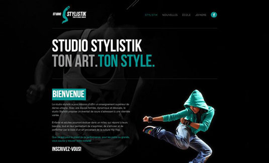
The designers for Studio Stylistik use strategic bursts of turquoise against a black background to create a very decisive visual pattern (specifically a Z-pattern, which we discuss in greater detail in Web UI Design for the Human Eye).
The repetition of turquoise in letters, logos, and the graphics strengthens each coloured element against the otherwise overpowering black background.
03. Blocking and hovering
Especially with card-style interfaces, the trends of blocking and hovering and popular not just for their appearance, but also for their usability.
Blocking refers to a grid-based layout in which the blocks and cards are differentiated with dramatic colours. Hovering refers to an element — particularly cards — that change colour when hovered over. While blocking and hovering can each be used on their own, they are often used together.
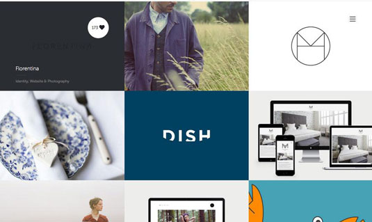
On the PFD site above, the bright colours of some cards stand out against the white backgrounds of others. When hovered over, the card becomes tinted (as the upper-left card in the example) and displays the number of hearts. This functions as an effective signifier, since a change on hovering is a cue that the object is clickable.
Blocking and hovering a practical choice as well as a stylish one. The colourful blocks create a layout that invites interaction, then the hovering displays support this by making interaction smooth.
04. Texture
While texture is most common in neutral backgrounds, under the right circumstances it can be combined with bright colours for exceptional results.
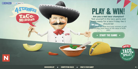
The site Tacospillet uses full background and foreground images with texture. The treatment slightly softens the bright colours. The texture also gives the graphics a unique aesthetic that doesn't feel overly skeuomorphic.
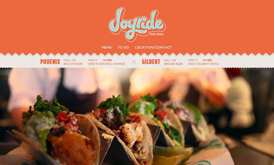
Coincidentally, another food-related site, Joyride Taco House, shows us how texture accents the interface. The slight shadow under the main header adds a bit of separation with some depth, while the blue-green lines in the logo draw most of the initial attention.
The use of texturing is light and fun, which reflects the atmosphere of the restaurant itself.
05. Highlighting text
The attention-grabbing qualities of bright colours make them useful in highlighting certain words within a block of text — particularly when contrasted with duller backgrounds, as we mentioned above. Brightly coloured text adds a natural emphasis and even affects how the message comes across.
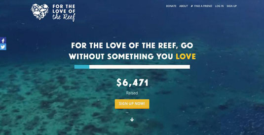
For the Love of the Reef, above, accents only the word "love". It's a clever visual trick since the call-to-action is also highlighted in gold, creating a subtle connection between the two.
06. Buttons/UI elements
Just like with words, bright colours can emphasize buttons or other UI elements, whether to draw attention or to ease usability.
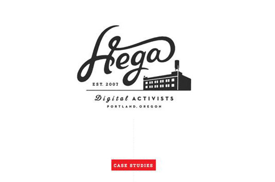
As seen in the Hega example (above), the red call-to-action grabs attention amidst the black and white throughout the rest of the page.
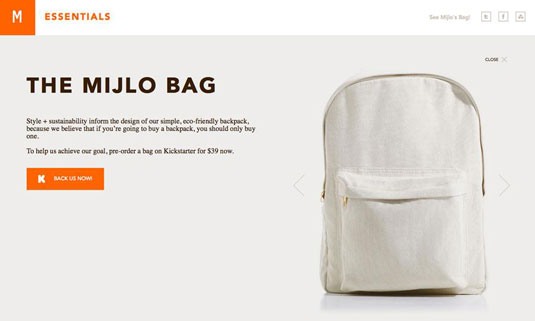
Similarly, the bright orange call-to-action on the Mijlo site (above) stands out against the plain background and equally plain product image. The combination of muted colours in the background and product work together to make the bright call-to-action that much more appealing.
07. Navigational aids
Colour's benefit in organization has been known for a long time, and can be seen in the coloured tabs of books and filing cabinets. This application on web navigation seems like the logical progression, as the different colours easily separate the different sections. This becomes especially useful for content-heavy sites, where every effort must be made to simplify navigation.
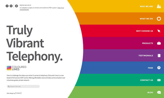
For example, Coloured Lines above uses the rainbow spectrum to partition the eight separate pages of their site. It's a bit unorthodox, but it certainly reflects the brand identity (considering the company's name).
The site might feel less familiar to desktop users, but it's quite fluid for mobile users who probably appreciate a scroll-based navigation menu.
Additional knowledge
Our free ebook Web Design Trends 2015-2016 goes into more details about the latest colour trends, as well as 9 other current trends. Download it now, and you'll find 166 hand-picked examples from companies like Adidas, Intercom, Apple, Google, Versace, and others. To help speed up the design process, there's also a curated list of 100 free resources.
Words: Jerry Cao
Jerry Cao is a content strategist at UXPin — the wireframing and prototyping app.
Like this? Read these!

The Creative Bloq team is made up of a group of art and design enthusiasts, and has changed and evolved since Creative Bloq began back in 2012. The current website team consists of eight full-time members of staff: Editor Georgia Coggan, Deputy Editor Rosie Hilder, Ecommerce Editor Beren Neale, Senior News Editor Daniel Piper, Editor, Digital Art and 3D Ian Dean, Tech Reviews Editor Erlingur Einarsson, Ecommerce Writer Beth Nicholls and Staff Writer Natalie Fear, as well as a roster of freelancers from around the world. The ImagineFX magazine team also pitch in, ensuring that content from leading digital art publication ImagineFX is represented on Creative Bloq.
