Clever new 2021 logo captures how we're all feeling
Cut off everything that drags you down.
For many, transitioning from 2020 to 2021 feels like a bigger opportunity than in previous years, with hopes of happier times firmly placed in the hands of the new year. With that in mind, one designer has made a logo representation of the change of year, and it's pretty powerful.
Shared on Reddit with the accompanying title, 'wanted to make something other than vaccines & pandemic. Cut off everything that dragged you down in 2020 and start fresh', the logo has gone down a storm. See it below, and for more logo design inspiration, head to our guide.
Wanted to make something other than vaccines & pandemic. Cut off everything that dragged you down in 2020 and start fresh ✂️💪 Does it convey the concept well? from r/Design
Created by designer Sehbanaliakbar, the logo design cleverly plays with the numbers 2020, which is being chopped by a pair of scissors in just the right place to discard the majority of the squared '0'. This leaves only the edge in place to form a number one for the new year.
Article continues belowPositive responses flooded in on Reddit, with many wondering where the typography came from. "Thank you! I created these numbers from scratch on a very basic square grid," said Sehbanaliakbar. Others called the design "refreshing", and "clever and crisp".
A couple of voices questioned the use of the "sound effect" lines at the top of the scissors, with Badman27 asking "10,000% petty nonsense because I love the design, but can you explain the placement of the 'sound effect'. I'd think most people would align to the top of the scissors without thinking about it, so if there's a reason I'd love to know."
We like the addition of the sound effect lines though, as they visually balance out the lowered baseline of the scissors and add a punch to the overall impression of the concept. However, we'd like to see the results of Karvelle's advice to "put the snip sound marks on a jaunty angle so they aren't so symmetrical or add another mark so there are four". What do you think?

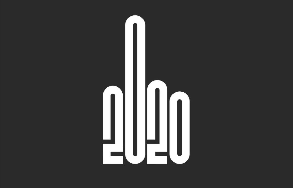
This logo design reminds us of the hilariously blunt 'logo of the year' last year (above), which said all we needed to say about 2020. Overall, it seems 2020 has been told where to go. Let's hope this new year's logo is a symbol of more positive things to come.
Sign up to Creative Bloq's daily newsletter, which brings you the latest news and inspiration from the worlds of art, design and technology.
Read more:

Georgia has worked on Creative Bloq since 2018, and has been the site's Editor since 2023. With a specialism in branding and design, Georgia is also Programme Director of CB's award scheme – the Brand Impact Awards. As well as immersing herself with the industry through attending events like Adobe Max and the D&AD Awards and steering the site's content streams, Georgia has an eye on new commercial opportunities and ensuring they reflect the needs and interests of creatives.
