Traditionally, brands have a limited number of logo variations that they stick to almost without exception. Style guides dictating the official brand colours and applications play an important role in creating a consistent memorable brand identity. But more and more brands are now breaking the mould – at times.
Adaptive logos, a term used to describe logos that are designed to have more than one iteration, are becoming an increasing tendency in logo design. The idea is that a brand's logo is designed to make it easy to adapt to uses, and that variations are developed for different purposes (creating variations is usually a lot easier when the logo is simple and easily recognisable – see our tips on how to design a logo).

like Experimental Jetset's logo for the Whitney Museum of American Art above or for logos designed to work in different applications, for example in an app icon and email footer as well as a billboard.
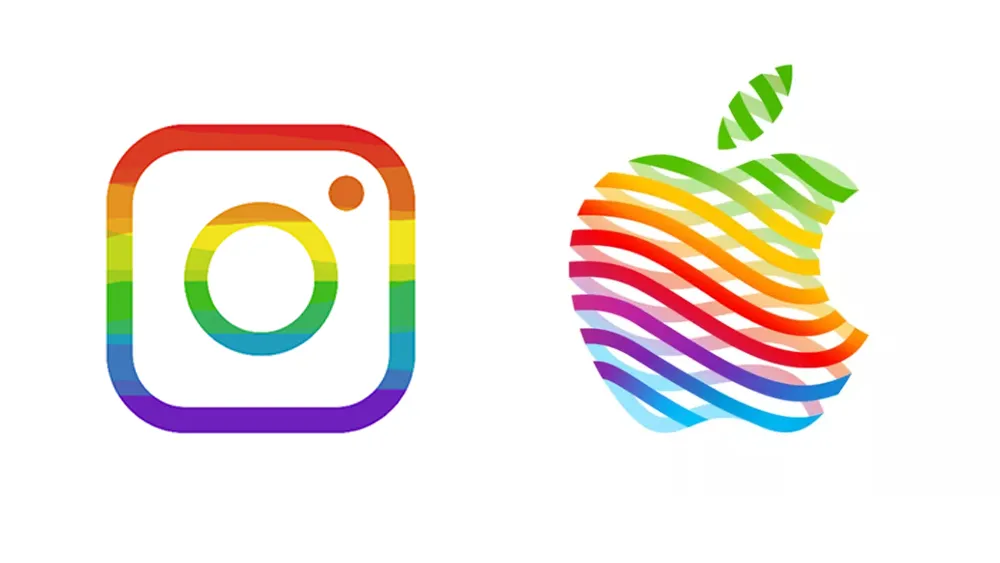
But adaptive logos can also make it possible to tweak a design for a specific brand campaign – the simplicity of the Apple logo lends itself to adaptation to promote events and new Apple store openings. They can also be used to create families of related logos that communicate a visual link between related brands or organisations.


But increasingly, brands are also adapting logos to align themselves with causes as consumers begin to demand stronger ethics. The online marketing agency Glass Digital mentions in its Digital Marketing Trends report 2023 that "going beyond brand guidelines by adapting company logo colours to show support for a cause can allow brands to show their values and nail their colours to the mast — literally."

Adaptive logos are also being used to communicate brand collaborations. The Los Angeles 2028 Olympics Games logo is a controversial first in sponsorship. It was designed as an adaptive logo that can takes infinite forms, including community-created designs. But the games are also allowing sponsors to put their own logos into the adaptive logo design.

Companies need to get it right. Many brands have been congratulated on showing their support for LGBT with pride logos, but Wendy's was accused of getting the wrong end of the stick with an attempt to adapt its logo to take a stand against ageism, turning it into a question of hair colour. And efforts to create an adaptive logo for a family of identities can also go wrong – we'll never forget Australia's Women's Network logo, which was one of the worst logo fails of 2022.

Key ingredients are simplicity and continuity. A simple logo is easier to adapt that a complex one, and the adapted designs need to offer enough continuity to fit into the wider brand identity. Perhaps even more important though for the trend of using adaptive logos to align with causes is to make sure that the brand genuinely understands and believes in the cause that it's supporting and isn't just trying to get publicity. If the rest of the brand's actions contradict the expression of solidarity, the gesture isn't going to go well.
For more on what's hot, see Envato's predicted design trends of 2023 and our pick of 2023 web design trends. And you can always get more perennial inspiration from our guide to the famous graphic designers you need to know.
Read more:

