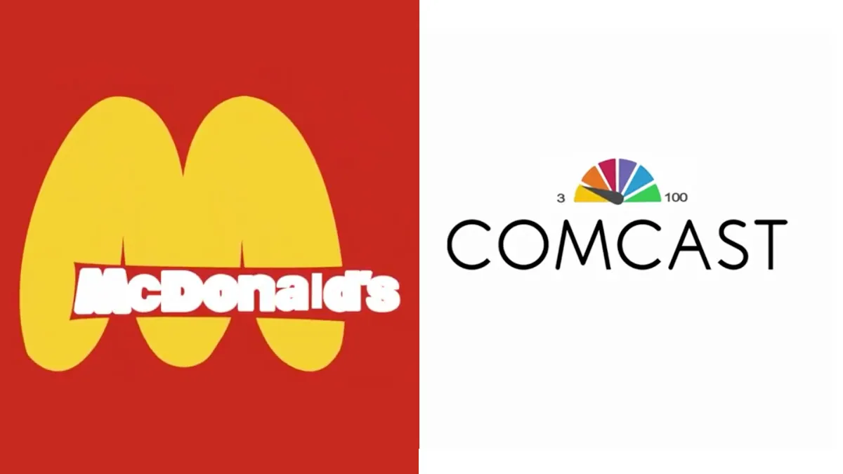
The best logos manage to sum up a brand in a single image. From the McDonald's Golden Arches to Facebook's deceptively simple 'f' icon, via the colourful Comcast peacock, most famous designs are instantly recognisable – but do they truly capture the essence of the brand?
In an effort to represent some of the world's largest corporations a little more honestly, Future Punk has cleverly tweaked the designs of their logos. This includes the playful swelling of McDonald's Golden Arches to reflect the chain's calorific food, through to on-the-nose designs like the addition of a headstone to the Marlboro logo (smoking's bad for you, kids). Even the best logos of all time could be a little more honest, it seems.
Now, of course, it would probably be unwise for a company to use any of these images. As our guide to logo design points out, the reason a brand's logo is so important is because it's most often its first point of contact with the world – and if it's done right, people will be able to recognise it anywhere.
But Future Punk's ideas are a fun, subversive look at how to reinterpret familiar designs. We're fans of the blurry Budweiser logo. Although we're surprised that Future Punk didn't go after Amazon's smiling logo in the run up to the Black Friday and Cyber Monday sales the online retailer is famous for.
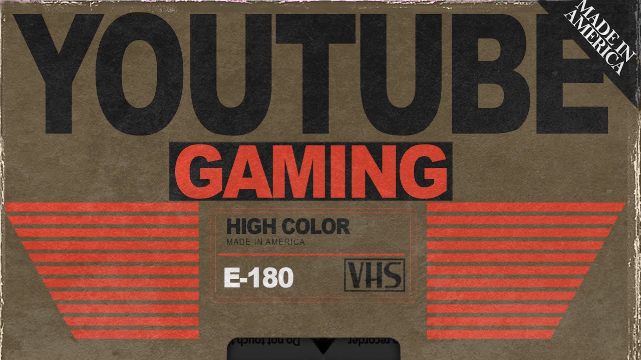
If these designs are a little dark for your tastes though, how about something a little bit more wholesome? Future Punk isn't a total cynic, in fact they've also injected some retro charm into the logos of streaming services companies like YouTube and Google Play, offering a tantalising glimpse into a world where they existed in the 1980s (below).
Perhaps some companies would do well to look to the past when it comes to logo design. With the brand new, overly minimal Google Workspace logos causing confusion among users, it seems the modern trend for simplicity is going a little too far. If you're looking for logo tips, our guide to finding logo inspiration is a great place to start – and you can also get ahead of the game with these 10 logo design trends for 2021.
Read more:

