Can Melania Trump be best at logo design?
The First Lady creates branding for her new initiative.

Sign up to Creative Bloq's daily newsletter, which brings you the latest news and inspiration from the worlds of art, design and technology.
You are now subscribed
Your newsletter sign-up was successful
Want to add more newsletters?
Perhaps one of the best things about being alive in the social media age is the unsightly rush to have opinions whenever a new logo design is revealed. Given any new logo, the internet – that is, Twitter – can't wait to critique its every detail and pick apart all its faults. It's the first step on the road to being hailed as a modern design classic a few years down the line.
Even better is when a well-meaning but entirely unqualified CEO decides to take matters into her own hands and design the logo herself, as Marissa Mayer infamously did with the Yahoo! logo back in 2013. So the news this morning that the First Lady of the United States had unveiled an exciting new initiative and also designed the logo had us, quite reasonably, rubbing our hands in glee.
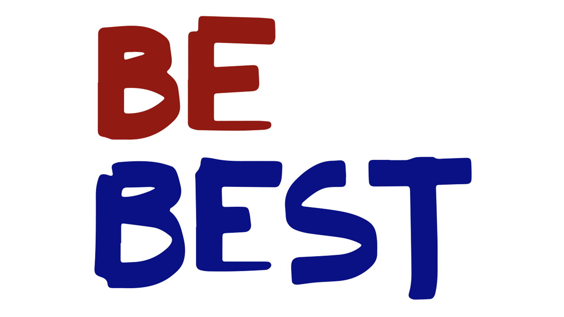
Melania Trump's initiative, entitled Be Best, aims to encourage children to literally be best in their individual paths, while focusing on the three biggest issues facing young people today: well-being, social media use, and of course, opioid abuse.
Article continues below 
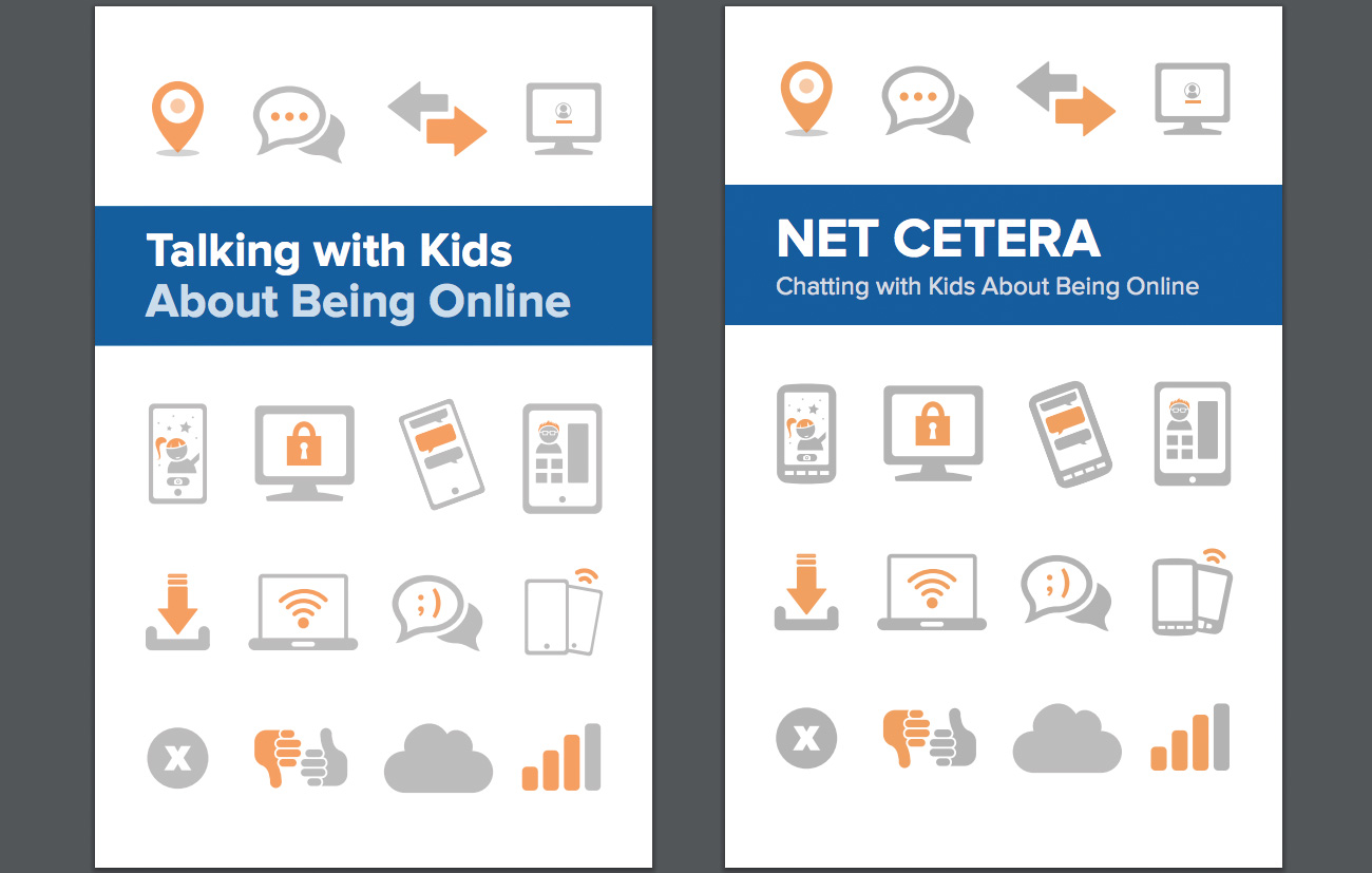
While it's clearly driven by the very best intentions, it's already drawn plenty of internet shade, particularly for the jarringly ungrammatical name and its pamphlet on safety online that's a mildly updated copy of another pamphlet from 2014. But what's really got us going is that logo.
According to the White House, FLOTUS designed it herself, and while Melania has form for claiming other people's work as her own, in this case we can quite believe it. Apparently Melania likes clean lines and wanted something that would appeal to children, and this is the result.
Melania Trump designed the “Be Best” logo herself, an East Wing official told us. She likes clean lines, the official said, & wanted something that would appeal to children pic.twitter.com/6lABdOjkHpMay 7, 2018
An unkind person might suggest that it looks like it was scrawled with a chisel tip marker in five seconds, then scanned and coloured in Photoshop. We think it looks more like it was drawn on-screen using free chisel tip Photoshop brushes. Others have been less kind.
Shouldn’t “Be Best” be either “be the best” or “be better,” or no? I really hate this campaign name by the #FLOTUS. As a designer, I really hate the low-budget, low-effort, fake flat tip marker aesthetic of the logo. It painfully does not live up to the ideal to “be best.” pic.twitter.com/BWsOGA3gGNMay 7, 2018
Beeee best! Beeee bestDesigners are to be testMelania be design logoNo will be unimpressedFirst ladyArt be serveShe won't be fry optic nerveCan be designer your wishesDon't believe me? Ask be missus.May 8, 2018
The saddest part about @FLOTUS Be Best "logo" is that she still probably ripped it off from some @fiverr designer pic.twitter.com/bO4DE1WGXUMay 8, 2018
I love how that Be Best logo was clearly designed by someone who was just randomly dicking around with paths in Illustrator pic.twitter.com/5sVE9NxGhzMay 8, 2018
For once, we're enjoying a social media logo backlash without an ounce of the usual low level guilt that we usually feel when everyone's ripping on a perfectly acceptable design that's just a little unexpected and different. Keep it coming, Twitter.
Sign up to Creative Bloq's daily newsletter, which brings you the latest news and inspiration from the worlds of art, design and technology.
Related articles:

Jim McCauley is a writer, performer and cat-wrangler who started writing professionally way back in 1995 on PC Format magazine, and has been covering technology-related subjects ever since, whether it's hardware, software or videogames. A chance call in 2005 led to Jim taking charge of Computer Arts' website and developing an interest in the world of graphic design, and eventually led to a move over to the freshly-launched Creative Bloq in 2012. Jim now works as a freelance writer for sites including Creative Bloq, T3 and PetsRadar, specialising in design, technology, wellness and cats, while doing the occasional pantomime and street performance in Bath and designing posters for a local drama group on the side.
