QUIZ: Guess the extreme close-up logos
You might know your famous logos, but can you spot them from a close-cropped detail?
Sign up to Creative Bloq's daily newsletter, which brings you the latest news and inspiration from the worlds of art, design and technology.
You are now subscribed
Your newsletter sign-up was successful
Want to add more newsletters?
One golden rule that any designer is guaranteed to come up against time and again is this: don't mess with the logo.
Somewhere in most style guides you'll find a section telling you exactly how to use the logo, and warning you in no uncertain terms not to mess about with the logo design, under any circumstances, ever.
Which is fair enough; branding needs consistency if it's going to do its job, after all. But sometimes you just have to break the rules – something that McDonald's has done twice recently.
Article continues below 
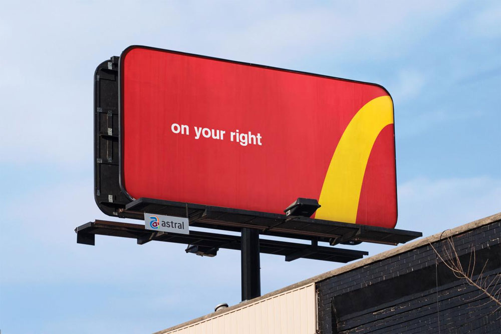
First it put up billboards in Canada, cropping the iconic Golden Arches logo to give directions to the nearest restaurant. Then for International Women's Day, it turned the logo upside down, making it into a big W.
Such logo manipulation is a ballsy move, and while it's paid off for McDonald's with a stack of publicity, it's the sort of trick a brand can only really get away with if its logo is instantly recognisable.
So, how well can you guess the logo if it's been given a serious crop? Test your brand awareness with our extreme close-up logo quiz...
Related articles:
Sign up to Creative Bloq's daily newsletter, which brings you the latest news and inspiration from the worlds of art, design and technology.

Jim McCauley is a writer, performer and cat-wrangler who started writing professionally way back in 1995 on PC Format magazine, and has been covering technology-related subjects ever since, whether it's hardware, software or videogames. A chance call in 2005 led to Jim taking charge of Computer Arts' website and developing an interest in the world of graphic design, and eventually led to a move over to the freshly-launched Creative Bloq in 2012. Jim now works as a freelance writer for sites including Creative Bloq, T3 and PetsRadar, specialising in design, technology, wellness and cats, while doing the occasional pantomime and street performance in Bath and designing posters for a local drama group on the side.
