Coca-Cola unveils a bold and minimal new redesign
(But Coke's description of it is pretty ridiculous.)
Sign up to Creative Bloq's daily newsletter, which brings you the latest news and inspiration from the worlds of art, design and technology.
You are now subscribed
Your newsletter sign-up was successful
Want to add more newsletters?
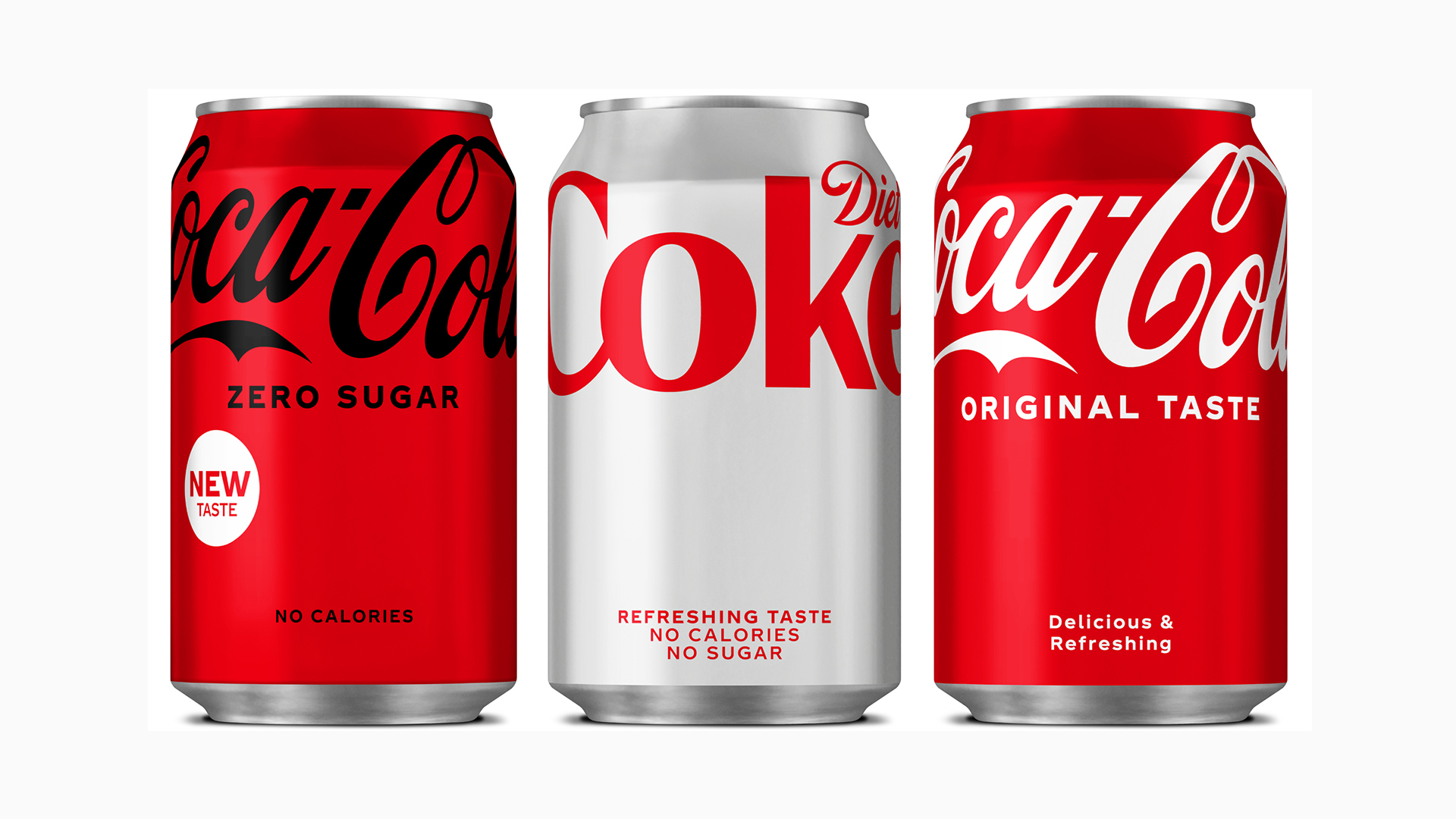
How do you redesign one of the most ubiquitous and recognisable pieces of packaging design in the world without compromising its distinctness? In the case of Coca-Cola's minimal new redesign, it seems the answer is: move the logo up a bit.
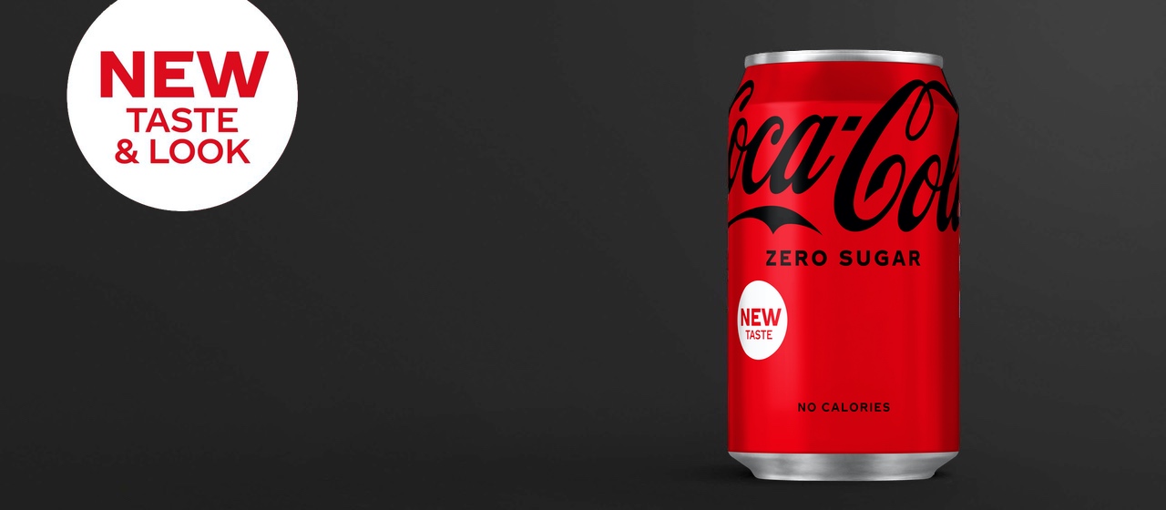
The company's first packaging redesign since 2016 has seen the iconic Coca-Cola and Diet Coke logos to the top of the can, leaving some bold negative space in the middle. It's a nicely minimal design – but just wait until you hear what the elevation of the company's brand assets supposedly represents. (Check out our best logos of all time if you're looking for design inspiration.)

According to Design Week, Coca-Cola's in-house global design team (based in Atlanta, US) collaborated with Kenyon Weston on the new look, which forms part of the company's 'One Brand' strategy, designed to "provide a simple and intuitive navigation system that carries across all Coca-Cola variants".
Article continues belowThe minimalist redesign has also seen the team strip back visual clutter from the packaging. "Added elements", such as the red disc and wave line previously surrounding the can, have now been axed.

While it's certainly a clean and simple redesign, Coca-Cola's own description of it is anything but. The company waxes lyrical about various aspects, including the bright red hue of the cans, which "signals authentic, delicious and refreshing". But the most poetic treatment is saved for the raised logo – a "visual metaphor" for the "uplifting potential" of Coca-Cola products. Lovely. We'll have whatever Coca-Cola's marketing team is drinking (probably Coca-Cola).
While we naturally wouldn't go as far as the company itself, we'd describe Coca-Cola's new look as a pleasingly clean and minimal. It's by no means the boldest redesign we've seen (instead of merely raising its logo, Kit-Kat recently removed it altogether), nor even the most uplifting (Burger King's new rebrand is much more fun), but it does the job. If you're inspired to create your own packaging masterpiece, check out today's best Adobe Creative Cloud deals below.
Read more:
Sign up to Creative Bloq's daily newsletter, which brings you the latest news and inspiration from the worlds of art, design and technology.

Daniel John is Design Editor at Creative Bloq. He reports on the worlds of design, branding and lifestyle tech, and has covered several industry events including Milan Design Week, OFFF Barcelona and Adobe Max in Los Angeles. He has interviewed leaders and designers at brands including Apple, Microsoft and Adobe. Daniel's debut book of short stories and poems was published in 2018, and his comedy newsletter is a Substack Bestseller.
