Corel has a new name and logo (and I have some questions)
Say 'allo to Alludo.
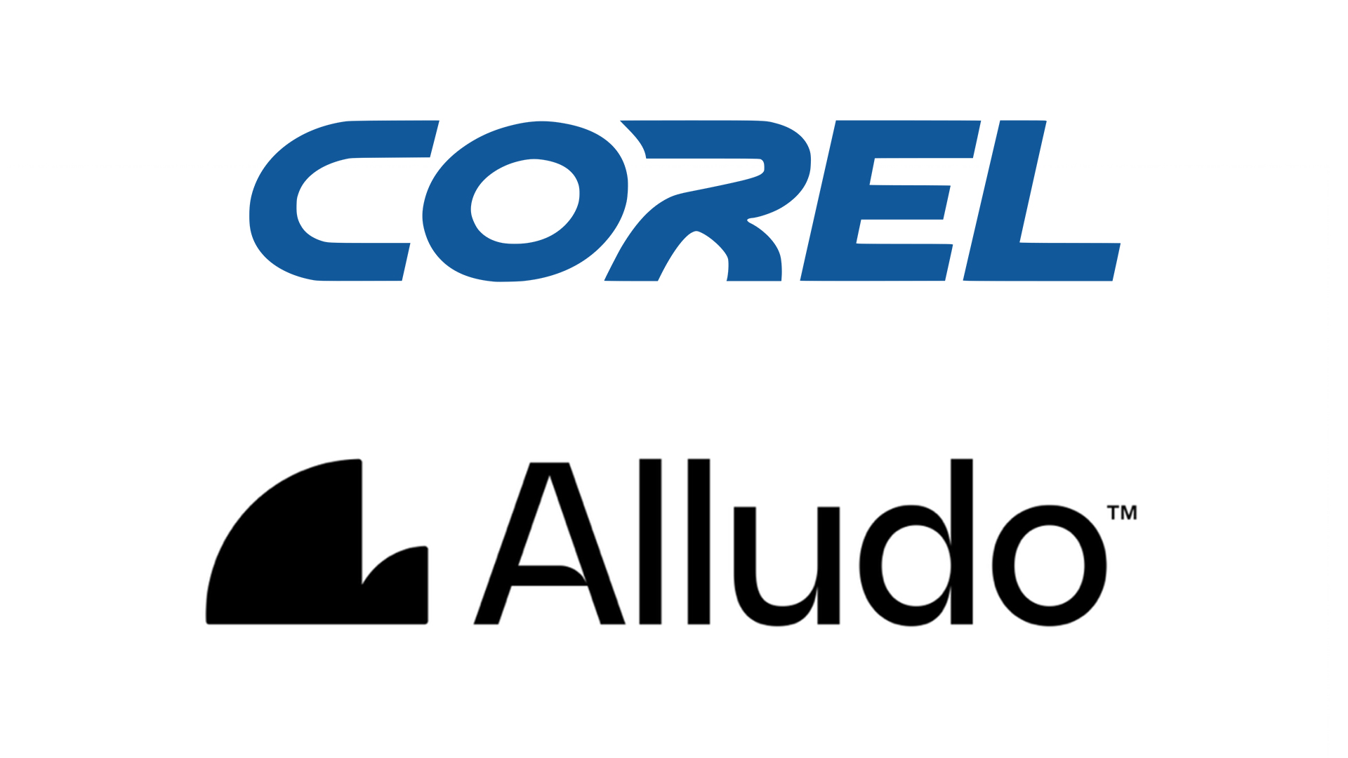
Most digital artists are familiar with Corel, the brand behind apps including CorelDRAW and Corel Painter. But after a comprehensive rebrand, the company is has changed its name, logo and entire visual identity, giving users a new name to get used to – Alludo.
That's right, Corel is now Alludo (pronounced “ah-LOO-dough"), and it has a brand new logo that's, er, open to interpretation. Whatever it's meant to look like, I'm not sure it'll be hitting our best logos roundup any time soon. (Don't worry, Alludo – CorelDRAW is still one of the best graphic design tools.)

According to Alludo, while the parent company name is changing, the products themselves (Corel, MindManager, Parallels and WinZip) will stay the same. The new name is "a nod to [Alludo's] purpose: empowering all you do." A little confusing, then that the company is at pains to point at that this isn't how it's pronounced.
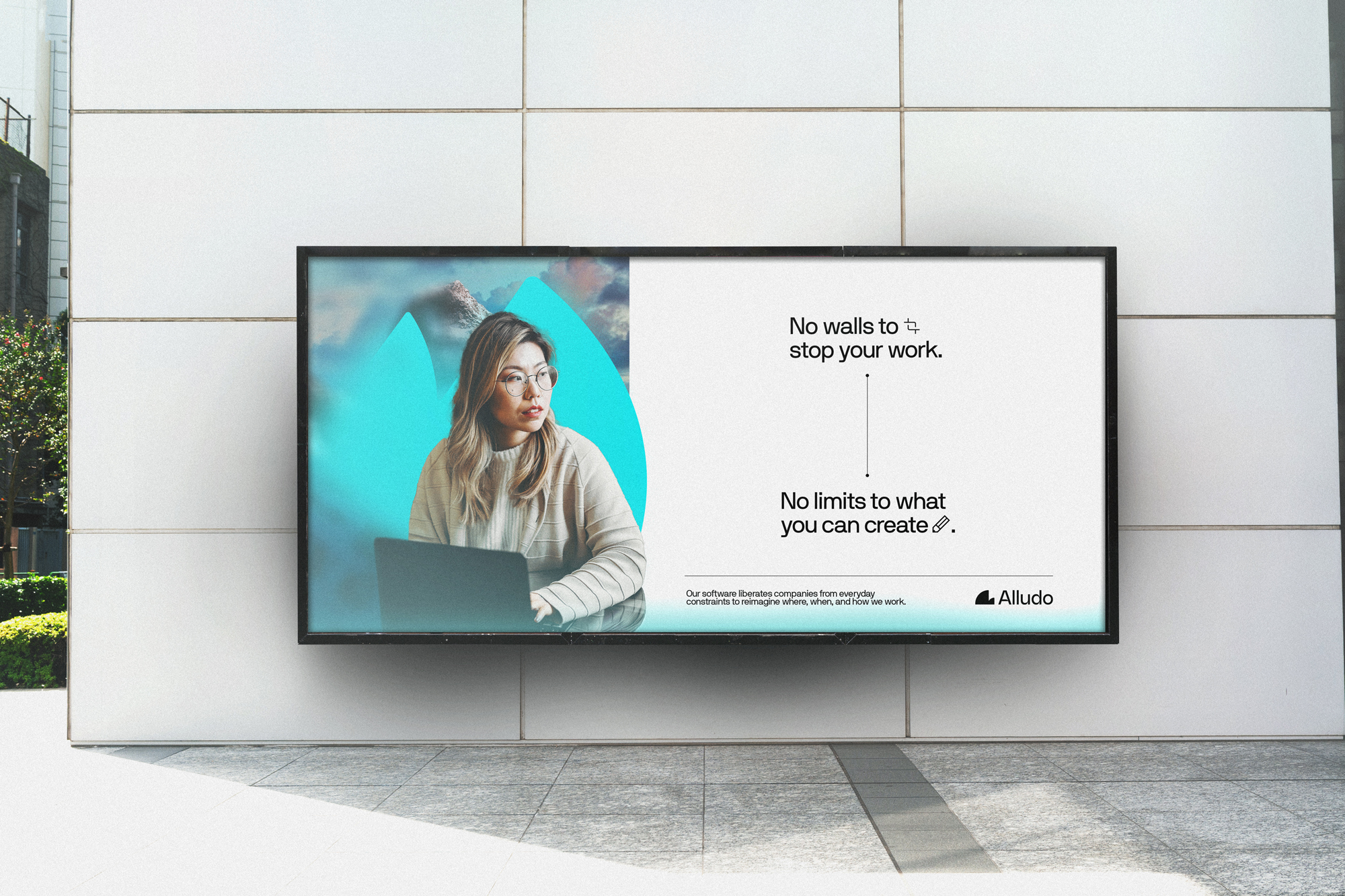
Article continues belowThe new logo and visual identity was created by DesignStudio, which describes the symbol as a "unique silhouette" that "curves forward, off the beaten path, towards a boundless reality. The wordmark is tailored to match, with curving inktraps that echo the symbol."
As for what the shape is meant to represent, your guess is as good as mine. One minute I'm seeing the Sydney Opera House, the next I'm seeing the last spluttering breath of Pac-Man as he descends into a pit of lava, Terminator-style. Still, not looking like anything in particular is better than looking a toilet – eh, Calendly?
And the amorphous nature of the design is, it seems, intentional. Alludo CEO Christa Quarles told Creative Bloq, "What you see really depends on where you are in the world. I see a half-dome in Yosemite, some people think it looks like the Sydney Opera House. Some people see a whale. Some see Baby Yoda’s Crib. What is beautiful about it is that it evokes emotion. Most of all, it represents forward progress."

As for the new name, it's going to take a little while to stick. It's a little perturbing that the pronunciation takes such explaining, but there's no denying that it's a more modern sounding word than Corel. The same goes for the rebrand as a whole, which comes with some undeniably pleasing graphics and animations. Overall, this is a clean and contemporary rebrand, and one which emphasises Alludo as the parent company behind a suite of apps rather than just CorelDRAW and Corel Painter. Indeed, Alludo isn't the only brand keen to point out its less well-known products this week.
Sign up to Creative Bloq's daily newsletter, which brings you the latest news and inspiration from the worlds of art, design and technology.
From Burger King to Magnum, we've seen plenty of awesome rebrands over the last couple of years – and while I have a few questions, I'd say Alludo's is a success. As is its awesome illustration tool – check out our Corel Painter 2022 review.
Read more:

Daniel John is Design Editor at Creative Bloq. He reports on the worlds of design, branding and lifestyle tech, and has covered several industry events including Milan Design Week, OFFF Barcelona and Adobe Max in Los Angeles. He has interviewed leaders and designers at brands including Apple, Microsoft and Adobe. Daniel's debut book of short stories and poems was published in 2018, and his comedy newsletter is a Substack Bestseller.
