Magnum rebrand plays with pleasure (and does not play it cool)
Ice-cream brand wants to be a 'liberated force of pleasure'.
If we told you a brand's aim was to be a 'liberated force of pleasure', what would your first thought be? Well, we'd ask you to drag your mind out of the gutter as this is actually the refreshed brand focus for ice-cream royalty, Magnum.
Yup, Magnum has rebranded, with a brand new logo to boot (let's hope they used our logo design guide). And, in the age-old tradition of associating chocolate with pleasure, some of the wording around the brand's aim has overtones of something altogether tinglier than ice-cream. This approach puts us in mind of that scandalous '90s Flake advert (tongue, steamy bath, woman – need we say more?).
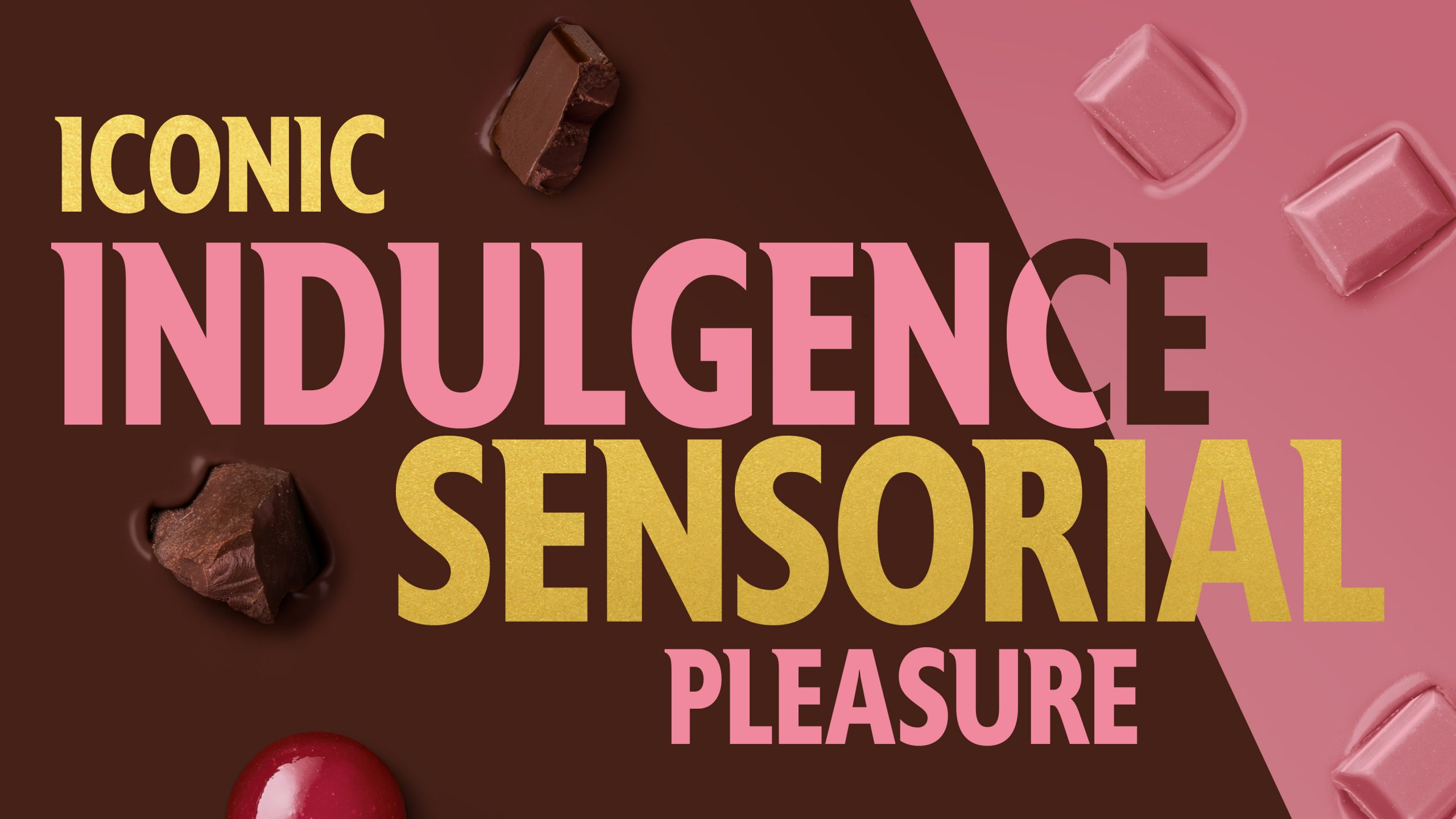
According to agency Sunhouse, which masterminded the rebrand, the "new M-angle seeks to amplify the brand's most powerful asset: the 'crack-and-cream' experience" (stop giggling, please). However, while some of the wording around the redesign seems pretty loaded, the overall package puts pleasure in a different arena. The tagline 'Pleasure for all' truly means for all, and not just for those who can reach the top-shelf – with a focus on 'fearlessness, confidence and sensorial indulgence'.
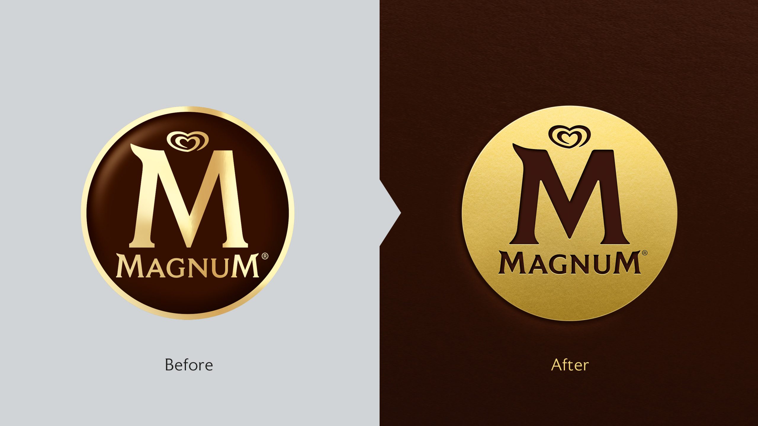
The new logo is an inverted version of the old one (compare them above), with the brown setting and gold lettering flipped to create a golden disk with the wording now etched in chocolate-brown. It seeks to represent Magnum's iconic status in the ice-cream sphere, and as a literal gold stamp, we agree it gives that impression cleanly and simply. On its own, the logo is on the edges of tacky, but put together with the very different aesthetic of the packaging design, it balances well.
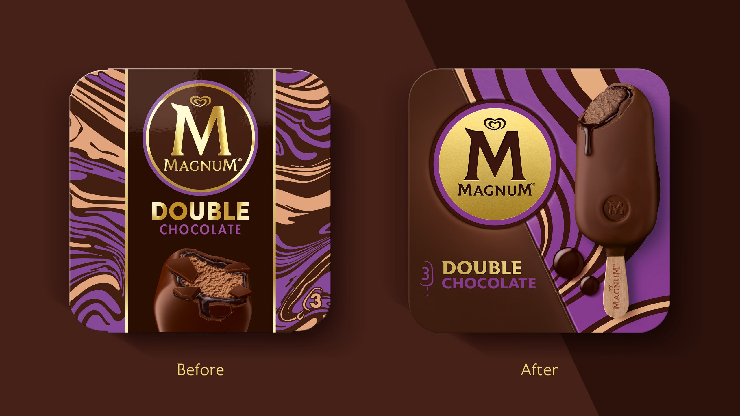
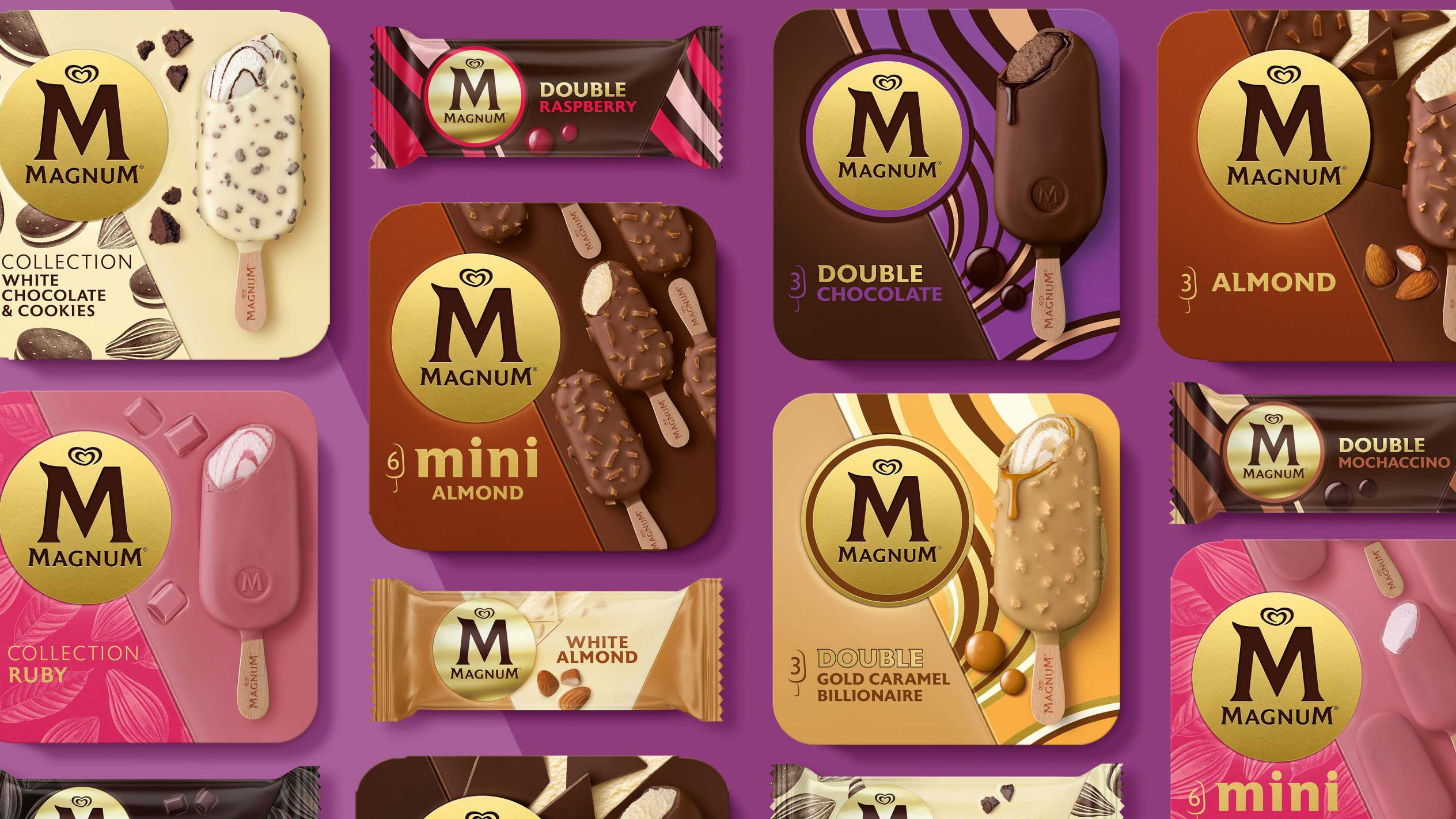
In terms of packaging, the designs are actually way more fun than the elegance of the logo would suggest, and these designs are what frame Magnum's concept of pleasure. Complete with bold colour and pattern, the new graphics do away with the confining dividing lines and borders from the boxes (see above), allowing the graphics to reach the edges, and giving a sense of freedom.
According to Sally Knapton, senior account director at Sunhouse, the agency was on a mission to set the brand free from its "stiff and contained" image. "Our challenge was to set it free by pushing it off its pedestal without losing any of its aspirational allure and desirability," Knapton explains.
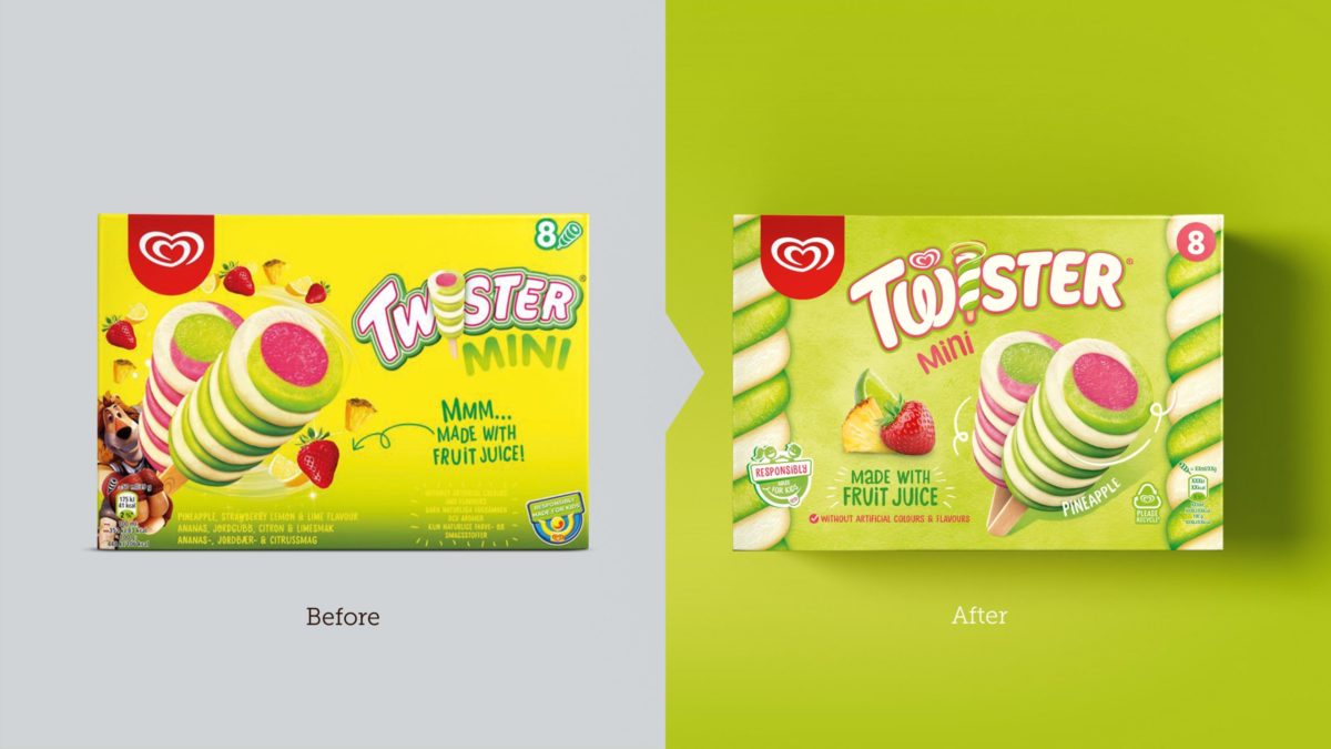
Sunhouse has form in the frozen treats game having worked with Magnum since 2011, and coming hot (or cold, we guess) off the heels of a successful Twister redesign last year. Both rebrands are fun and eye-catching – just what ice-cream lovers need for the summer ahead. Want to explore more fun design? Check out Heinz's new poster campaign – which gives a masterclass in bold, brandless advertising.
Sign up to Creative Bloq's daily newsletter, which brings you the latest news and inspiration from the worlds of art, design and technology.
Read more:

Georgia has worked on Creative Bloq since 2018, and has been the site's Editor since 2023. With a specialism in branding and design, Georgia is also Programme Director of CB's award scheme – the Brand Impact Awards. As well as immersing herself with the industry through attending events like Adobe Max and the D&AD Awards and steering the site's content streams, Georgia has an eye on new commercial opportunities and ensuring they reflect the needs and interests of creatives.

