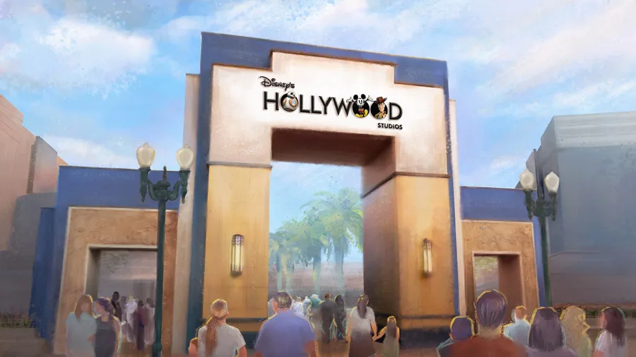
Yesterday Disney's Hollywood Studios celebrated a landmark anniversary as it turned 30. To mark the occasion, the theme park has been given an overhaul to its attractions and branding. While the parks may be considered 'the most magical place on Earth', the new look is a little less inspiring.
The logo brings together different Disney properties, and features characters from Pixar and Star Wars films. If this sounds like a design overload, it’s because it is, and it has already attracted criticism for looking clumsy and amateurish. You can see two versions below (click the arrows to toggle), as well as an artist's interpretation above.
It's more like the mockup a designer would run by executives to give them an impression of what to expect, instead of the finished result. If it's logo design inspiration you're after, you'll need to look elsewhere.


The Reddit channel r/Design is always a good source of brutally honest feedback, and the response to the Disney's Hollywood Studios logo is no exception. Choice user comments include "Did an intern make this in 5 minutes in powerpoint?" and "Looks like a year one design student's first concept draft". Although our favourite reply says the logo looks like it was made "on a tablet while taking a dump".
Our first reaction on seeing these designs is that Mickey's ears, possibly the most recognisable design asset Disney has at its disposal, are obscured in both versions. The logo with the black background also sees Mickey emerging from a letter with a brown background, while the rest of the typography is a crisp white.
Previous logos for the resort relied on Disney's distinctive mascot, Mickey Mouse, to give visitors an idea of what to expect. Equipped with a clapperboard, these logos succinctly communicated that park attendees can look forward to movie making insights with a Disney twist.
However the new version does away with the cinematic imagery, and instead relies on Disney characters past and present to welcome tourists. Mickey Mouse is joined by Toy Story cowboy Woody and Star Wars' spherical droid BB-8, all whom enthusiastically pop out of the lettering.

Unveiled with an animated video at the park's birthday celebrations, Disney's senior vice president Maribeth Bisienere explains that the new logo is designed to celebrate new attractions such as Toy Story Land and Star Wars: Galaxy's Edge. All of which "let guests of all ages live their adventure."
But while Disney hits every demographic with its logo, in terms of design it looks cluttered. In the launch video characters duck out of the lettering, leaving regular wording in their place. All that leaves is a pretty uninspiring typographic logo, meaning that this design doesn't work whichever way you slice it.
Images of new Disney's Hollywood Studio logo via Disney Parks blog, /Film and WDWNT.
Related articles:

