It took me a second to spot how brilliant this logo design was
This design is a hole-in-one.

Sign up to Creative Bloq's daily newsletter, which brings you the latest news and inspiration from the worlds of art, design and technology.
You are now subscribed
Your newsletter sign-up was successful
Want to add more newsletters?
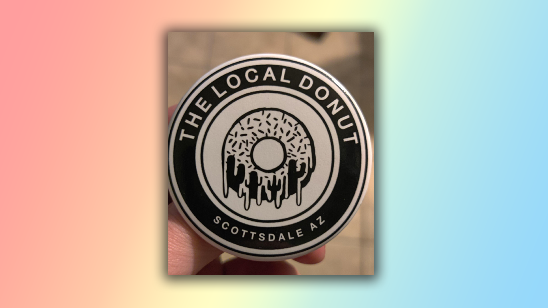
A great logo is not easy to design as there is so much thought and detail that goes into it. And while we've seen plenty of design fails in our time, there are still a number of genius logos that sound out – much like this clever design for a doughnut shop in Arizona.
A user shared the logo on the DesignPorn Reddit and has gradually made its way to the top of the page. At first glance, the design just looks like a very well-iced doughnut, but there's a little more than meets the eye. If you'd like to design your very own logo, then head over to our guide on how to download Photoshop and have a go.
the_donut_shop_my_wife_works_at_didnt_notice_at from r/DesignPorn
The Local Donut has managed to hide a secret Arizona landscape in its logo using just negative space. If you look at the bottom of the doughnut, the dripping icing doubles up as four cacti and three hoodoos (you know, those obscure rock formations native to Arizona).
Article continues belowThe design has racked up over 14,000 upvotes and many Redditors have complimented the logo in the comments. One user replied, "Hell of a smart design," and another said, "This is [design] porn because it goes beyond clever normal people wouldn't have thought about cactus".
Now all this doughnut talk is making me hungry, so while I slink off to the kitchen, why not catch up on how to design a logo, so you can make one as good as this? Or if you'd rather just appreciate some brilliant designs, then make sure you check out our roundup of the best logos of all time.
Read More:
- Leaving Twitter? Here are 5 alternative social media platforms for creatives
- I'm lowkey obsessed with Burger King's new reusable packaging
- These iPhones might miss out on iOS 16
Sign up to Creative Bloq's daily newsletter, which brings you the latest news and inspiration from the worlds of art, design and technology.

Amelia previously worked as Creative Bloq’s Staff Writer. After completing a degree in Popular Music and a Master’s in Song Writing, Amelia began designing posters, logos, album covers and websites for musicians. She covered a range of topics on Creative Bloq, including posters, optical illusions, logos (she's a particular fan of logo Easter eggs), gaming and illustration. In her free time, she relishes in the likes of art (especially the Pre-Raphaelites), photography and literature. Amelia prides herself on her unorthodox creative methods, her Animal Crossing island and her extensive music library.
