The Elizabeth Line London Tube map is out, and we're baffled
One is not amused by this design.

Sign up to Creative Bloq's daily newsletter, which brings you the latest news and inspiration from the worlds of art, design and technology.
You are now subscribed
Your newsletter sign-up was successful
Want to add more newsletters?
There are a few things as iconic as the London Underground tube map, right? Those chaotic, colourful lines are quintessentially British and are recognised all over the world – but the map's new update has left us asking, well, um, why?
On 17 May, the Queen opened up the brand new Elizabeth underground line, which has been under construction since 2009. The new line has been assigned a new royal purple colour and has finally been added to the tube map – but we're not sure how to feel about it. If you're illustrating your own map, then make sure you check out our step-by-step guide on map illustration.
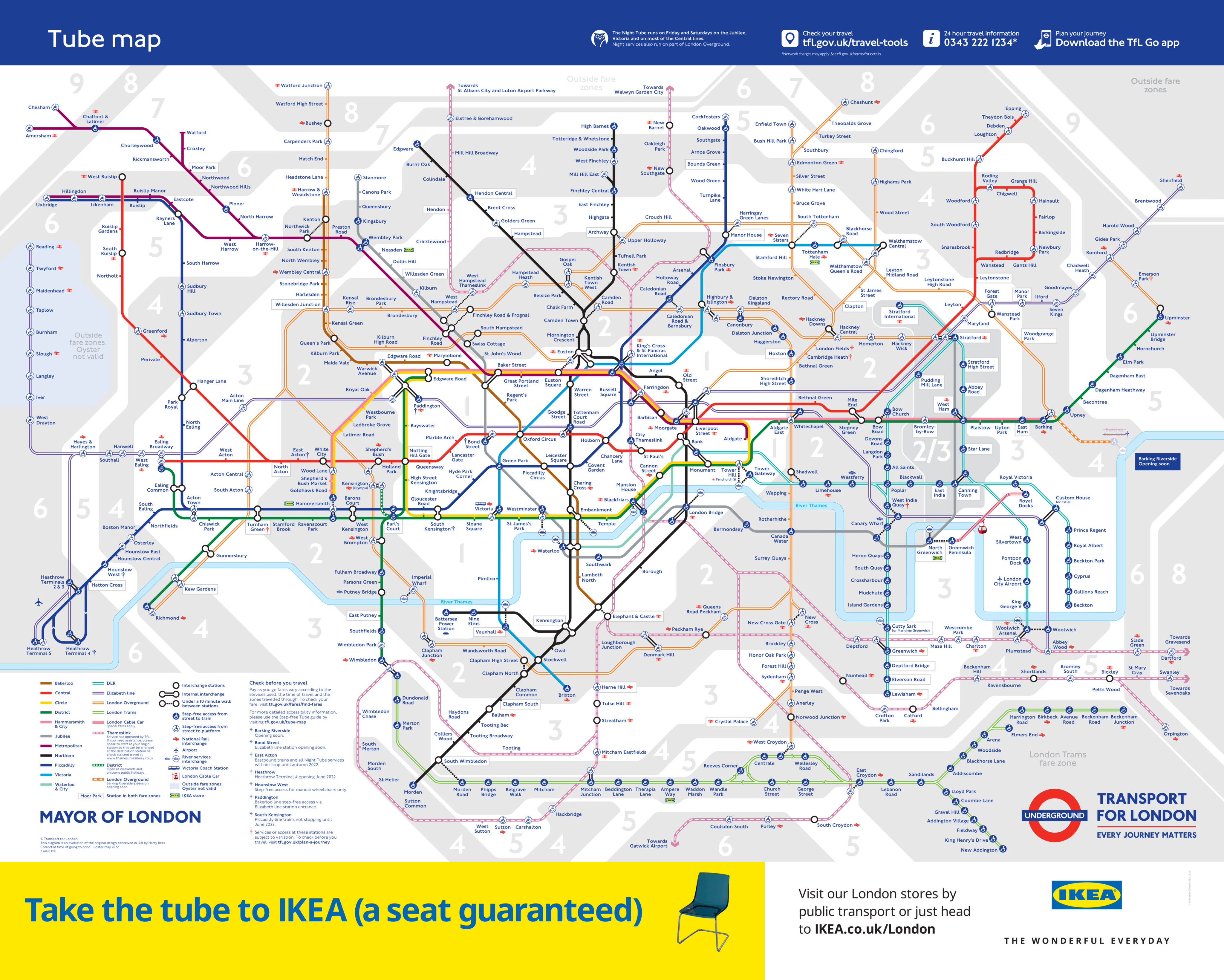
TfL has shared on its Twitter the new London Underground Tube map. The map now features the £19 billion line, but the combination of its pale purple colour and two parallel lines (to signify that it's partly above ground), makes it nearly impossible to read.
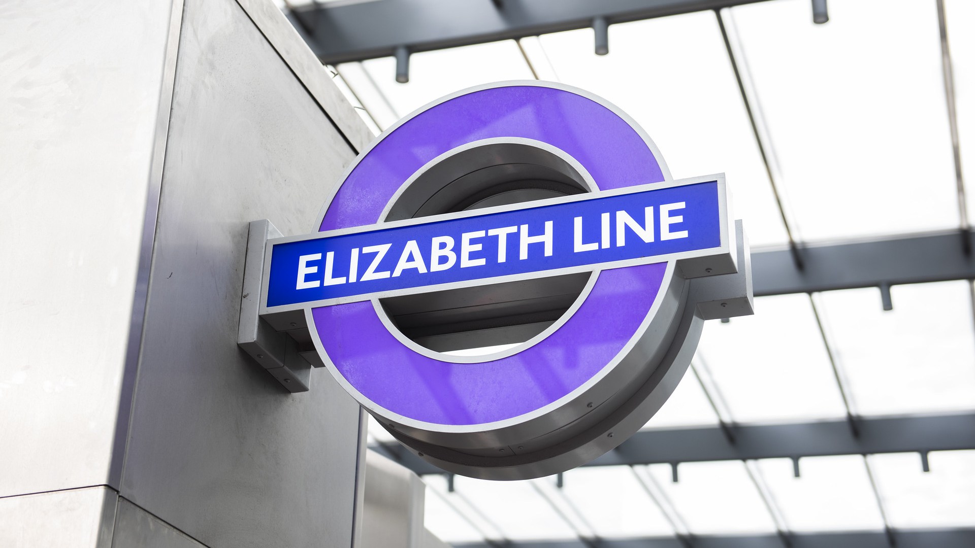
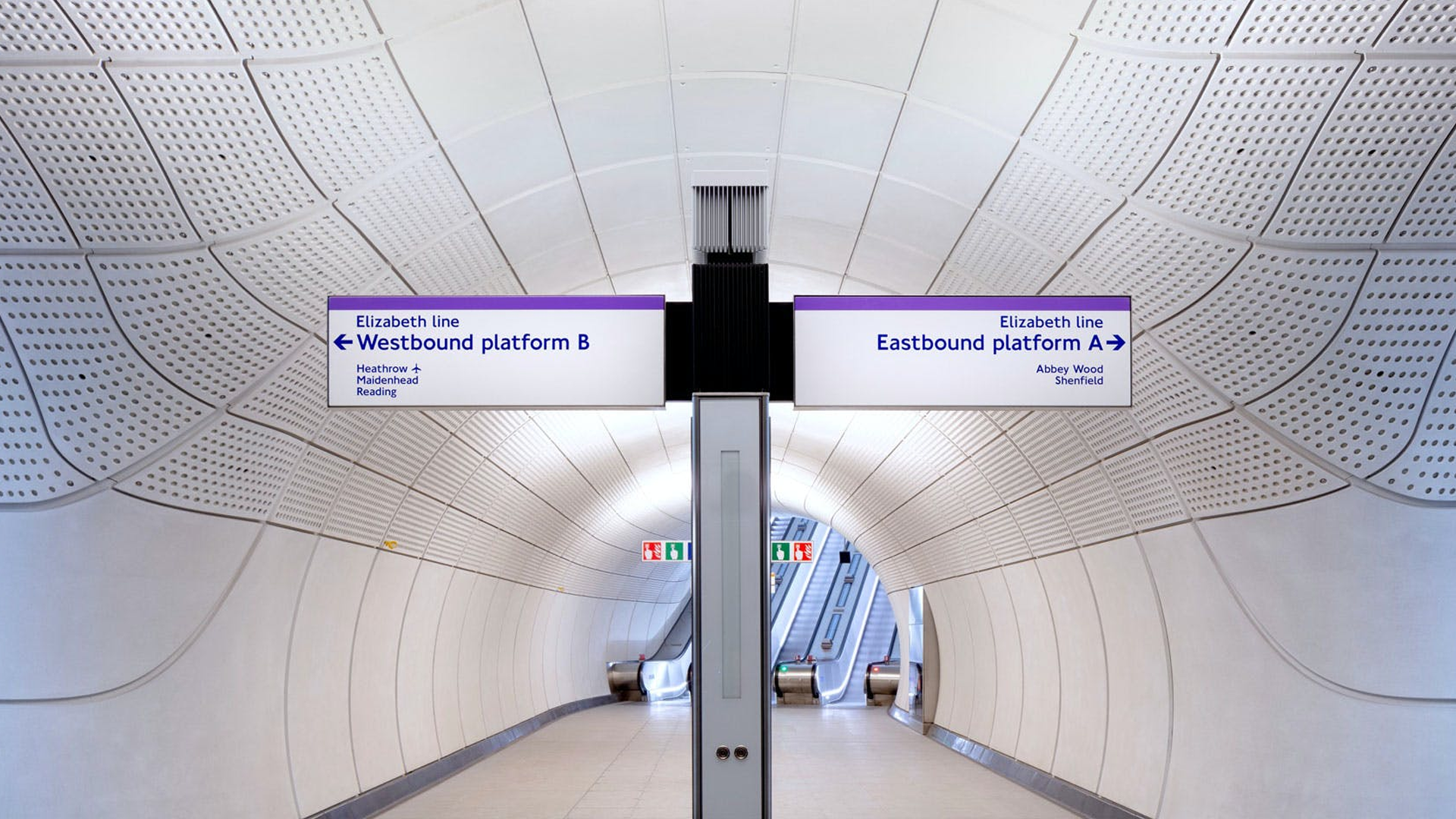
Article continues belowWe think the purple colour is an interesting choice. We can understand that purple is quite a rich colour and that it often has connotations relating to royalty (which makes sense considering the line is named after the Queen). But while it looks the part at the actual stations (see below), it's very difficult to spot on the map. It kind of reminds us of Pantone's colour of the year, Very Peri.

It looks as though we aren't the only one finding the new design pretty baffling, with lots of users heading to Twitter to express their confusion. One user replied to the design, "It's too busy for my eyes," and another tweeted, "At what point do you just start over the map? This looks like a ball of tumbleweed now," and we have to agree.
This can be graphically communicated better by now surely https://t.co/jr9OtEOcq9May 19, 2022
FYI my partner is sat next to me going "this is the worst tube map I've ever seen". TfL losing their map audience. https://t.co/RYA2a82vsYMay 19, 2022
It really is the "Elizabeth line line" huh https://t.co/qE75SZB4RNMay 21, 2022
While you can start riding the Elizabeth line already, it still won't be fully completed until May 2023. In the meantime, if you'd like to have a go at redesigning the tube map (because let's face it, it's pretty messy), then why not download Illustrator and get creating?
Read More:
Sign up to Creative Bloq's daily newsletter, which brings you the latest news and inspiration from the worlds of art, design and technology.

Amelia previously worked as Creative Bloq’s Staff Writer. After completing a degree in Popular Music and a Master’s in Song Writing, Amelia began designing posters, logos, album covers and websites for musicians. She covered a range of topics on Creative Bloq, including posters, optical illusions, logos (she's a particular fan of logo Easter eggs), gaming and illustration. In her free time, she relishes in the likes of art (especially the Pre-Raphaelites), photography and literature. Amelia prides herself on her unorthodox creative methods, her Animal Crossing island and her extensive music library.

