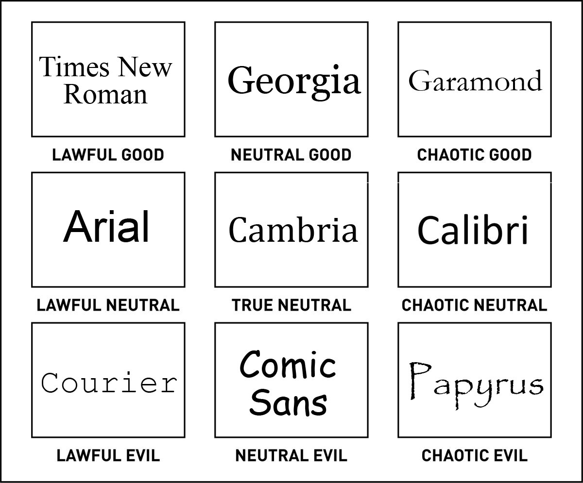
Funny font chart separates the good from the evil
But where on earth is Helvetica?!
Sign up to Creative Bloq's daily newsletter, which brings you the latest news and inspiration from the worlds of art, design and technology.
You are now subscribed
Your newsletter sign-up was successful
Want to add more newsletters?
Typefaces can be controversial things. One person's Times New Roman could be another's Papyrus. Perhaps the only sure-fire way for a typeface to win the hearts of designers is if they're reasonably priced. (We even went one better and sourced the best free fonts for you to download right now.)
But how do you separate the good typefaces from the bad? Such a task would surely require a chart breaking down the gradations of font quality. Luckily, we have exactly that. The chart follows a pattern you're sure to recognise if you spend a lot your time plugged into social media. It's based on the Dungeons and Dragons character alignment scale, but the structure has become a popular design meme in itself.
In this chart, typefaces are split between good, neutral and evil types, then further sub-divided based on whether they're lawful, neutral, or chaotic. Do you agree with how these famous typefaces have been sorted?
Article continues belowSee the original thread here. As you can see, the old reliable Times New Roman is the most clean-cut of the typefaces as it takes the lawful good crown. On the other end of the scale, Papyrus occupies the chaotic evil spot.
Meanwhile, Cambria sits slap bang in the middle. Although we can't help but notice the absence of Helvetica, which would surely sit comfortably alongside the good guys? But as Michel points out, this is a typeface scale for writers, who have different priorities when it comes to letter shapes.
this is for writers not designers. No one wants to read a book in Helevetica.October 17, 2019
This begs the question: what would a typeface alignment chart for designers look like? We bet it would look a little different, although Comic Sans would probably still be filling in one of the evil sections.
Related articles:
Sign up to Creative Bloq's daily newsletter, which brings you the latest news and inspiration from the worlds of art, design and technology.

Dom Carter is a freelance writer who specialises in art and design. Formerly a staff writer for Creative Bloq, his work has also appeared on Creative Boom and in the pages of ImagineFX, Computer Arts, 3D World, and .net. He has been a D&AD New Blood judge, and has a particular interest in picture books.

