General Motors has rolled out a new brand identity as part of a drive to increase adoption of electric vehicles. It claims its new look – created by in-house designers – is more "modern and vibrant" than the previous blue square. But is it up to the job?
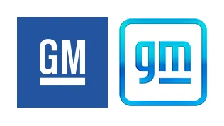
The rebrand swaps out the old logo's dark blue background with a white lettered uppercase monogram for a light blue lowercase 'gm' with a gradient, which sits in a white box outlined by the same light blue. Instead of having an underline on both letters, there's now a line under just the 'm'.
This change of emphasis makes us think we're supposed to change the way we say it too – General MOTORS instead of just General Motors. But is there something else to it? Either way, we're not convinced it's up there with our list of the best logos. And when compared to the other big rebrand so far of 2021 – Burger King – it feels like even more of a missed opportunity.
According to General Motors executive director of Global Industrial Design, Sharon Gauci, there most definitely more to that 'm' than you might have immediately noticed.
"The underline of the 'm' connects to the previous GM logos as well as visually representing the Ultium platform [GM's tech that powers electric vehicles]. And within the negative space of the 'm' is a nod to the shape of an electrical plug."
Whether or not the negative space looks like a plug to you will probably depend on which country you're from, and what plugs look like there. We definitely think this hidden Easter egg gives the logo more weight, but it's not enough to have us fully on board with the new look.
The blue iteration of the logo isn't the only one, either. There are further iterations in blue and black. We think the black is the strongest.

Gauci also elaborates on the colour scheme choice of the main logo: "The new GM logo features a colour gradient of vibrant blue tones, evoking the clean skies of a zero-emissions future and the energy of the Ultium platform. The rounded edges and lower-case font create a more modern, inclusive feel."
Perhaps it's the typeface choice that's the sticking point for us, coupled with the gradient, which somehow dates the logo. Together, it doesn't feel strong or enticing enough to really draw us in. The accompanying campaign for this piece is labelled 'Everybody In', and although we're certainly up for ways to make driving less damaging to the environment, we wonder whether a U-turn on the logo might be needed before it's full steam ahead for this one.
Read more:

