Why the Hershey's logo is more complex than you think
How many Kisses can you spot?

Sign up to Creative Bloq's daily newsletter, which brings you the latest news and inspiration from the worlds of art, design and technology.
You are now subscribed
Your newsletter sign-up was successful
Want to add more newsletters?
We love an innovative and iconic logo here at Creative Bloq, especially when the design features an Easter egg. That's why the Hershey's Kisses logo has caught our attention today. The design has us begging the question, how many Kisses are there?
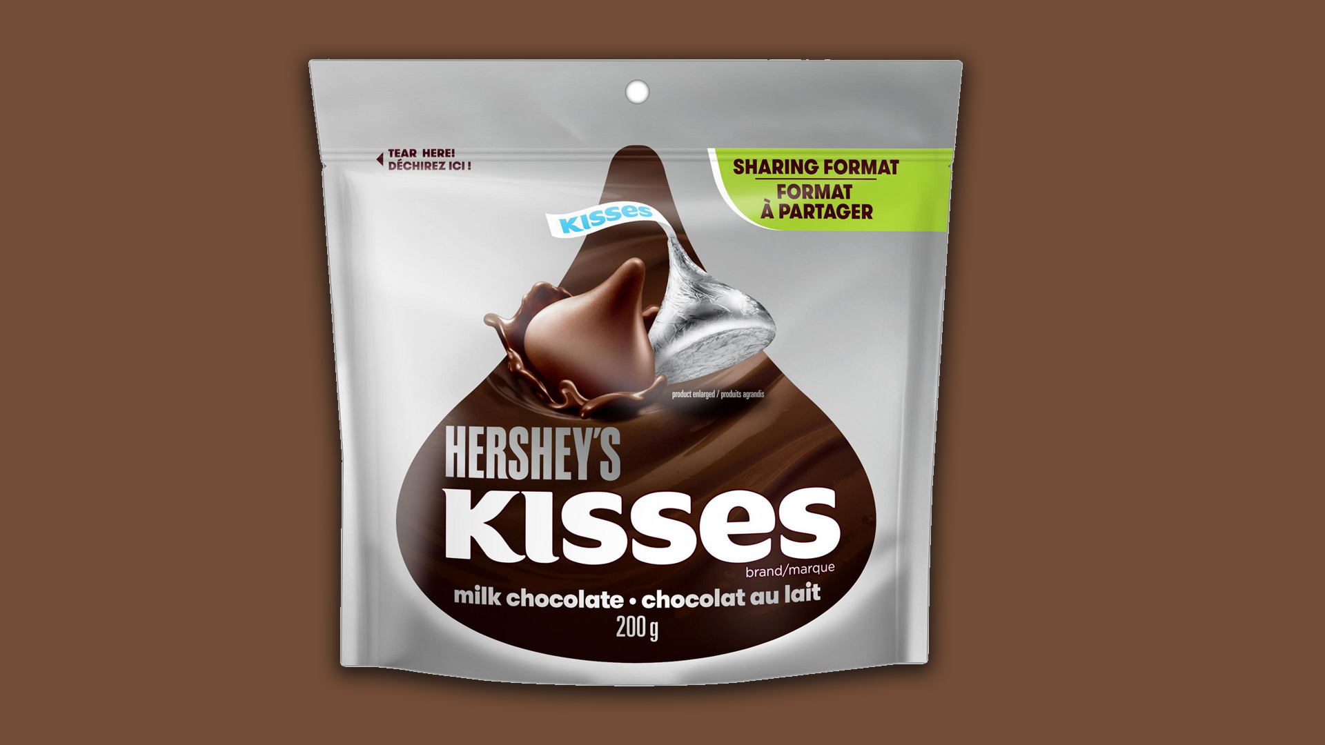
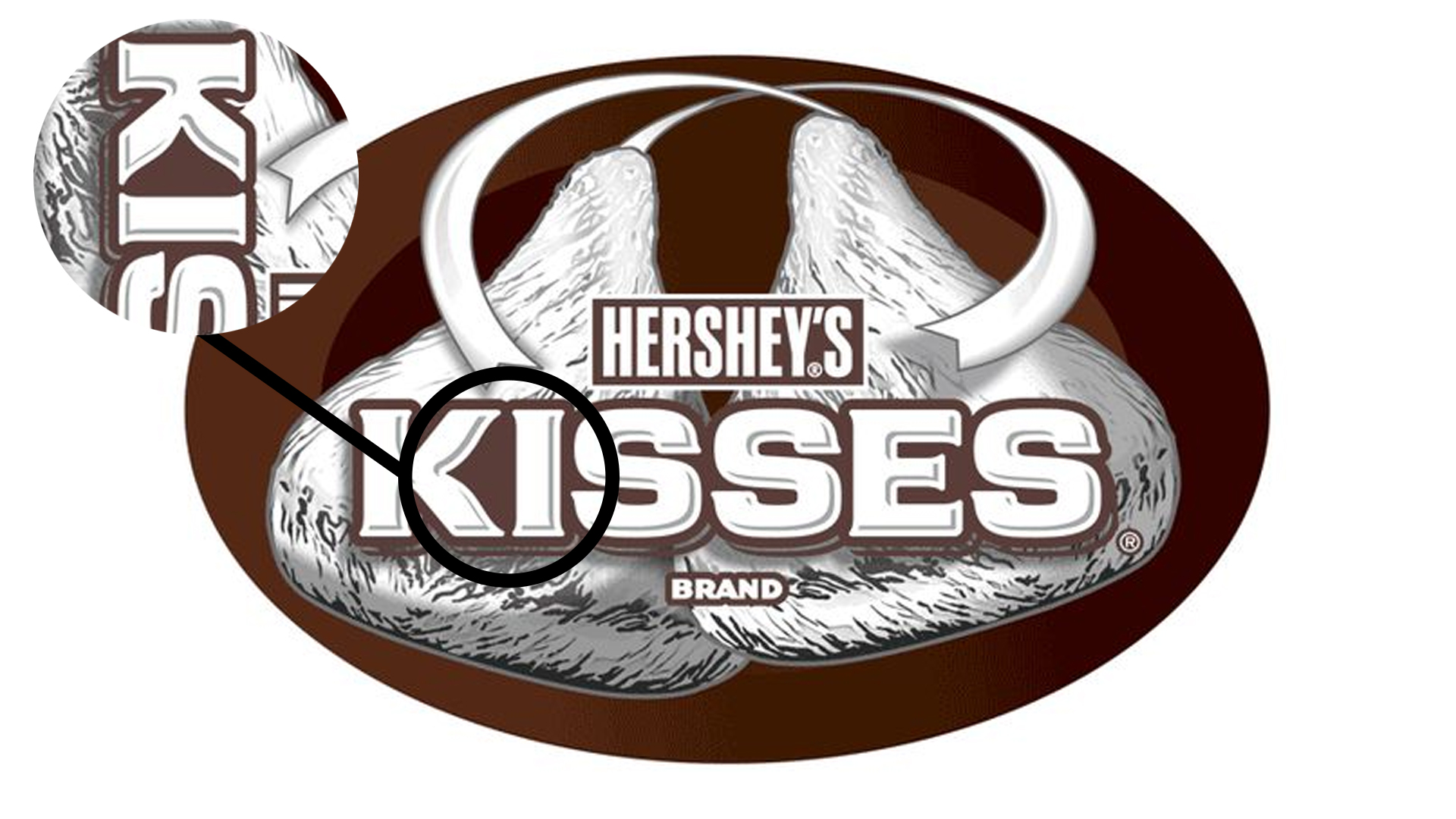
The design (see above) famously features two Hershey's Kisses as well as the 'Hershey's' and 'Kisses' wordmarks. But did you ever notice the third kiss in the logo? Sneakily slotted between the 'K' and the 'I' of 'Kisses' is a third chocolate on its side. If you're hoping to create your very own logo, then make sure you check out our roundup of the very best free logo makers to help you get started.

At first glance, it's hard to spot the chocolate in the design, but if you tilt your head or rotate the packaging, the Kiss is as clear as day. Despite definitely seeing the Kiss shape, we can't but wonder if this is just a coincidence as it's such a subtle design secret. These coincidences can happen – just last week we found out that fans thought there was a hidden meaning in the Wendy's logo, but the burger brand has since revealed it's just a happy accident.
Article continues belowIntentional or not, this is an excellent use of negative space (you can learn how to use it in your own projects with our guide on negative space). It reminds us of the genius use of blank space spotted on the eight of diamonds playing card.
If you're creating your own logo and are hoping to include some innovative designs, then make sure you check out our 15 golden rules of how to design a logo. Or if you'd rather indulge yourself in some more brilliant designs, then you'll love our roundup of the best logos of all time.
Read More:
- Apparently Apple is working on a wacky new MacBook-monitor hybrid
- We can’t stop staring at these hyper-realistic 3D portraits
- NFTs of cereal boxes sell out in 24 hours
Sign up to Creative Bloq's daily newsletter, which brings you the latest news and inspiration from the worlds of art, design and technology.

Amelia previously worked as Creative Bloq’s Staff Writer. After completing a degree in Popular Music and a Master’s in Song Writing, Amelia began designing posters, logos, album covers and websites for musicians. She covered a range of topics on Creative Bloq, including posters, optical illusions, logos (she's a particular fan of logo Easter eggs), gaming and illustration. In her free time, she relishes in the likes of art (especially the Pre-Raphaelites), photography and literature. Amelia prides herself on her unorthodox creative methods, her Animal Crossing island and her extensive music library.
