IKEA's new logo is... different
The Swedish furniture giant is rolling out a redesigned logo, but can you tell?

Sign up to Creative Bloq's daily newsletter, which brings you the latest news and inspiration from the worlds of art, design and technology.
You are now subscribed
Your newsletter sign-up was successful
Want to add more newsletters?
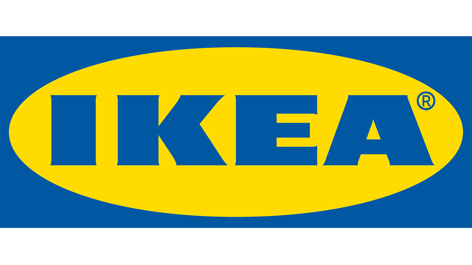
Ready to see IKEA's new logo? Have you clicked straight through to this page expecting to see a radical redesign that repositions the famous Swedish brand? If so, sorry. We're being a little cheeky. You've already seen the new IKEA logo. It's at the top of this article. There it is, go on, take it in.
We won't blame you if you don't believe us. The new logo, designed by Joakim Jerring from Stockholm's Seventy agency, isn't exactly a huge departure from the previous IKEA logo, which had been going strong since 1992. In fact, if you were prompted to draw the IKEA logo from memory, you'd probably whip up something fairly similar to both that logo, and this shiny new one.
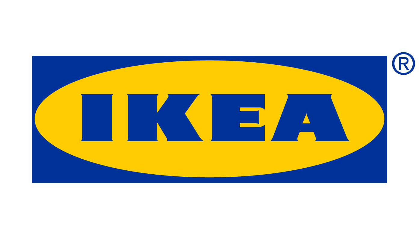
So, what's changed with the new logo design? When compared with the old logo (below) perhaps the most obvious change is that the registered trademark symbol has been packed away into the recognisable yellow oval itself, rather than being left to float along side it.
Article continues below 
Speaking of the oval, that's had a growth spurt to accommodate the (slightly) bigger lettering. The flairs on said lettering have also been trimmed, which allows for tighter kerning. Meanwhile, the counter in the letter 'A' has been expanded, and the arms on the letter 'K' taper off into a more narrow point.
According to Jerring, the updated logo was the result of close collaboration with IKEA for the best part of a year. As part of its brief, IKEA wanted the new logo to increase its legibility on both digital and physical domains. It also wanted the design to avoid re-registration of the trademark.
On top of this, the new logo had to define rules of usage and be able to co-exist alongside the old logo. This all goes some way as to explaining why it is new, but similar.
“By making subtle but impactful changes to the logo, we created an optimal visual experience across all formats, yet still maintained the unique characteristics of the original iconic design,” Jerring tells Creative Bloq.
Sign up to Creative Bloq's daily newsletter, which brings you the latest news and inspiration from the worlds of art, design and technology.
“One of these updates was increasing the optical size of the brand name,” Jerring adds. “By changing the proportions of the box and oval, we increased the letter size by 15%, creating a bigger brand presence within the same amount of media space.”
Other changes include the introduction of a different shade of blue and yellow. The new colouring appears more toned down and muted. This is a welcome change, as the previous design used a bold palette that was a little harsh on the eyes. And if you've ever had to traipse through the arrowed slalom that is IKEA, you'll probably agree that the last thing you need is eye strain.
As far as logo redesigns go, yes, this is much of a muchness. And IKEA has got its work cut out if it wants to replace its branding with this subtle update. We had to check and double check to make sure we were talking about the correct version when putting this post together, so god help the designers who have to replace the logo in store and online.
Still not convinced that the logo is that different? Check out this eye-popping before and after contrast put together by the clever folks over at Brand New.
Related articles:

Dom Carter is a freelance writer who specialises in art and design. Formerly a staff writer for Creative Bloq, his work has also appeared on Creative Boom and in the pages of ImagineFX, Computer Arts, 3D World, and .net. He has been a D&AD New Blood judge, and has a particular interest in picture books.
