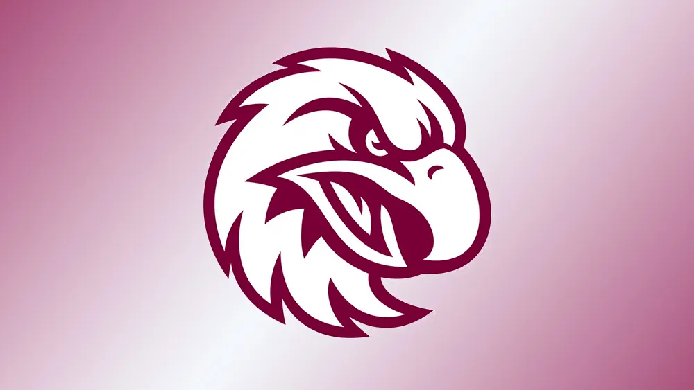
A new logo for a sports team is always going to divide opinion. However, fans of Australian professional rugby league club the Manly Warringah Sea Eagles seem to be particularly unsure of what to make of their team's radical new look
As with many recent rebrands in sports and new logos in general, the redesign has focused on making the logo simpler and clearer. But for some fans, the result is a little too simple. Some think it looks more like a rooster than a fierce and majestic bird of prey.

The new Sea Eagles logo drops the previous roundel and full-size bird for a much cleaner design that features only the head of an eagle. It's an approach that's been taken by various sports teams, such as some of the best NFL logos. It's even a little reminiscent of the Premier League logo. In fact, over on the former Twitter, some fans suggest the design was directly copied.
Some say it looks more than a little like the logo of the Australian rules football club the West Coast Eagles while others see an uncanny likeness to Augsburg University Athletics. For others the problem is what species of bird the design is supposed to show.
"That’s a 20 cent clip art eagle from the USA. They could have commissioned an Australian to design something that at least represented an Australian Sea Eagle," one person wrote. "Manly Angry Chickens?" one person suggested. "Could be an angry chicken, could be an eagle, could be Foghorn Leghorn?" someone else tweeted. Others think the bird has a mullet and looks too cartoonish.
I’m calling them Augsburg from here on in.. pic.twitter.com/ehew8XAmLVOctober 16, 2023
BREAKING!! Manly Sea Eagles new logo pic.twitter.com/OvcoihiGPDOctober 17, 2023
Very innovative logo … pic.twitter.com/80pobe82xMOctober 16, 2023
Manly CEO Tony Mestrov told Yahoo Sport Australia: "We wanted to modernise the emblem and jersey, not for the sake of change but to show we are an ambitious, go-ahead club with big plans for the future." He also stressed that the rebranding was undertaken in consultation with the club's members' council, fans, players and sponsors.
It's extremely difficult for sports team logos to please everyone (see our pick of the best sports logos) I can see why the rugby club wanted to rebrand. The new logo is a lot cleaner and simpler - an easier to apply to merchandise. But heritage and identity are hugely important to fans and simplified logos easily start to look generic and less characterful.

