For once, a new logo design is getting a lot of love from fans, but it's ignited a whole debate of a different kind. Disney's revealed a new logo for The Muppets Studio and, while some fans wonder what it's for since they've been waiting eons for new projects, it's been largely welcomed.
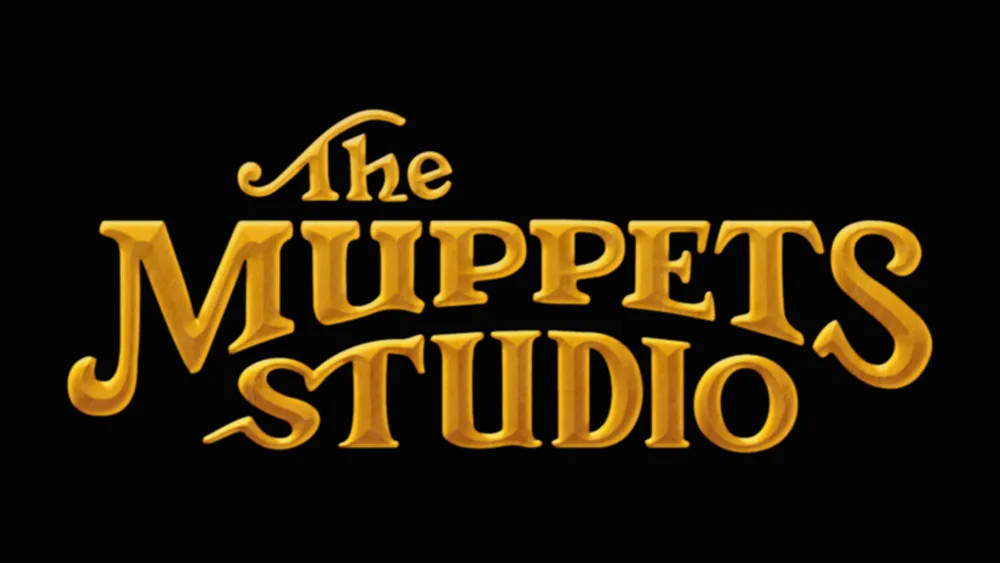
Fans have praised the new design for adopting a retro look that harks back to The Muppets' heritage. With lettering reminiscent of the logo from the intro to the Muppet Show series in the 1970s, the design seems much more on-brand than previous efforts. Even Statler and Waldorf might approve. See our guide to logo typography for advice on how to nail the typeface for your logo.
Curtains up on our shiny new logo for The Muppets Studio! Keep an eye out for it on new projects like Muppets Haunted Mansion this fall on Disney+. pic.twitter.com/wpUuHyq61SJuly 31, 2021
Muppets Studio Vice President Leigh Slaughter told the fan site ToughPigs that the logo aims to appeal to nostalgia and hark back to the Muppets' heyday. She said: "Those letters are instantly recognizable. But we took it a bit further by changing a few of the letters and elements so that it’s got a bit of a modern touch as well." She said the logo will be customised for different projects, suggesting it will get some spooky tweaks for the upcoming Halloween special Muppets Haunted Mansion to be shown on Disney+.
The design has done down well with fans, who see it as more traditional and in keeping with The Muppets brand than the last effort with its wild Kermit-green lettering. Tough Pigs reckons is the best logo the studio's had to date, while cartoonist and animator Natalie Redden commented on Twitter: "The ornate lettering was always better than the basic silly green ones."


Of course, it wouldn't be a new logo design if there weren't a few complaints. One user on Twitter commented: "Muppets are about warm fuzzy feelings inside, not about bling." Others have issues with the proportions of the letters. "The 'm' and the 's' aren’t even and it’s gonna drive me crazy haha. But beyond that I love it," one fan tweeted.
But more than anything else, the logo has ignited a much less expected debate that has nothing to do with the design of the logo at all. It's about the grammar of the company's name. Should it be The Muppets Studio or The Muppet Studio? Or even The Muppets' Studio? "The S's at the end of Muppets and Studio make the whole thing very awkward. It's like nobody ever said this out loud," One fan tweeted. "At the very least, there should be an apostrophe after the 's'," someone else has suggested.
The studio was formed in 2004 when Disney bought The Muppets from The Jim Henson Company. It went under the name Muppet Studios while part of the Muppets Holding Company, settling for The Muppets Studio in 2007. "I guess the bad grammar makes sense since you have nothing to do with Sesame Street anymore," one fan quipped on Twitter.
If you're looking to develop you're own logo designs, make sure you check out our guide to choosing the best free logo maker, or see below for the best prices currently available for Adobe's Creative Cloud.
Read more:
- How to choose the perfect logo colour for a brand
- The Paris 2024 Olympic logo is still being mocked online
- Logo design: 15 golden rules for crafting logos

