Everyone's saying the same thing about the new Google Chrome logo
The new design has fallen flat (literally).

Sign up to Creative Bloq's daily newsletter, which brings you the latest news and inspiration from the worlds of art, design and technology.
You are now subscribed
Your newsletter sign-up was successful
Want to add more newsletters?
When a brand reveals a new logo in this day and age, it's almost guaranteed to be a flatter version of its previous design – and that's certainly the case with Google Chrome's new logo. Revealed this week, it's the browser's first new icon in eight years, but some users are struggling to spot the difference.
A designer for Chrome tweeted the new design (below), along with a bunch of tidbits about how the design will appear on various operating systems. But apart from the removal of the shadow and some slightly brighter hues, we're not seeing a huge amount of change – and it seems we're not alone. (Looking for inspiration? Check out our guide to logo design.)
Some of you might have noticed a new icon in Chrome’s Canary update today. Yes! we’re refreshing Chrome’s brand icons for the first time in 8 years. The new icons will start to appear across your devices soon. pic.twitter.com/aaaRRzFLI1February 4, 2022
The most notable change in the design, shared by Elvin Hu, is the removal of those shadows. Yep, Google has finally joined the flat design party, saying goodbye to any trace of skeuomorphism. But while the change removes any 3D aspect from the icon, it's hardly a profound change.
Article continues below 
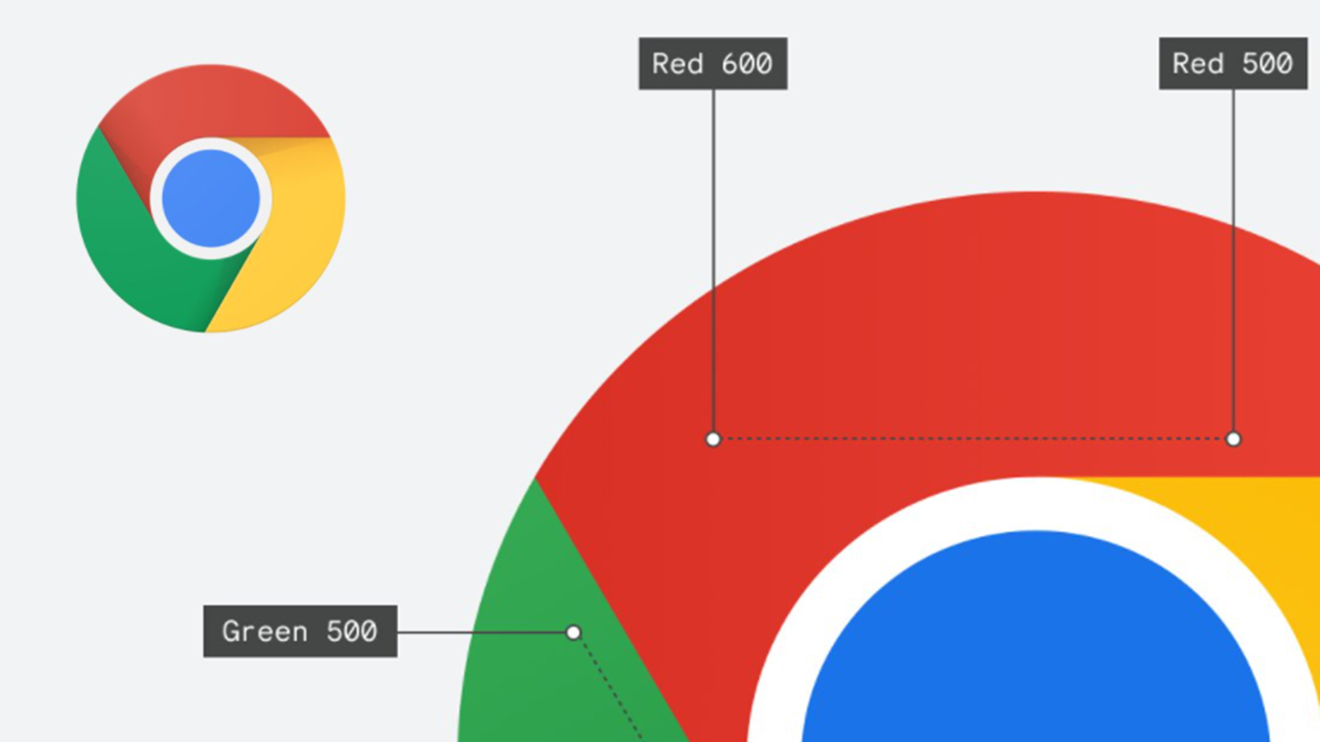
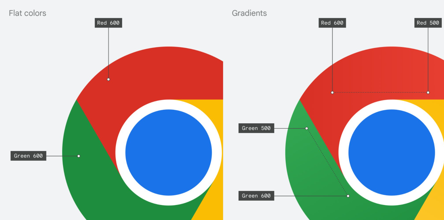
Even more subtle is the alteration of the colours. At first glance you wouldn't notice, but Hu rather fascinatingly explains that instead of flat, block colours, the new version incorporates a subtle gradient. This is because the team "found that placing certain shades of green and red next to each other created an unpleasant colour vibration."

But while Hu makes no claim that the logo is intended to be a revolutionary redesign, the internet is finding much mirth in its similarity to the previous design. "It took 8 years to make those changes that will go unnoticed to the human eye," one Twitter user comments, while another adds, without a hint of sarcasm, "OMG Google has single handily undisputedly without a shrivel of doubt BROKEN THE INTERNET in its groundbreaking next-generation design – this will be studied for centuries to come as never in HUMAN HISTORY has such a masterful design been created by humankind in its 200,000 years." Fair enough.
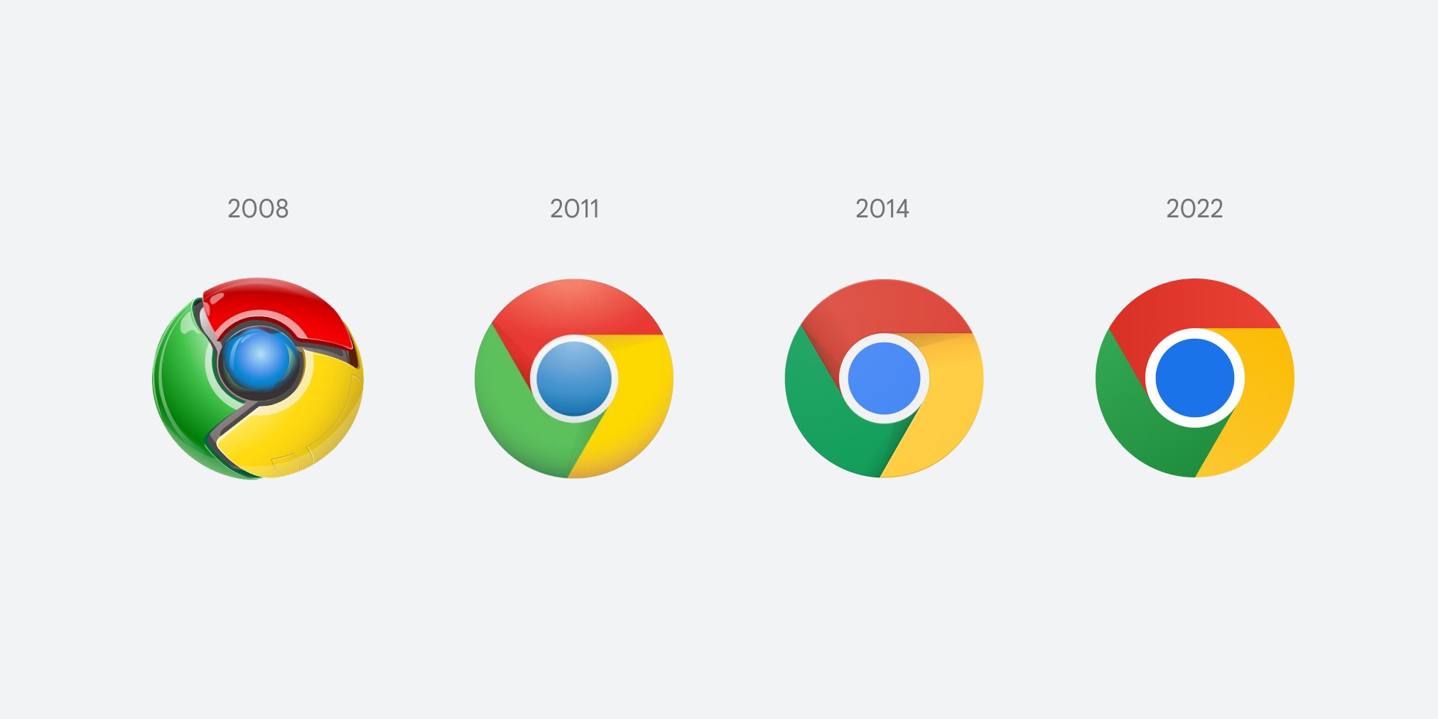
We have to admit, seeing every design since 2008 side-by-side makes it clear just how much icon design has changed in 14 years. Is that a twinge of nostalgia we feel for the extravagantly 3D original design? Well, if Apple's new icons are anything to go by, skeuomorphism could well be coming back.
Chrome: We changed our logo! Me: pic.twitter.com/PhX1nxS9VmFebruary 7, 2022
And as many have pointed out, this doesn't fix one fundamental problem with the Google Workspace icons – that they all look the same. Users have been complaining about the confusingly similar designs for months, and removing a tiny shadow is clearly doing little to mitigate the issue.
Sign up to Creative Bloq's daily newsletter, which brings you the latest news and inspiration from the worlds of art, design and technology.
While it might not be the most exciting new design in the world, at least it isn't a clanger – who can forget Amazon's disastrous new app icon from last year? If you want to see what it looks like when a brand gets it right, check out the best logos of all time – and if you fancy creating your own, take a look at our guide on how to download Photoshop.
Read more:

Daniel John is Design Editor at Creative Bloq. He reports on the worlds of design, branding and lifestyle tech, and has covered several industry events including Milan Design Week, OFFF Barcelona and Adobe Max in Los Angeles. He has interviewed leaders and designers at brands including Apple, Microsoft and Adobe. Daniel's debut book of short stories and poems was published in 2018, and his comedy newsletter is a Substack Bestseller.
