New Converse logo re-treads old ground
The famous shoe brand has a new look that relies on brand heritage.

Sign up to Creative Bloq's daily newsletter, which brings you the latest news and inspiration from the worlds of art, design and technology.
You are now subscribed
Your newsletter sign-up was successful
Want to add more newsletters?
Don't panic, Converse has given its wordmark a redesign but the famous Chuck Taylor logo remains intact. Given that the star-shaped piece of ankle decoration is one of the most recognisable pieces of Americana, arguably up there with McDonald's Golden Arches, it's a relief that this rebrand didn't scrap a design classic.
Instead, Converse has revised its wordmark – the one that had the star in the letter 'O' – to tie into a new purpose statement that claims it will provide the youth with "tools that enable movement(s)."
To reflect this, Converse has dusted off the star chevron and placed it front and centre in its visual communications. Complete with a wonky star that's representative of the Converse brand moving forwards, this new identity has already started rolling out on the official site and will be fully introduced over the next 12 months. Click left to right in the gallery below to see how the new wordmark compares to the old one.
Article continues below

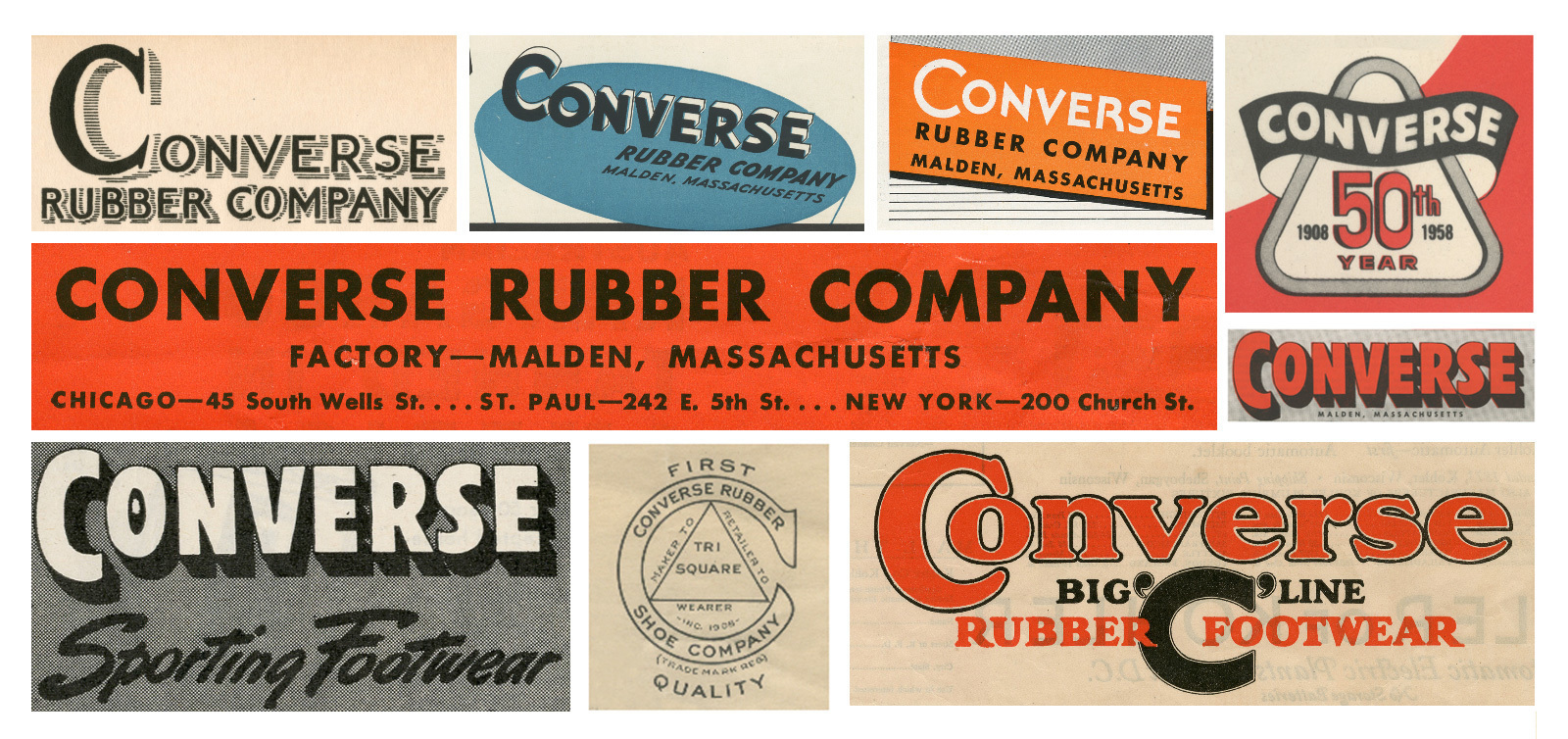
Just like plenty of other recent rebrands, including the Co Op and Kodak redesigns, this identity was updated with a bit of creative inspiration from older logos. For Converse, it was a case of looking at old typography. The wordmark is a combination of four or five different versions of the logo, harking back to lettering from the '20s and '30s, which relied on heavyweight sans-serif fonts.

Related articles:
- Why we should be wary of the retro trend
- Is your design retro... or just dated?
- How to give illustrations a retro look in Photoshop
Sign up to Creative Bloq's daily newsletter, which brings you the latest news and inspiration from the worlds of art, design and technology.

Dom Carter is a freelance writer who specialises in art and design. Formerly a staff writer for Creative Bloq, his work has also appeared on Creative Boom and in the pages of ImagineFX, Computer Arts, 3D World, and .net. He has been a D&AD New Blood judge, and has a particular interest in picture books.
