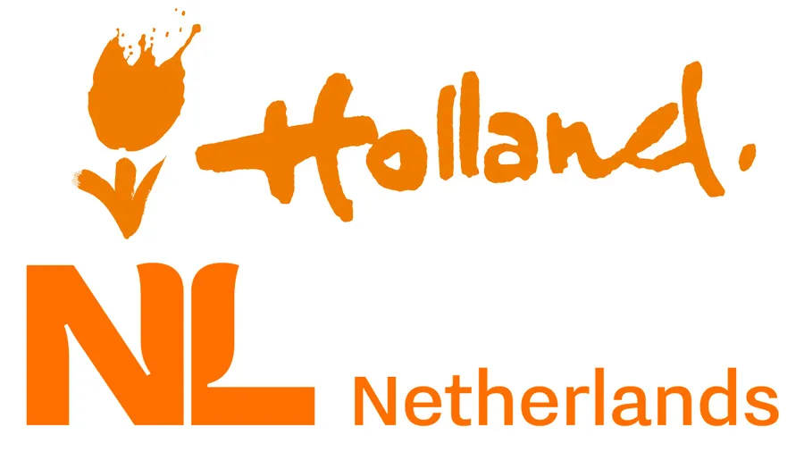
What do you think of when you think of Holland, or the Netherlands? The Netherlands Board of Tourism & Conventions are hoping it's the colour orange (associated with the Dutch royal family) and tulips, judging by its new logo for the country. We wonder if they got any top tips from our logo design inspiration post?
The fresh logo is the result of a strategy developed to more clearly show what the Netherlands has to offer. The Dutch government decided it was time to ditch the old brush-style tulip and hand-drawn 'Holland' text logo and be recognised internationally by a new, more representative logo. Yes tulips are still there, and so is the colour orange, but the two are brought together in a more subtle and contemporary style. And can you spot a hidden tulip hiding in the forms of the 'N' and the 'L'?
The informal 'Holland' text also got the heave-ho. Holland is a region of the Netherlands, and while commonly used as the country's name in the outside world, inside the country many think this is misrepresentative. Hence the change to Netherlands in the new-look logo.
While the government might like the new logo, it seems Dutch designers have not been so complimentary, as you can see from the comments on Twitter (below).
De tulp is niet symmetrisch. Ik herhaal. De tulp is niet symmetrisch. pic.twitter.com/HFxES995CnNovember 8, 2019
This translates as "The tulip is not symmetrical. I repeat. The tulip is not symmetrical." While the post below is a little more forthright saying "The Netherlands has a new logo. We are no longer the land of tulips. The N and L together form a chimney."
Nederland heeft een nieuw logo. Niet langer zijn we het land van tulpen. De N en L vormen samen een schoorsteen. pic.twitter.com/hSwru0P4LCNovember 9, 2019
This last one has got to be one of our favourites, though. Translation: “I have made the logo future-proof”.
Ik heb het logo toekomstbestendig gemaakt: pic.twitter.com/vxkYQj7jI0November 9, 2019
There are a couple of questions around the use of 'NL', too. Is there a strong enough association with the NL abbreviation? We only remember it from car bumper stickers. But what we do like that tulip design. It is almost ugly and not immediately obvious, but as soon as we spotted it, we liked it. And the more we look at it the more we like it. That's what we call smart logo design.
We're not sure how the world will embrace the new international-friendly identity, but the logo will be rolled out from January. Watch this space.
Read more:

